Mostrar mensagens com a etiqueta M. Mostrar todas as mensagens

17/11/2012

Musée de l'imprimerie Lyon

>
Le Musée de l'imprimerie : présentation et historique Le musée de l'Imprimerie est un des musées de Lyon dont les missions principales sont d'enrichir, de conserver, de documenter et de valoriser auprès de divers publics le patrimoine livresque et graphique. [Ler mais...]

Corpus Typographique Français 150 ans de lettres en France

Le Corpus typographique français recense les polices de caractères dessinées en France entre 1850 et aujourd’hui. Il se veut une illustration de la création française dans ce domaine. Il n’a pas pour but d’être exhaustif mais représentatif : s’y côtoient des grands classiques et des créations plus obscures, des caractères de labeur « sérieux » et de la « titraille » fantaisiste, des créations de haute volée mais, aussi, des caractères médiocres, voir mauvais, car l’histoire de la typographie en comporte également. [Ler mais...]

fonte: http://www.imprimerie.lyon.fr/imprimerie/sections/fr/musee# 
http://www.imprimerie.lyon.fr/imprimerie/sections/fr/documentation/corpus

16/02/2010

Wood Type Museum

>


This Web Museum is established for the purpose of educating the general public, and the next generation, on the beauties of wood types and engraved blocks. Our mission is to gather, save, preserve, and interpret wood types and information about them.

As the demand for broadsides increased during first years of the nineteenth century, the need for the process of producing large letters cheaply arose. Wood was a logical material choice because of its ready availability, lightness, and proven printing qualities. In 1827, Darius Wells of New York City first found the means to mass produce wood letters. In March of 1828, first wood type catalogue was published by Wells. Throughout the wood type manufacturing history, many manufactories were in business. Among those, Wm. H. Page & Co., Vanderburgh, Wells & Co. and Hamilton Mfg. Co. was the most noted ones. [Ler mais...]


Museum of Creative Calendar Design

This Web Museum of Creative Calendar Design is established for the purpose of showcasing the outstanding calendars created by creative graphic desingers thoughout the world. It is a part of our on-going initiative designed to encourage and aspire people with creative talents in various fields to keep creating calendars in physical form. It is open to all with no cost to participants. Calendars have been with us since the beginning of the time. It is an essential part of the civilization. Calendars listed here are chosen for its beauty, uniqueness, and quality of finish. Entries here are essentially by invitation only, from all over the world and selected works will be displayed throughout the year.. So come often, enjoy !!


fonte: Wood Type Museum > Museum of Creative Calendar Design

08/05/2009

Buchstaben Museum

>
Ziel des Buchstabenmuseums in Berlin ist es, die Exponate in einem repräsentativen Museum der Öffentlichkeit zugänglich zu machen. Geplant sind Dauer- und Sonderausstellungen sowie begleitende Aktionen, um weiterhin das Bewusstsein für Typografie und das Interesse für die Sammlung zu wecken. [Ler mais...]


07/03/2009

13/05/2008

Affiche Museum

The Swiss Poster Collection: 1970 to the Present > Tour


07/10/2007

05/10/2007

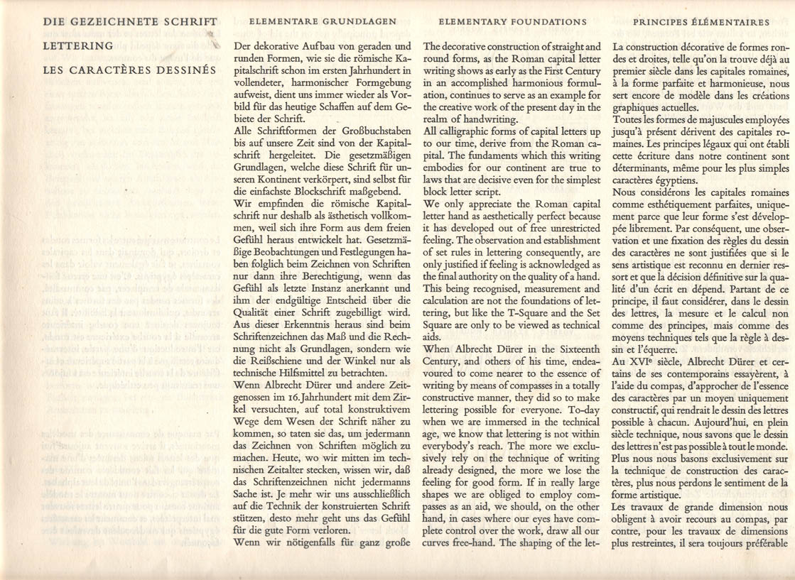
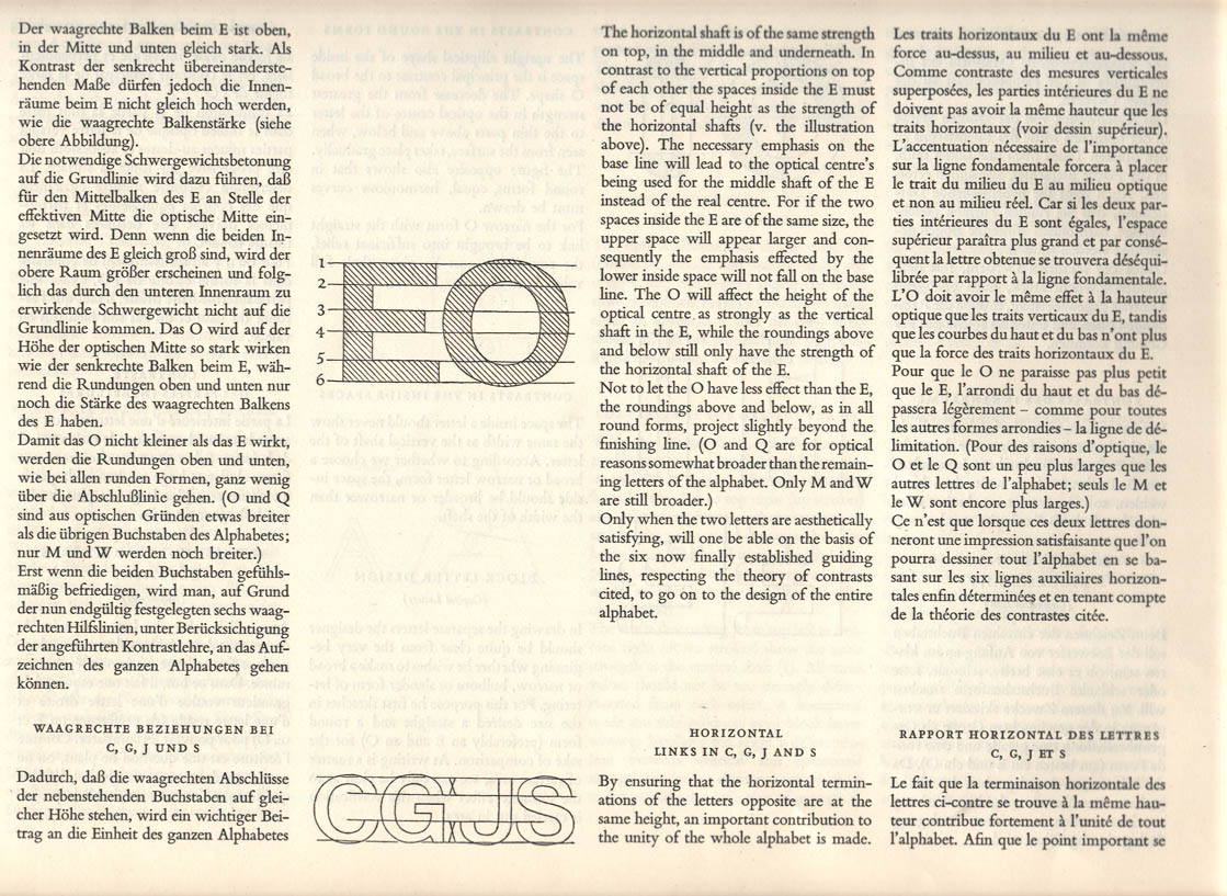
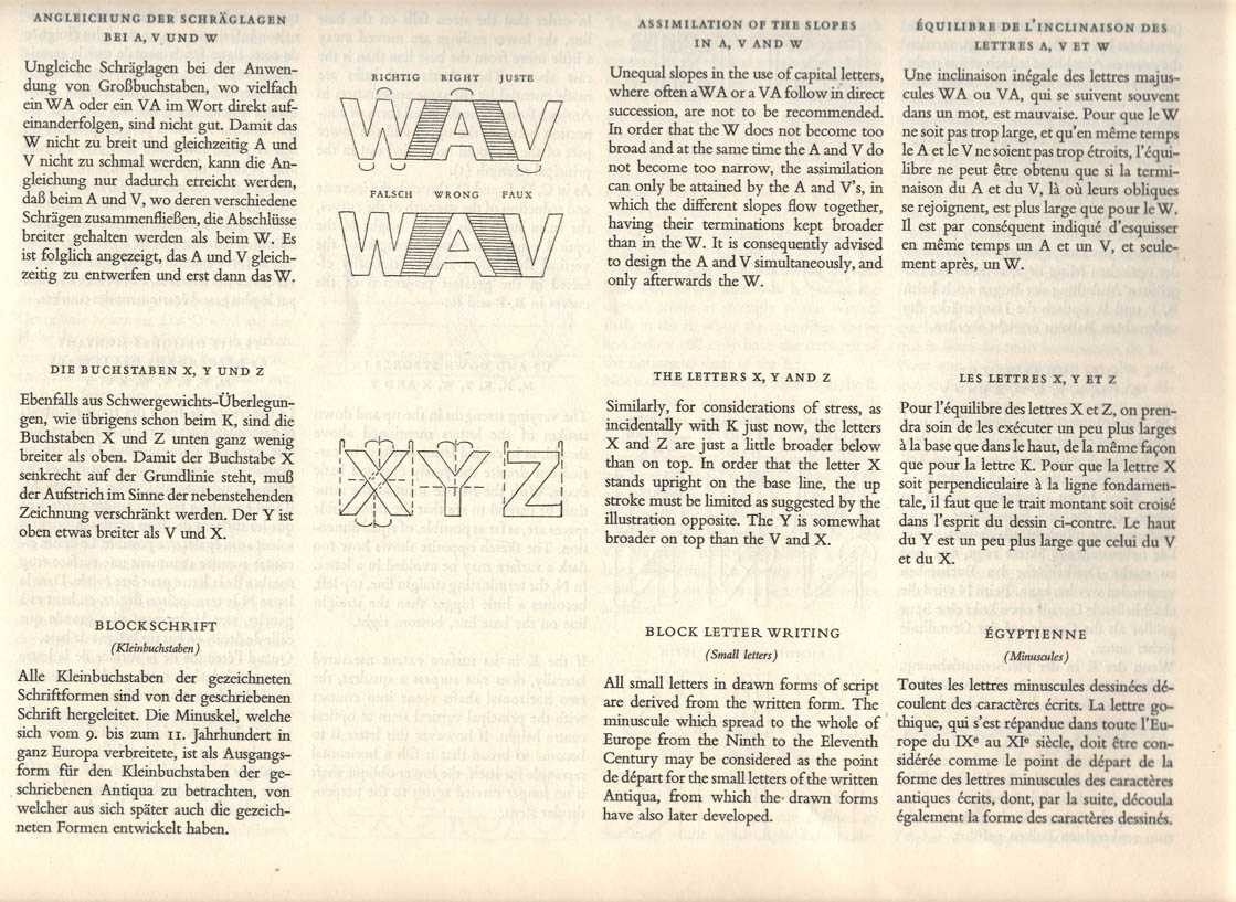
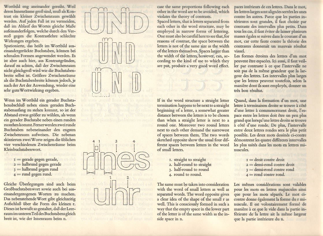
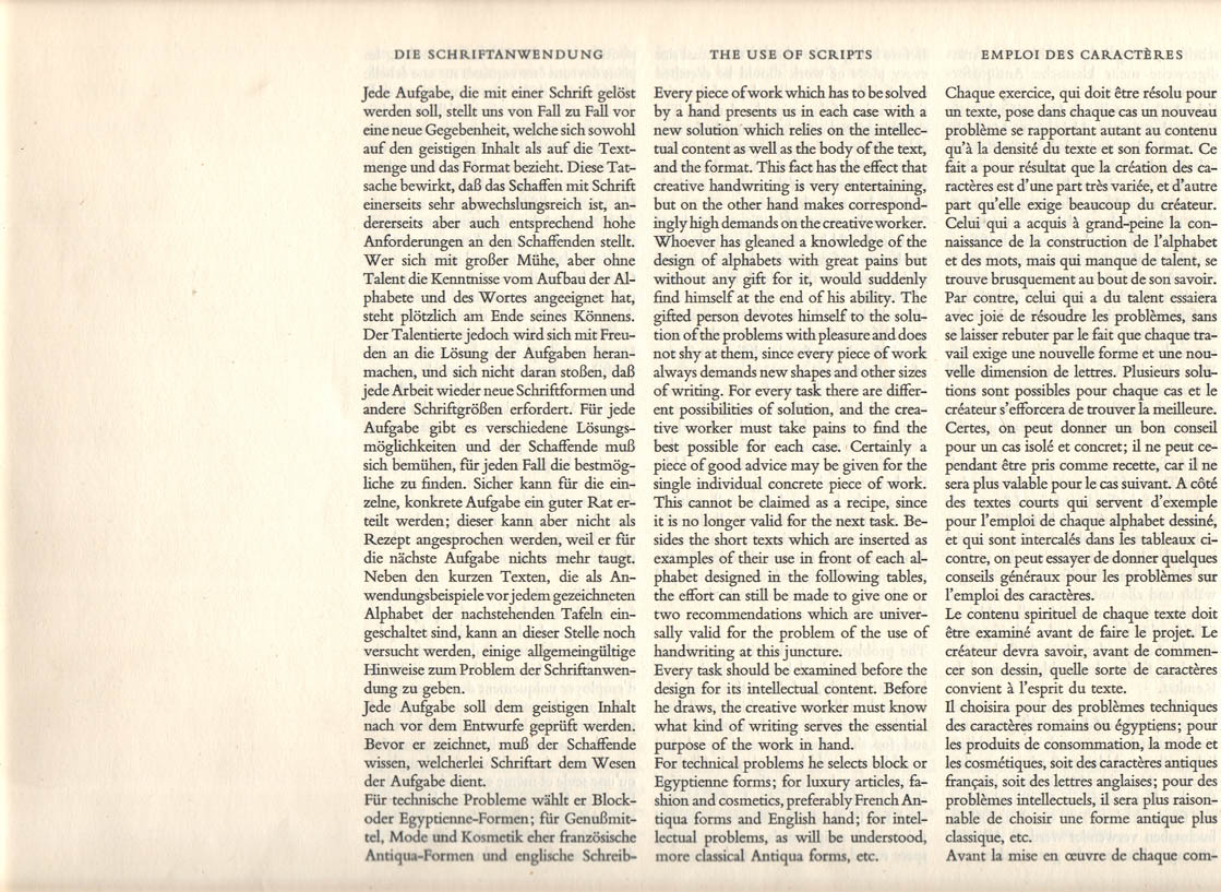
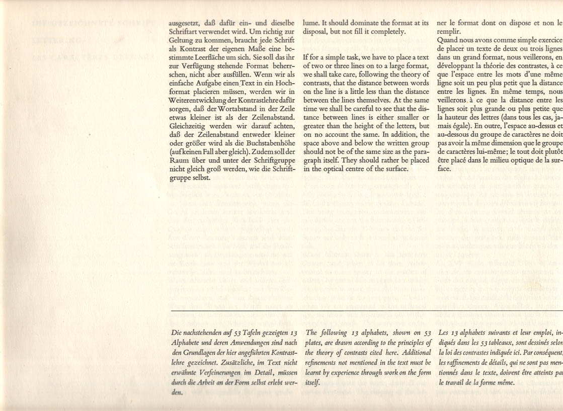
Lettering _Elementary Foundations

Die Gezeichnete Schrift / Lettering / Les Caractères Dessinés
Elementare Grundlagen / Elementary Foundations / Principes Élémentaires


...

31/08/2007

The .918 Club_printing history


> Preserving a Tradition of Letterpress Printing


The .918 Club shares Printing history with visitors

The .918 Club brings together the volunteers of the Heritage Center Museum Print Shop to share ideas and suggestions concerning the educational demonstration. We meet monthly to provide a gathering place for people with an interest in letterpress printing, to schedule volunteers to operate the Print Shop, and to provide a place for anyone interested in learning about letterpress printing or developing the skills to become a volunteer in the Museum Print Shop.

Through our regularly scheduled demonstrations we educate the public about the history of printing while providing a working letterpress job shop to fulfill the printing needs of the Heritage Center of Lancaster County, Inc. [Ler mais...]


fonte: The .918 Club: History
...

29/07/2007

The International Printing Museum

Background on the Printing Museum

The International Printing Museum in Southern California is a dynamic museum that takes one of the world's most significant collections of antique printing machinery and brings it to life through working demonstrations and theatre presentations. Since 1988, over 250,000 visitors have toured the museum, learning about the history of books and printing, great inventions and inventors that have changed our world. The Printing Museum has been recognized worldwide for its importance and size, and for the successful and creative approach it takes in interpreting the collection to a general audience.
The Museum was founded in 1988 by David Jacobson of Gutenberg Expositions and Ernest A. Lindner to house the Lindner Collection of Antique Printing Machinery. The collection has grown since then with significant donations and acquisitions, making the International Printing Museum the premier exhibit on printing history throughout the world.
From 1988 until 1997, the Printing Museum was located in the city of Buena Park. Following the acquisition of the Museum property by the California Department of Transportation in 1997, the collection was moved into storage while a new home was sought. The new public display opened in 1998 in the city of Carson, 20 minutes south of downtown Los Angeles. In February of 2003, the Board of Trustees for the International Printing Museum Foundation successfully raised the necessary down payment for the acquisition of the Museum property in Carson. [Ler mais...]


fonte: The International Printing Museum
...

29/05/2007

Graphion’s Online Type Museum


Table of content

Organised around six sections (Typographic visionnaries, Elements of typesetting style, Old Phototypesetter tales, Q&A, The Crystal Goblet and a glossary), these pages were written by Michael Sanborn, formerly a typesetter for a company named Graphion. About his site, the author used to say that “the museum serves as both a gallery of typographic trivia and a repository of information that today's graphic designers really should know and don’t. (…) A lot of elements of typographic art have been forgotten”.

Typographic Visionnaries

This is a gallery of the individuals who, through their creative drive and passion for their craft, formed the world of type as we know it today.

Other documents


...

22/05/2007

The Story of Verdana

In 1994, Microsoft began a typeface development project which was to forever raise the bar for quality standards of screen type. The goal was to produce a new family of sans serif typefaces as TrueType outline fonts which had exceptional readability. To do the job right would require a team of individuals skilled in art, craft and engineering. For the type designer, they chose the talent of Matthew Carter, and for the technological expertise, they chose Tom Rickner of Monotype Imaging.

Matthew Carter’s breadth of experience includes cutting punches in steel for metal typefaces, editing bitmaps, and drawing outlines for photo and digital systems. One typeface of note is Matthew's Bell Centennial, which he designed as a bitmap for use on the new CRT typesetting systems of the late 1970’s. That typeface was used to print phone books, which are notorious for being printed on poor quality paper at high speeds. So when Microsoft presented Matthew with the challenge of designing a highly legible and readable outline font, optimized for the screen, he borrowed a chapter from his past and began by making bitmaps.

The pixel, or picture element, is the basic building block of screen type. Every bit, whether black, white or gray has tremendous impact on our ability to read fluidly and without impediment. Matthew therefore focused his attentions on the final product which people would read, namely three sizes of bitmaps for each of four weights of this new sans serif typeface family. From those bitmaps, Matthew “wrapped” outlines around them, which would in turn be produced as hinted TrueType outlines.

What is TrueType hinting, anyway? Hinting is both engineering and art. It is about defining and controlling the structure of letters. It requires the elimination of subtlety at small sizes where choices are limited. Hinting enforces consistency among similar features, where mathematical chance could introduce optical and typographical errors. It is accomplished by writing small computer programs for each glyph in a font. These programs adjust the shape of the scaled outline to improve the bitmap which is generated by the rasterizer.

Tom Rickner is well versed in TrueType hinting. He was a part of the TrueType development team at Apple Computer, where he hinted and oversaw the production on the first TrueType fonts to be released with Apple’s System 7. After leaving Apple and prior to joining Monotype Imaging, Tom worked as a freelance designer, hinting custom typefaces for such clients as Apple and Microsoft.

Hinting is full of decision making, such as choosing the right compromises between shape, spacing and proportions. However the Verdana project added a new element. Typically, the hinter exercises his or her own judgment in adjusting the font to best represent the “spirit” of the outlines at a given size. With Verdana, Tom had to apply hints in such a way as to reproduce the bitmaps which Matthew had created, while still faithfully rendering the outlines at all other sizes. This required further compromise. In some rare cases, the bitmaps which Matthew had designed were too radically different from the outlines, and so the bitmaps had to be modified. In other cases, Tom’s hinting resulted in a different yet preferable bitmap, and that revision was adopted as well. However, the vast majority of letters appear just as Matthew first designed them, matching his vision pixel for pixel.

Since Verdana first shipped with Internet Explorer in 1996, it has become one of the most widely specified fonts in Web sites around the world. We choose to attribute this to both the universal appeal of the design, and the quality of the rendering. The team of Carter, Monotype Imaging and Microsoft have since produced other widely used typeface families, including the condensed cousins to Verdana, named Tahoma and Nina, and Matthew’s serifed family named Georgia. It should be noted that Monotype Imaging’s role has not been limited to supplying technical expertise alone. When Microsoft chose to extend Tahoma to support the Hebrew, Arabic, and Thai scripts, they chose the expertise of Monotype Imaging and its talented drawing office. But that is another story...
[Ler mais...]

09/03/2007

Hermann Zapf

Manuale_HZapf001.jpg © photos peter gabor. Reproduction interdite. Usage strictement pédagogique.
Manuale Typographicum par Hermann Zapf, édité à 1000 exemplaires en 1954.

Oeuvre majeure de démonstration typographique.

peter gabor
graphiste / créateur d'alphabets / logotypes / presse et plaquettes d'entreprise / direction artistique http://www.typogabor.com 01.44.84.37.07 / 06.80.13.90.90 graphiklab@noos.fr

29/06/2006

Museu Virtual da Imprensa

"A Escrita, como um sistema de signos que serve para exprimir graficamente a linguagem, constitui uma das grandes conquistas da Humanidade. Desde os primeiros signos conhecidos até chegar aos sistemas alfabéticos actualmente em uso, a escrita passou por inúmeras mudanças e transformações. Nesta evolução distinguem-se claramente duas fases essenciais: a escrita ideográfica e a escrita fonética.(...)"
"A história da imprensa está muito marcada pela evolução, ora lenta, ora acelerada, dos equipamentos gráficos.Apesar das graves perdas patrimoniais, existem ainda, em alguns países, conjuntos de peças que assinalam os principais momentos da evolução tecnológica do sector.O prelo de Gutenberg (séc. XV), onde pela primeira vez foram utilizados os caracteres móveis, é o início duma longa história da tecnologia gráfica.(...)"
"De A a Z."
"De 1300 a 1900."
"Nacionais e internacionais."
"De A a Z."
"Visita a tipografias (filmes)."