Mostrar mensagens com a etiqueta entrevistas. Mostrar todas as mensagens

20/11/2012

Good design - Oliver Reichenstein

>
Good design is invisible: an interview with iA's Oliver Reichenstein
By Sam Byford on July 24, 2012 01:00 pm

Oliver Reichenstein is the founder and director of Information Architects, the Tokyo, Zurich, and Berlin-based design agency. iA's usual trade is website design and consultancy along with the odd concept like the Twitter strikethrough, but the company has also found recent success in iOS and Mac app development. Writer for iPad is a pioneering minimalist text editor, and its focus-enhancing combination of sparse visuals and refined typography has since made the leap to OS X and the iPhone.

Reichenstein recently took the time to answer some of my questions on design and development. Since iA's work is informed by its presence in Europe and Asia, I wanted to know his thoughts on the differences between the two, and in particular where he sees the state of Japanese design right now. After all, for anyone who's visited a cluttered Japanese website recently, the tasteful and restrained work put out by iA would seem to be entirely out of step with the agency's Tokyo base. Read on for Reichenstein's thoughts on why this is, as well as typography, user interface design, influences, and more — he has a lot to say.

Sam Byford: Where are you right now, and what are you doing? 
Oliver Reichenstein: I’m in Switzerland. My wife and I decided to move from Japan after the earthquake, because we deemed a triple meltdown two car hours away from Tokyo too insecure for our 3 year old boy. It’s too early to tell whether we were right or wrong, but I think it was the right decision, if only for peace of mind. Since we have offices in Zurich and Berlin, and most of our clients are European, it was not a big business risk. Actually, this has been our best year so far, and it has helped me being closer to our main clients. [Ler mais...]

(...)

"HARDLY ANYONE CAN DISCERN GOOD FROM BAD TYPOGRAPHY, BUT EVERYBODY CAN FEEL IT"

(...)


fonte: http://www.theverge.com/2012/7/24/3177332/ia-oliver-reichenstein-writer-interview-good-design-is-invisible

12/07/2012

OnCreativity.tv - Milton Glaser Interview - Part 1

>
On Creativity sits down with legendary graphic designer Milton Glaser, to discuss the creative process, the act of making things, and cocker spaniels.

fonte: http://www.youtube.com/watch?v=5BGlNBnlpPA&feature=plcp

30/07/2009

Jean François Porchez

>
This month marks the second anniversary of our acclaimed series of interviews. Thank you all for your compliments and encouragements! We celebrate the event with a lengthy interview conducted in French (don't worry — we did translate it)…

Ever since he vaulted onto the type scene fifteen years ago with a series of widely visible and award-winning typefaces, Jean François Porchez has been among the most prominent type designers in France. He designed custom type for clients ranging from the Baltimore Sun to Louis Vuitton and the Paris Métro, and drew some of the best-known logos in his country. He has been with MyFonts since our first year and has recently made available several more of his spectacular font families. Meet Jean François Porchez, our man in Paris.

[Ler mais...] > Creative Characters is the MyFonts newsletter dedicated to people behind the fonts.

20/03/2009

Classification Vox-AtypI

Polices de caractères

Des commentaires de polices très sérieux, enrichis de définitions pour les néophytes et d'illustrations pour vos beaux yeux ?
Cliquez à votre guise :

Banco
Baskerville
Bodoni
Caslon
Cheltenham
Cochin
Didot millimétrique
Galliard
Garamond
Garamont de l'Imprimerie nationale
Gauthier de l'Imprimerie nationale
Gill
Grandjean de l'Imprimerie nationale
Helvetica
Jaugeon
Marcellin Legrand de l'Imprimerie nationale
Luce de l'Imprimerie nationale
Optima
Peignot
Times
Univers
Vendôme
Walbaum


Familles de caractères
Classification Vox-AtypI
C'est Francis Thibaudeau qui, le premier en 1921, eu l'idée de regrouper certains caractères présentant des caractéristiques communes établies selon certains critères formels principalement liés aux empattements. Il classa ainsi les caractères en quatre familles : bâton ou antique, didot, égyptienne, elzévir.

Cette répartition, insuffisante pour concerner l'ensemble de la production graphique, fut complétée en 1954 par Maximilien Vox avec une répartition en neuf familles tenant compte de l'architecture générale des lettres et de détails historiques : manuaire, humane, garalde, réale, didone, mécane, linéale, incise, scripte. Il fallut attendre l'addition de deux familles, fractur et orientale, proposées par l'AtypI (Association Typographique Internationale) en 1962, pour parvenir aux onze familles de la classification Vox-AtypI.

Cette classification, adoptée par toute la profession du monde des Arts et Industries graphiques, permet de faire entrer dans une de ces familles tous les caractères actuellement sur le marché ou, tout au moins, par le principe d'addition de définitions, de pouvoir décrire tous les caractères.

Bien entendu certains caractères dessinés pour le titrage ou pour des amusements typographiques peuvent en être exclus.

Manuaires
Humanes
Garaldes
Réales
Didones
Mécanes
Linéales
Incises
Scriptes
Fraktur
Orientales

[Ler mais...]

Affaire-esperluette, 2003. Tous droits réservés.

14/02/2009

Josef Müller-Brockmann

From Wikipedia, the free encyclopedia

Josef Müller-Brockmann, (May 9, 1914 – August 30, 1996), was a Swiss graphic designer and teacher. He studied architecture, design and history of art at both the University and Kunstgewerbeschule in Zurich. In 1936 he opened his Zurich studio specialising in graphic design, exhibition design and photography. From 1951 he produced concert posters for the Tonhalle in Zurich. In 1958 he became a founding editor of New Graphic Design along with R.P. Lohse, C. Vivarelli, and H. Neuburg. In 1966 he was appointed European design consultant to IBM. Müller-Brockman was author of the 1961 publications The Graphic Artist and his Design Problems, Grid Systems in Graphic Design where he advocates use of the grid for page structure, and the 1971 publications History of the Poster and A History of Visual Communication.

He is recognised for his simple designs and his clean use of typography, notably Akzidenz-Grotesk, shapes and colours which inspires many graphic designers in the 21st century. Many of his works can be found on the gallery Blanka. [Ler mais...]


Links:
A conversation with Josef Müller-Brockmann
by Yvonne Schwemer-Scheddin
eyemagazine.com

17/01/2009

Henrique Cayatte

Que designers queremos ser?
2007-04-18

Henrique Cayatte é um dos mais conhecidos e premiados designers portugueses, tendo ganho, no ano passado o Prémio Carreira, atribuído pelo Centro Português de Design. Sendo um dos mais criativos na sua área, Henrique Cayatte foi também responsável pelo primeiro projecto gráfico do diário Público. Um projecto arrojado e que mudou completamente a maneira de apresentar um diário aos seus leitores. Mas o seu percurso é bem mais vasto, como demonstra os cargos que tem desempenhado, casos de comissário e autor do design global para a exposição Uberdade e Cidadania - 100 Anos Portugueses, coordenador do curso de pós-graduaçâo em Design urbano da Faculdade de Belas Artes da universidade de Lisboa e do Centro Português dê Design. e designer da revista EGOÍSTA.

Em entrevista ao Ensino Magazine, aquele responsável que estará presente no 3º Fórum da Imagem da Escola Superior de Artes Aplicadas do Instituto Politécnico de Castelo Branco, fala da sua experiência, da evolução do design em Portugal e da relação com os responsáveis editoriais da imprensa escrita.
Desde há muitos anos que a noção de design gráfico foi substituída pela de design de comunicação, concorda com a ideia?

Concordo. O design de comunicação passou a integrar o gráfico. A evolução da profissão, das mentalidades e da tecnologia originou esta mutação. O design de comunicação inclui todas as variáveis do design gráfico embora a inversa não seja verdadeira.

O design de comunicação, hoje, recorre imagens fixas e animadas, de duas e três dimensões, som, texto e lettering, montagem sequencial de imagens, composição, cor e forma. Como vemos, um âmbito bastante mais lato que a área de operação do design exclusivamente gráfico. [Ler mais...] > tipografia em portugal_entrevistas

Entrevista retirada da Ensino Magazine Online
fonte: UBI :: Design Multimédia

15/01/2009

Andrew Howard

Andrew Howard é designer gráfico, curador e crítico de design. Vive e trabalha em Portugal desde 1989, onde tem desenvolvido uma colaboração intensa com diversas instituições culturais, entre as quais a Fundação Calouste Gulbenkian, a Fundação de Serralves e o Centro Português de Fotografia, e mantido uma colaboração permanente com a ESAD – Escola Superior de Artes e Design de Matosinhos. O pretexto para esta entrevista é a aproximação do fim da última temporada dos Personal Views um ciclo de conferências sobre design gráfico iniciado em 2003 e que trouxe a Portugal alguns dos mais importantes designers da actualidade. Ao longo da entrevista, Andrew Howard expõe os seus pontos de vista sobre a teoria, a prática e o ensino do design.

Por José Manuel Bártolo


P: É designer gráfico, crítico, curador e professor de design. A ordem é esta?

R: Eu preferiria evitar identificá-las como se escrevesse uma lista que automaticamente envolve colocá-las por uma determinada ordem. Gosto de considerar todas essas facetas, movendo-me constantemente entre elas. Também não usaria o termo “crítico”, prefiro usar a palavra “escritor” mesmo que não escreva tanto quanto gostaria. [Ler mais...] > tipografia em portugal_entrevistas


Links

www.studioandrewhoward.com

www.esad.pt/personalviews

http://www.studioandrewhoward.com/idioms/publications.php?cat=3


fonte: artecapital.net

23/09/2008

An Interview with Cyrus Highsmith

Cyrus Highsmith is a Senior Designer at the Font Bureau in Boston and faculty member at Rhode Island School of Design. He has been called "one of the truly original new voices in American type design" on account of his vast range of new typefaces, alongside numerous revivalist projects. I met Cyrus while at RISD and he has since left a lasting impression on my approach to typography and type design. Cyrus was kind enough to answer a few questions for us, sharing some insight into his type filled world.

Christian Palino: With so many typefaces being designed every year, last year Stephen Coles noted at least 1,800 new commercial typefaces for 2006, what is the criterion of "good" type design? Do you think that criterion is different today than it was for someone like W. A. Dwiggins?

Cyrus Highsmith: I look at typefaces in the context of their intended use. The spring semester at RISD is about to start and I will be teaching my type design elective. The students can draw whatever kind of typeface they want to, but they have to define the kind of document it will be used in and how their typeface will be used. The more specific they can be, usually the better the semester goes, and the better the results. Without this context, it is hard to say very much about a typeface. I think this was true in the old days also.

To me, the really interesting question now is what is the effect of 1800 new typefaces a year on the reader? Not only are readers exposed to all these different typefaces, they are being exposed to more different kinds of typefaces. I wonder what effect this is having. It is making readers more sensitive to typography or less sensitive? or both?

CP: Its a good question, certainly if the reader is bombarded with more and more typefaces then one could generalize that the sensitivity to type becomes duller, but that doesn't account for variety. And what about quality, that must have an effect on the reader as well. How do you answer these questions?

CH: My focus is working with the typographers who are choosing and setting the type, and to a lesser extent working with the engineers who are designing the type setting systems. The type designer is just one small part of the process of creating a document. In the big picture, I just want people to keep reading. If typography gets so bad that literacy rates actually go down, then we are in trouble.

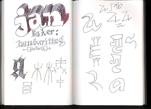
CP: On one of your sketchbook pages there is a note about "Jan Baker: handwriting" which reminded me of John Hegnauer's penmanship and how emphatic he was about the importance of good handwriting. Any thoughts on this?

CH: I am writing my responses for this interview by hand. Later, I will type them. (or actually, now I am typing them). The reason for this is that when I write by hand, and I can see the pencil or pen marking the marks on the page, all these different parts of my brain light up. Ideas flow better. I remember what I write by hand longer. So for me, handwriting is an important thing. However, I don't have very good handwriting in a traditional sense! If I sit down and focus, I can do pretty nice lettering. But that is a different kind of thing for me. [Ler mais...]


17/09/2008

An Interview with Zuzana Licko

Stephen Coles | September 29, 2005

Zuzana Licko co-founded Emigre — one of the first independent digital type foundries — in 1984. This interview with Licko was conducted on the eve of Emigre’s 15th anniversary in 1998.

How do you get ideas for new typeface designs?

Most of my inspiration comes from the particular medium that I’m involved with at the time. I search out a problem that needs to be addressed or a unique result that a production method can yield.

For example, my interest in making type was initiated by my need for unique and more effective fonts than those originally available for the Macintosh computer screen and dot matrix printer in 1984. As graphic designers, we also enjoyed the new found ability to test and implement the faces directly within our design work. Initially I was designing typefaces exclusively for use in Emigre magazine, but as other designers expressed interest in using them as well, we formed Emigre Font in 1986. [Ler mais...]

Emigre Lo-Res Narrow FontEmigre Modula FontEmigre-Base-9-FontEmigre Mrs Eaves Ligatures
Whirligig


22/04/2008

Jon Gray _entrevista


Jon Gray is a far-too humble designer working out of East London. He operates under the monicker “gray318” and is creating some of the most memorable and recognizable book covers on the market today. He was kind enough to grant us an interview: 

Fwis: What’s your background? How and when did you become interested in design?
Jon Gray:When I was 8 I decided to be an artist. Apparently this didn’t pay, but the careers advisor at school said that by adding the word ‘commercial’, I would become extremely rich. I adjusted my aspirations accordingly, did a basic foundation course and managed to con my way into the London College of Printing. LCP is like the design equivalent of marine training. I went in a boy and came out a … boring graphic designer. [Ler mais...]


18/04/2008

Art is Work: Milton Glaser retrospective

On view at the AIGA National Design Center from November 2 through December 27, 2000

"Art is Work: Milton Glaser Retrospective" the largest retrospective show ever held in New York of the work of the American graphic designer Milton Glaser. The show coincides with the publication of Glaser's eponymous book, Art is Work, a comprehensive survey of his work in the 25 years since the publication of his classic Milton Glaser Graphic Design.

One of the most influential and unusual figures in the history of graphic design, Glaser has been producing memorable images and objects for more than four decades. From the famous Bob Dylan poster of 1967 and the universally imitated "I Love NY" logo up to the cutting-edge design of his new websites and his masterful illustrations for Dante’s Purgatory, Glaser has created some of the most powerful and enduring visual art of our time.

I Love NY logoThe extraordinary variety of subject matter and style in the show demonstrates why Glaser has been called "the Picasso of the graphic arts field." It includes his posters, magazine and newspaper designs, interior designs, corporate logos, record albums, magazine illustrations and typography, as well as watercolors, drawings, prints and illustrated books, toys, textiles, jewelry and home furnishings.

Among the more unusual pieces in the show are the erotic drawings the designer created for a French edition of Boris Vian's novels, a wood-and-glass sculptural tribute to Glaser's teacher, Giorgio Morandi (1890-1964) and a set of ingeniously modular children's building blocks.

The show will also feature rare examples of illustrated books Glaser conceived for European publishers that have never been shown in this country, including versions of Charles Baudelaire'sLes Fleurs du Mal and Guillaume Appolinaire's Oeuvres Poetiquesand Oeuvres en Prose.

Born in 1929, Milton Glaser was educated at the High School of Music and Art and the Cooper Union in New York, and via a Fulbright Scholarship, the Academy of Fine Arts in Bologna, Italy. He co-founded the seminal Pushpin Studios in 1954, founded New York magazine with Clay Felker in 1968, established Milton Glaser, Inc. in 1974, and teamed with Walter Bernard in 1983 to form the publication design firm WBMG. Milton Glaser, Inc. is a multidisciplinary design company, specializing in corporate identity, logos and trademarks, brochures, packaging, interiors, exhibitions, posters and websites.

Glaser was the 1972 recipient of the AIGA medal, the highest honor given to a graphic designer in this country, and is the only graphic artist ever to have had one-man shows at both the Centre Gorges Pompidou in Paris and the Museum of Modern Art in New York.

Buy Milton Glaser's book Art is Work

23/03/2008

Graphic Convergence:

Drawing Together Ed Fella and Geoff McFetridge

Two lines align: you can’t deny the pleasure of the words taken together. Two lines. A line. Align. And it’s not just pretty: the lines and their alignment constitute curator Michael Worthington’s central conceit—that the work of designers Ed Fella and Geoff McFetridge, who are separated by more than 30 years in age, as well as by method, worldview, technology, institutional foundation and culture, does indeed come together in interesting and productive ways, ways that move beyond mere chronology or the influence of one generation on another. “When you put the two of you end-to-end it forms a line that makes sense,” Worthington said in an interview with the artists. And his show, “Two Lines Align: Drawings and Graphic Design by Ed Fella and Geoff McFetridge” on view at REDCATgallery in downtown Los Angeles through April 6, offers a huge collection of work spanning 40 years in support of his contention. But you wouldn’t think so at first.

Ed Fella at the exhibit opening and some of his featured work.

At the exhibit’s start, visitors find display cases featuring dozens of sketchbooks by the 70-year-oldFella, who graduated from the Cranbrook Academy of Art in 1987 after a successful career as a commercial artist, and is now on the faculty at CalArts where he’s been teaching for more than 20 years. In one book on one page, a collage: the body of a boy, the head of a girl, a building, a plane. Dated 1983, the slight but nimble piece suggests the nascent ’80s deconstructive impulse that would explode a few years later, and references Russian and German collage works 50 years prior. More striking than the piece’s combined clarity and complexity, though, is how the sketchbooks feel so precious, their colorful, delightful images sparking a warm nostalgia and a desire to touch, to feel the layers of paper, the grease of crayons, the smudge of pencil.

Geoff McFetridge’s work on display and the artist at the opening.

Moving back along a wall of classic Fella posters, featuring his iconic lettering style which initially appears casual but is scrupulously composed, visitors come upon a large box housing a ton of stuff: hats, skateboards, posters, magazines, CDs, T-shirts and many other things, all of it emblematic of a generation and all marked by simple line drawings, silhouettes and graphics. The style shares the hand-drawn vernacular lettering that echoes Fella’s work, but there’s also a rosy haze of ’70s kitsch, too, that feels cool but well framed—not critically but affectionately. This is work by Geoff McFetridge, who graduated from CalArts in 1995, founded the design studio Champion Graphics the following year, returned to CalArts as a faculty member and is now one of the most celebrated designers today (see him in the upcoming documentary Beautiful Losers). Unlike Fella’s sketchbooks, McFetridge’s box of things is not precious so much as sincere, any solicitous critique softened by felicitous appropriation and recontextualization. Like many of his contemporaries, McFetridge mines the cultural materials around him, and through a kind of mimicry at once celebrates material culture while remaking it to suit his own needs. Referencing the clarity of children’s books, McFetridge says he yearns for a similar simplicity and directness.

Untitled work by Fella, 2007.

Rather than blithely denoting that hoary divide said to distinguish a critical, art-inflected practice and the more obviously commercial work, Worthington instead posits a vector that unites the two eras and directions. It brings together the deconstructive urge of the ’80s evident in Fella’s dazzling posters—which refute an entire generation’s rules and methods—and the clarity and jaunty acceptance of commodification suggested by McFetridge’s work. Rather than mere capitulation, from a high ground of disaffected resistance, artful ambiguity and transgression to the lower ground of corporate compliance, the vector instead maps the contours of a sociocultural shift that no longer demands outright antipathy but instead invites coy participation—on new terms. “Times change and cultures change,” says Fella in the interview. “Attitudes change.”

Installation by McFetridge, 2008.

The lines blur, then, taking the shape of a Möbius strip where art and commerce, fine art practice and graphic design, align on a surface that itself shifts in response to needs. The analogy is not capricious, as the winding strip itself conjures formal elements evident in the work of both designers. McFetridge frequently uses lines to conjure impossible drawings: a hand that becomes a landscape, for example; a single, continuous edge that morphs from border to furrow to edge. And the lines of an earlier generation—lines you wouldn’t cross, lines between this and that—converge and take shape for a newer generation.

Works by Fella (top) and McFetridge in “Two Lines Align.”

Sean Cubitt writes eloquently about vectors in his 2005 book The Cinema Effect, which divides the history of cinema into phases, one of them characterized by the vector. Considering these historical phases, he writes: “It is no longer a matter of recognition, of deciphering what is already encoded. Rather it is a matter of reinterpreting, of adding a new spin to a trajectory that has not yet realized itself.” As critics and curators begin to assess and chronicle the latest decade of graphic design history, they’ll need new models to accommodate new needs. To its credit, Worthington’s curatorial agenda eschews easy side-by-side comparison—which would still have been fascinating given the rich bodies of work considered—as well as a simplistic historical presentation that would observe the formal boundaries that do indeed seem to divide the two generations represented by Fella and McFetrdge. He is not examining a history so much as creating a way to conjure history. Indeed, Worthington spins a trajectory that reinterprets not just two designers and two generations but the possibilities of design history—acknowledging not only dialectical evolution, but the need to be attentive to the specifics of cultural context and the creative force of interpretation itself. As Fella says of the progression that brings the end of postmodern critique up against a new generation’s striving for authenticity: “That’s a very 20th-century trajectory, I think, in art and design.” He adds, “I can also see that as part of a shift that we both epitomize: something ending and something beginning but still being a continuum.” And it’s this notion—of history as continuum, as a trajectory always in the process of becoming, like a line in motion—that Worthington’s show manages to capture.

All photos by Scott Groller. © CalArts 2008

About the Author: Holly Willis is the director of the University of Southern California’s Institute for Multimedia Literacy, and writes frequently on media art and design.

07/03/2008

Zuzana Licko

eye magazine (text in full)

As one of the first type designers to exploit the potential of the Apple Macintosh in its pre-designer days, Zuzana Licko transformed the pixel from low-resolution imitation to high-style original. Her early Emigre fonts not only revolutionised digital typography but also opened up the market for the smaller foundries whose quarter-page ads populate today’s design magazines. She has designed more than two dozen typeface families and oversees the Emigre foundry, which currently offers 300 or so typefaces by the likes of Barry Deck, Jonathan Barnbrook, Frank Heine and Rodrigo Cavazos.

Born in Czechoslovakia, Licko (pronounced Litchko) emigrated to the US with her family as a schoolgirl. She studied architecture, photography and computer programming before taking a degree in graphic communications at the University of California at Berkeley. When Rudy VanderLans, her partner, launched Emigre, she began to contribute fonts to the fledgling ‘magazine that ignores boundaries’. Rather than replicate (on a dot matrix printer) typographic forms already adapted from calligraphy, lead and photosetting, Licko used public domain software to create bitmap fonts. Emperor, Emigre and Oakland appeared in the magazine and were soon advertised for sale when VanderLans and Licko co-founded the Emigre foundry.

Emigre’s development reflected the evolution of digital technology while questioning conventional ideas of legibility and layout. Licko’s highly structured typefaces counterbalanced VanderLans’ organic compositions. The ‘Emigre aesthetic’ lay at the heart of a once-controversial battle on the American design scene, pitting them against Modernists such as Massimo Vignelli, who referred to the new typography as ‘garbage’. The debate did little to slow the popularisation of the Emigre fonts, which by the late 1980s had moved beyond alternative pop cult status into the mainstream (The New York Times, ABC and Nike). The graphic design establishment has since recognised Licko and VanderLans with a 1994 Chrysler Award, the 1997 AIGA gold medal and the 1998 Charles Nypels Award for Innovation in Typography.

Licko’s intellectual approach to type creation continued to find inspiration in the production qualities of technology. In 1986 she created Citizen, which approximated the smoother bitmap printing of the new laser printers. Base-9 and Base-12 originated as screen fonts for Emigre’s website in 1995, and then evolved with a companion printer font. As Emigre began publishing more design theory, Licko developed more ‘classical’ fonts; her designs Mrs Eaves and Filosofia were based respectively on Baskerville and Bodoni. And with issue 60 (see Reviews pp.76-87) Emigre’s latest music-oriented incarnation, Licko and VanderLans have found yet another format in which the publication can continue to be a testing ground and type specimen for Emigre typefaces.

Rhonda Rubinstein spoke to Zuzana Licko about this apparently ideal setup for a type designer and questioned the courteous but curiously reticent designer on a variety of other type matters, all (via email) in 9pt Monaco.

Rhonda Rubinstein: Do you have a maxim?
Zuzana Licko: I’ve never thought about having a maxim . . . it might be: ‘Question the obvious’.

RR: And what typeface would it be set in?

ZL: That would depend on the context, of course. But for general print reproduction I would pick the last one I’ve finished, as I’m still trying to get better acquainted with the most recent designs.

RR: ZL:What is your greatest accomplishment?

ZL: That I was able to design functional and desirable typefaces without mastering calligraphy, which I was taught was impossible.

RR: Your greatest regret?

ZL: Sometimes I wish my career was more involved with disciplines that generate tangible items, like designing textiles, clothing, or shoes. I find it difficult to find good-looking shoes that are comfortable. I often pick up a comfortable shoe and think, if they had just done this or that differently, I’d wear it.

RR: After becoming well known for designing radical fonts, you became interested in more traditional ones. Why?

ZL: My interest in reviving the classics (which began in 1995) was sparked by two factors: the sophistication of personal computer technology, and Emigre magazine’s shift towards theory and the subsequent need for text faces to set large bodies of text. Each design gives me the opportunity to study details of classic faces that I’d never fully appreciate or notice through casual observation or usage. For example, working on my Bodoni revival, Filosofia, allowed me to better understand this long-time classic. This kind of scrutiny, in turn, has given me ideas for faces that are not strict revivals, such as Tarzana and Solex.

RR: How do you judge good typeface design?

ZL: It depends on the intended usage, and what criteria you define as being important: longevity of usage, intensity of usage, influence on other designers, etc. It takes the perspective of time to determine which typefaces remain classics, which become icons, and which fade away. Moreover, these perceptions also change, and it is the constant changing of these perceptions that drives our desire for new typeface solutions. In addition, new technologies and environments present new problems for the designer to address. The most successful experimental typeface designs are often those that address the possibilities or limitations of a yet uncharted technology.
But we live and make decisions in the moment without the benefit of a time-lapse perspective. You must have opinions on typeface designs, and criteria for determining whether you want to pursue a particular design.
For me it’s like the Supreme Court’s definition of pornography: ‘I know it when I see it.’ I don’t have a preconceived idea about what constitutes a good typeface design. It can be a font created by LettError’s random technology, an old classic such as Bodoni, or a new classic such as Matthew Carter’s Verdana. It has to contain some originality, something that makes you think, ‘Hmm, I hadn’t thought about that,’ but originality in itself is not enough.

RR: Your father, a biomathematician who enabled your early computer access, was your first client, with the commission of a Greek alphabet for his personal use. What other people, events and/or things have influenced you most?

ZL: There were at least two important events: meeting Rudy VanderLans, and meeting the Macintosh computer. The Macintosh was unveiled at the time I graduated. It was a relatively crude tool back then, so established designers looked upon it as a cute novelty. But to me it seemed as wondrously uncharted as my fledgling design career. It was a fortunate coincidence; I’m sure that being free of preconceived notions regarding typeface design helped me in exploring this new medium to the fullest. It’s interesting how the gradual sophistication of my type design abilities has been matched by advances in the Apple Macintosh’s capabilities, so it has continued to be the ideal tool for me.
When I started building Macintosh bitmap fonts in 1984, it was a purely experimental endeavour. I didn’t have a client for these fonts, nor did I plan to start a type foundry. It was Emigre magazine that opened up these options. Rudy had started it (with two Dutch artists) as a showcase for émigré artists. Issue 3 was the turning point for my typeface experiments and for the magazine, as it was typeset entirely using my first low-res fonts. We had a lot of inquiries about the availability of these typefaces that no one had seen before. It was the start of Emigre Fonts.
For a while this turned me into a typesetter. Many of the designers who wanted to use my typefaces did not have a Macintosh, so I was selling typesetting with my fonts. As it turned out, the magazine provided me with a reason to continue developing these fonts, as well as a means to promote them. In turn, these unusual type designs contributed to the magazine’s unique character, while also providing an efficient means of typesetting. Using the Macintosh not only cut costs but added a level of design control that otherwise would have been mediated through an outside typesetting service.

RR: Can you describe your working methods?

ZL: While I work primarily on screen, sometimes I begin with rough thumbnail sketches, to give me an idea of the proportions or a detail of a character. Then I try out shapes and serif details directly in the Fontographer drawing window. The only hand drawing I do is on laser printouts, to mark areas that need adjustment, or to sketch alternate forms. Then I eyeball the corrections on screen. At any given time, I have several designs sitting on the back burner. Sometimes I put a design away when I hit a stumbling block, and it may take months or even years to resolve some of these design problems.

RR: In the 1980s your typefaces were criticised as being either ugly or hard to read. How do you look back on those reactions?

ZL: The establishment’s negative reaction towards new forms and technologies is natural. So if this work eventually becomes accepted, it’s a compliment in hindsight, because it means the work was truly innovative.

RR: What have been the most shocking or delightful uses of your typefaces?

ZL: Billboard use can be shocking because you have so little time to react as you’re driving by (Was that Base-9 I just saw?). I often cringe when these huge letters are tracked so tightly that their counters can’t breathe – as tends to be the case on billboards. This is particularly problematic with typefaces such as Base 9 and Citizen that need more breathing space than narrower ones. It makes me wonder how such billboard designs come about. Perhaps it’s premeditated: if the goal is to grab attention, then a jarring use of type will be more effective than a harmonious treatment.
Oddly, some of the most pleasing uses have been those that I didn’t recognise right away to be my typefaces. This sometimes happens in books where the typography and the typeface are so well blended in a traditional sense that the idiosyncrasies (which my typefaces tend to have) are downplayed.

RR: You recently re-released your original bitmap fonts (Emperor, Universal, Oakland and Emigre) from 1985 as the Lo-Res family. What was it like revisiting these typefaces fifteen years later?

ZL: It was interesting to see how much font and page-layout technologies have changed, and how font-making software has improved. The reasons for the re-release were mostly technical, to accommodate new possibilities or new restrictions. For example, when I originally released these fonts, the use of point sizes was limited to a basic set, usually 9, 10, 12, 14, 18 and 24 point. This was quite limiting because each size group of bitmap designs is on a different grid structure, which relates to its resolution; the number in each Lo-Res font name indicates the number of pixels in its body, or ppem (‘pixels per em’). Once the point size restriction was lifted, I was able to fine-tune the grid resolutions so that the capitals are in alignment when the resolutions are scaled to the same size. At the same time, I added the euro symbol, and made the font outlines compatible with recent technologies such as Flash. We also renamed the fonts under one family name, which made more sense within the context of our font library. I wouldn’t be surprised if we have to make additional updates after another fifteen years. We’re already gearing up for OpenType. This format (developed by Adobe and Microsoft) makes it possible to incorporate advanced typographic features into PostScript and TrueType fonts.

ZL: Which is your most popular typeface?

RR: To judge from the volume of sales and usage, it’s Mrs Eaves, my Baskerville revival. I see it everywhere: magazines, book covers, even the junk mail with my electric bill!

RR: How would you explain its success?

ZL: I think Mrs Eaves was a mix of just enough tradition with an updated twist. It’s familiar enough to be friendly, yet different enough to be interesting. Due to its relatively wide proportions, as compared with the original Baskerville, it’s useful for giving presence to small amounts of text such as poetry, or for elegant headlines and for use in print ads. It makes the reader slow down a bit and contemplate the message.

RR: How did you come to work with VanderLans?

ZL: We met at the University of California at Berkeley where I was an undergraduate at the College of Environmental Design and Rudy was a graduate student in photography. This was in 1982-83. After college we both did all sorts of design-related odd jobs. There was no direction. Then, in 1984 the Macintosh was introduced, we bought one, and everything started to fall into place. We both, each in our own way, really enjoyed this machine. It forced us to question everything we had learnt about design. We both enjoyed that process of exploration, of how far you could push the limits. Rudy is more intuitive; I’m more methodical. Yin and yang. It seemed to click, and still does.

RR: How do you deal with the challenges of working with your partner when the tradition of design partnerships often means that the woman gets less recognition?

ZL: Rudy and I are both very detail-oriented and hands-on. This makes it difficult for us to work together. I’m not a great collaborator and neither is he. It’s one reason why I switched my studies from architecture to graphics. I realised that having to compromise with so many outside opinions wouldn’t allow me the kind of creative freedom I desired. I’m no diplomat! Our Emigre collaboration works because we each control a distinct part of the equation. I control my typeface designs, Rudy controls the magazine, and Emigre is the symbiosis.
As for the gender-biased recognition, I don’t know what the perception is from the outside, but I feel that I do get as much recognition for my type designs as Rudy is getting for the magazine.
A bigger problem for me is that type designers in general are under-recognised. For example, it often happens that a graphic designer takes full credit for a logo, even when most of its character came from the typeface. Even other designers tend to forget that there is a high level of creativity in typeface design. So it’s not so much a problem of being a woman in a man’s world, it’s being a type designer in a world that gives little recognition to this art form, and I find this disillusioning.

RR: You named your Baskerville revival after Sarah Eaves, who became Baskerville’s wife and
finished printing the volumes he left incomplete on his death. Is the typographic world as male-dominated as it appears from the outside?

ZL: The history of type design is rooted in the use of heavy machinery and lead founding, which have traditionally not been considered women’s work. Today, the discipline is available to any artist who embraces computer technology, but it is one of the more technical specialities within visual design. A type designer does benefit from some understanding of computer programming – another field that women traditionally seldom enter, though maybe this will change. Certainly, the field of type design is more open to women than it ever has been.

RR: How is your personal style and personal philosophy (such as your commitment to recycling) reflected in your work? How do you see the designer’s responsibility in these times?

ZL: To live in harmony with our environment, we will need to treat all life and material as precious. There can be no ‘waste’ because there is no black hole on this planet for its disposal, and storing it ultimately degrades the quality of life. The key to getting rid of waste is to rethink the way we use materials. For example, a container shouldn’t become waste as soon as it’s emptied. Next, we need to realise that what we do at home and at work are connected.
At home I can make the effort to wash an empty container out, then re-use or recycle it. At work, I can take the effort to design a container that is more easily re-usable and recyclable. But neither action will be nearly half as effective as when I do both. This is a very simple example, but I think you get the idea.

RR: Does this ethic show up in your work itself, in addition to your environment?

ZL: Maybe I should be more specific. I was using ‘container’ as a metaphor. It could be the choice of disk packaging or the paper we choose for a catalogue, or any other carrier of product or information. For example, whenever possible we print the Emigre type catalogues on 100 per cent recycled paper, which contains 50 per cent post-consumer waste, and the paper is processed chlorine free. We print 60,000 of these catalogues each year, so the choice of paper makes a significant difference. In addition, we avoid marcoating and other treatments that make the print work less recyclable.

RR: You’ve written that the catalyst for Hypnopaedia patterns was the lack of copyright for typeface designs (the patterns were created by the rotation of a single letterform from the Emigre library). Are you actively involved in such legal issues?

ZL: We address them in the Emigre catalogue and magazine. We do our best to stay informed about changing font technologies and to help establish fair usage standards. It’s something I’d rather not have to spend time on, but it’s a necessity for keeping our business in business. Typefaces are designed by people who rely on sales in order to continue investing in the development of new designs. We try to bring this message across in a variety of ways, and the Hypnopaedia design turned out to be a visual example of the basic copyright issue involved. One problem is that people find it difficult to distinguish between the ornamental design of letterforms and the alphabetic characters that they represent. As a result there is no us copyright protection for letterform designs, because they are seen as purely utilitarian. By rotating the letter designs, taking them out of context and turning them into textures, the Hypnopaedia patterns allow us to make this distinction and appreciate letter shapes on another level, abstracted from their function as alphabetic characters. (Although the design of a typeface is not protected by us copyright, the font software is covered by copyright, which does greatly protect our intellectual property.)

RR: What other type designers do you think are doing interesting work now?

ZL: Much of the interesting type design work these days is being done by individuals. This is a testament to pc technology, which has made the independent type industry possible by decentralising the design of typefaces and production of fonts. This has tremendously increased the choice of typefaces, since it no longer requires a committee of corporate executives to approve investment in the development of a typeface. However, the next phase of sophistication, OpenType, may once again take the manufacture of type beyond the reach of independent type designers. The complexities of designing huge character sets are extremely time-consuming, with diminishing returns (as few of the additional characters may be used by the average user).

RR: Are there specific type designers who you think are doing particularly innovative work?

ZL: Too many to list here, and too many to overlook, which would just get me into a heap of trouble. But every typeface that we’ve licensed for the Emigre library is designed by someone who I feel is doing very innovative work. I’m impressed and amazed by other people’s work all the time. That’s how we end up licensing other people’s designs.

RR: Increasingly, information is being accessed primarily onscreen in websites, kiosks and signage. In addition, the screens are getting smaller as cell phones, watches and control panels carry more information. How do you see typography evolving to meet this challenge?

ZL: The presentation of information on digital devices will change profoundly once the resolution of the displays (lcds or otherwise) quadruples. At that point, screen displays will be able to show just about any design that can be printed. With the present display resolutions the typography and the organisation of information needs to be very clean and efficient in order to maximise the use of every pixel. I don’t think we’re making the best use of the current technologies: too often it seems that the design of the screen information was hacked together by someone on the product design team, almost as an afterthought. Professional type designers, typographers, graphic designers and information designers are getting left out of the equation because the manufacturers don’t recognise the importance of the visual interface. Try programming your vcr – I’m sure you’ll think of at least three visual interface improvement suggestions right off the bat!

RR: What new Zuzana Licko typeface release can we look forward to next?

ZL: I’ve had a serif text face in the works for more than a year now, but I’ve had to put it away for
the time being due to the upgrade work. Most of the fonts in the Emigre library were released prior to the announcement of the euro currency, so we have to go back and design this character for every font. Since this requires fonts to be regenerated, I’m taking the opportunity to tweak them and
add features.
There is a dilemma with my older designs in that I’m often tempted to change details that I would have treated differently if I were designing the typeface today. But, of course, I don’t want to go so far as to change the character of the design; sometimes it’s difficult to draw that line.

RR: What do you think is the most important thing you have learnt?

ZL: That nothing is permanent, yet there is much value in the reincarnation of classics.


Copyright eye magazine © 2001.
eyemagazine.com is sponsored by artificial environments.
Site credits.

14/12/2007

Richard Kegler _P22

[November 2007]
“I would like to think our fonts open up Design history to a wider audience.”
Richard Kegler

What is P22?
The name P22 has no known significance. It was a found object (a rubber stamp in a sans serif with just “P22”) The name was applied to several art/commerce projects in college and grad school.

Can you explain why the types distributed on the P22 website are divided between P22 / IHOF / Lanston / Rimmer / Sherwood collections ?
P22 started first- all font “sets” that were packaged and sold in museum gift shops. All designs were created “in house” many were licensed from museums and foundations IHOF (International House of Fonts) was created to accommodate a) fonts that were not packed in sets b) only sold online and c) from designers not in house at P22...all things P22s were not.Sherwood came about because we had one designer (Ted Staunton, Vancouver BC) who had so many designs, that we felt if they were all in IHOF, would be very lopsided, so we suggested he start his own digital foundry. He preferred to stay with us so we formed Sherwood for him. The Lanston Type Co. was proposed to us by then owner Gerald Giampa. We did not think at first that we could take on such an important historical collection, but after some consideration, we felt is was workable and a good pairing with our existing collections. The Rimmer Type Foundry came about because there were several Rimmer designs in the Lanston digital collection.

How have you discovered your taste for type design ?
Looking for things that didn’t exist. If you cant find it...then you make it. If it exists but not in a a form that is acceptable...make it better.
You often propose your thematic typefaces pack with a dedicated dingbats font...
The initial marketing of P22 fonts in sets had fonts but also in trying to appeal to a more general market, dingbats or ornaments become much more obvious to the non-designer about how they might be used in a unique way. So just about every P22 package has a dingbat font included. Plus they are fun to make and use.

You like to design typefaces with a strong historical connotations (Modernist, Arts & Craft, Constructivist). How do you choose your themes ? Where do you find your sources ?
Sources are found everywhere. We have built up a very large design library but we also have had access to the collections of the Museums we have worked with. Choose the themes has evolved. In the early years of P22, the set had too be able to sell enough to cover the production costs of the packaging and later on the CD pressing costs. Now that P22 doesn’t necessarily have to issue packaging, we can be more flexible and experimental in the titles we release. Almost all of the P22 sets features designs that were famous lettering in Design or Art history but never made available digitally. P22 is like an interactive history of lettering. Looking at Bauhaus lettering is one thing. Setting type with it is something very different. I would like to think our fonts open up Design history to a wider audience. I think of much of what we do as typographic archaeology Another part of your creation are electronic adaptation of the handwriting of famous artists (Cezanne is the most famous of them).
This is related to the Design and Art history themes of the P22 museum fonts. Cezanne was initially commissioned by the Philadelphia Museum of Art for a Paul Cezanne Exhibition. They didn’t ask for a handwriting font, they just had an exhibition coming up and they wanted a font. The team we worked with was previously at the Guggenheim museum and we had worked on the Josef Albers set using the artwork in their collection. Cezanne was more of a free form idea we had. There were not really any casual and convincing handwriting fonts out there when we did Cezanne. Again filling a perceived void.

On a typographic point of view, is it the same work to digitalize an handwriting and to design a roman typeface ?
Very different approaches in doing the digitizing. A handwriting font is more like doing a painting and a Roman is more like Architecture and construction (actually a Geometric Sans is very much like Architecture sometimes like Frank Geary).

As far as I know, you have only designed titling typefaces ? You have no project to design a complete family like the one you sell in the Lanston typefaces collection for instance ?
Myself, yes, I have only designed display faces. I see amazing work being done with text faces, but don’t feel I have a contribution to make in that area. I may change my mind and become obsessed someday with making a complex type system that breaks new ground and fills a niche not yet covered, but not right now.

What will be your next historical inspired typeface ?
One that was started about 5 years ago. An early Roman digitized in three very different ways by 3 different designers. Again and experiment that will hopefully be very useful to designers. One by myself that is an approximation of how the type would have looked as cut by the punchcutter with minimal ink gain but some natural irregularities. Another by Paul Hunt that takes the same design and makes a very clean digital rendering with minimal distortion (as if the 16th century punchcutter had access to fontlab) and a third by Colin Kahn that uses direct under inked digitizations of the printed pages with random Opentype features to give a random distressed look. All three will have the same metrics. So there. [Ler mais...]

09/07/2007

An Interview with Matthew Carter

One of this century´s foremost type designers and co-founders of Bitstream, (America´s first digital type foundry), Matthew Carter shares his insight and experience regarding 20th century typography in America, ATF, Morris Fuller Benton, Linotype, ITC, Swiss International type design, current typographic movements and more.

Today Carter is the principal of Carter & Cone Type in Cambridge, Massachusetts. One of this century's foremost type designers and co-founders of Bitstream, (America´s first digital type foundry), Matthew Carter shares his insight and experience regarding 20th century typography in America, ATF, Morris Fuller Benton, Linotype, ITC, Swiss International type design, current typographic movements and more. Today Carter is the principal of Carter & Cone Type in Cambridge, Massachusetts. One of this century´s foremost type designers and co-founders of Bitstream, (America's first digital type foundry). [Ler mais...]

20/06/2007

The Graphic Design of Peter Saville

>
PERFECT STYLISTIC ATTITUDE James Nice

ARTWORK Substance Inlay

The austere impression of Peter Saville sleeve designs determine, for many people, their image of Factory Records. Here James Nice questions Saville on the influences, motives and restrictions that have shaped and also compromised, his work.

Any fan of bands such as Joy Division, New Order, Orchestral Manoeuvres In The Dark and Ultravox will also be familiar with the work of Peter Saville. Since 1978 he's become one of the best known, and probably best respected, record sleeve designers available.

JN: Why in the early days with Factory did you decide to work in the style of constructivism with bands such as Joy Division, Section 25, OMD and New Order?

PS: Well that's a rather wooly question. The first work I ever did for Factory was a poster (FAC 1) on which the Factory Sample was also based. It was certainly constructivist in style, though the sleeve for OMD's Electricity was more neo-classical. I was twenty two and in my last week's at college, and becoming aware of the great tradition of Twentieth century graphics, as well as certain schools such as the Russian constructivists, the Bauhaus and De Stijl. I was really into Jan Tschichold and Die Neue Typographie of the 1930s, which was exclusively typography and graphics and reflected the mood of the time. Thus my first studies were reflected in the sleeves of my first records. [Ler mais...]


James Nice, November 1984.
All contents Copyright © 1984 by James Nice/Glasgow University Magazine GUM