>
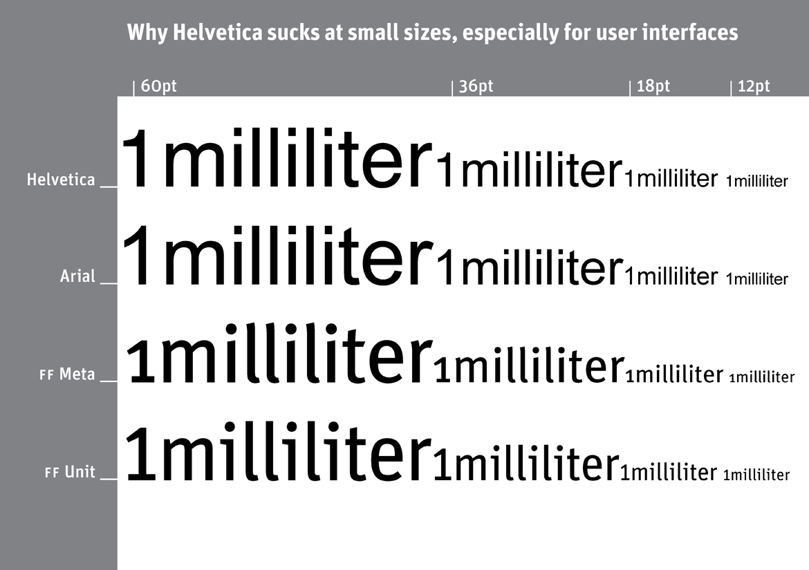
Why Helvetica sucks at small sizes, especially for user interfaces
by Erik
I have been suffering from Typomania all my life, a sickness that is incurable but not lethal. The Spiekerblog reflects the fact that I see most things from a typographic perspective. As most of what we find out about comes to us by typographic media – i.e. visible language – anything and everything may be reported.
Erik Spiekermann, December 2008
fonte: http://spiekermann.com/en/downloads/
Why Helvetica sucks at small sizes, especially for user interfaces
by Erik
I have been suffering from Typomania all my life, a sickness that is incurable but not lethal. The Spiekerblog reflects the fact that I see most things from a typographic perspective. As most of what we find out about comes to us by typographic media – i.e. visible language – anything and everything may be reported.
Erik Spiekermann, December 2008
fonte: http://spiekermann.com/en/downloads/