Mostrar mensagens com a etiqueta C. Mostrar todas as mensagens

22/01/2013

Erik Spiekermann _downloads

>
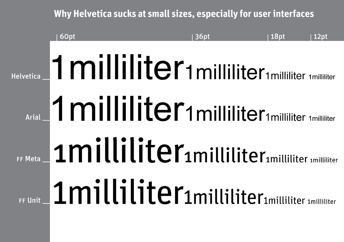
Why Helvetica sucks at small sizes, especially for user interfaces
by Erik
I have been suf­fer­ing from Typo­ma­nia all my life, a sick­ness that is incur­able but not lethal. The Spiekerblog reflects the fact that I see most things from a typo­graphic perspective. As most of what we find out about comes to us by typo­graphic media – i.e. vis­i­ble lan­guage – any­thing and every­thing may be reported.
Erik Spiek­er­mann, Decem­ber 2008

 fonte: http://spiekermann.com/en/downloads/

17/11/2012

Musée de l'imprimerie Lyon

>
Le Musée de l'imprimerie : présentation et historique Le musée de l'Imprimerie est un des musées de Lyon dont les missions principales sont d'enrichir, de conserver, de documenter et de valoriser auprès de divers publics le patrimoine livresque et graphique. [Ler mais...]

Corpus Typographique Français 150 ans de lettres en France

Le Corpus typographique français recense les polices de caractères dessinées en France entre 1850 et aujourd’hui. Il se veut une illustration de la création française dans ce domaine. Il n’a pas pour but d’être exhaustif mais représentatif : s’y côtoient des grands classiques et des créations plus obscures, des caractères de labeur « sérieux » et de la « titraille » fantaisiste, des créations de haute volée mais, aussi, des caractères médiocres, voir mauvais, car l’histoire de la typographie en comporte également. [Ler mais...]

fonte: http://www.imprimerie.lyon.fr/imprimerie/sections/fr/musee# 
http://www.imprimerie.lyon.fr/imprimerie/sections/fr/documentation/corpus

…

19/04/2012

Mauro Zennaro

>
Mauro Zennaro è nato a Roma nel 1953.

Si occupa di grafica, calligrafia e type design.

Insegna presso l’Istituto d’istruzione superiore Carlo Urbani di Roma e presso l’Università per Stranieri di Perugia.

Ha scritto numerosi articoli sulla grafica, la scrittura e la didattica.

È stato tra i fondatori della rivista Calligrafia e nel comitato di redazione della collana di libri sulla grafica Scritture, pubblicata da Stampa Alternativa/Graffiti.

Suoi lavori manoscritti e a stampa, pubblicati dalle Edizioni dell’Elefante, sono stati esposti in numerosi musei e biblioteche europee e statunitensi.

È membro dell’Aiap–Associazione italiana progettazione per la comunicazione visiva.

fonte: http://www.scriptoria.it/maurozennaro.html


…


21/09/2010

The origins of abc

>
WHERE DOES OUR ALPHABET COME FROM?

We see it every day on signs, billboards, packaging, in books and magazines; in fact, you are looking at it now — the Latin or Roman alphabet, the world’s most prolific, most widespread abc. Typography is a relatively recent invention, but to unearth the origins of alphabets, we will need to travel much farther back in time, to an era contemporaneous with the emergence of (agricultural) civilisation itself.

Robert Bringhurst wrote that writing is the solid form of language, the precipitate.[1] But writing is also much more than that, and its origins, its evolution, and the way it is now woven into the fabric of civilisations makes it a truly wonderful story. That story spans some 5,000 years. We’ll travel vast distances, meet an emperor, a clever Yorkshireman, a Phoenician princess by the name of Jezebel, and the ‘purple people’; we’ll march across deserts and fertile plains, and sail across oceans. We will begin where civilisation began, meander through the Middle Ages, race through the Renaissance, and in doing so discover where our alphabet originated, how and why it evolved, and why, for example, an A looks, well, like an A.


SUMER
Cuneiform

The Sumerians began to experiment with writing at the close of the fourth millennium BC, in Mesopotamia between the rivers Tigris and Euphrates (roughly modern-day Iraq). Like most writing systems, Cuneiform, initially scratched — later impressed by a stylus — into soft clay, started out as a series of pictograms — pictures representing words. The word for bird, for example, existed at first as a simple pictorial representation of a bird. The figure below demonstrates this process of abstraction or rationalization. In time, the pictures of things came to represent, not only things but, sounds. It is clear that a written language with signs that represent sounds requires fewer characters than a language in which a sign stands for a thing or an idea. We use 26 letters (and the Romans used only 23 to create some of the most outstanding literature the world has ever known) while the Chinese, for example, have to learn thousands of characters to express themselves. Even early cuneiform comprised some 1,500 pictograms. A language in which a picture or grapheme represents a thing or an idea has its advantages: people may speak any language while the written form stays the same. So a Chinese from the Southern provinces can speak a totally different dialect than his compatriot in Beijing, who would not understand him when he speaks, but can read what he writes. [Ler mais...]


1.1 The pictographic origin of Cuneiform.


fonte: http://ilovetypography.com/2010/08/07/where-does-the-alphabet-come-from/

…

11/10/2009

Periodic Table of Typefaces

>


Large image link HERE

Prints are available HERE

The Periodic Table of Typefaces is obviously in the style of all the thousands of over-sized Periodic Table of Elements posters hanging in schools and homes around the world. This particular table lists 100 of the most popular, influential and notorious typefaces today. [Ler mais...]

fonte: BehanceNetwork

20/03/2009

Classification Vox-AtypI

Polices de caractères

Des commentaires de polices très sérieux, enrichis de définitions pour les néophytes et d'illustrations pour vos beaux yeux ?
Cliquez à votre guise :

Banco
Baskerville
Bodoni
Caslon
Cheltenham
Cochin
Didot millimétrique
Galliard
Garamond
Garamont de l'Imprimerie nationale
Gauthier de l'Imprimerie nationale
Gill
Grandjean de l'Imprimerie nationale
Helvetica
Jaugeon
Marcellin Legrand de l'Imprimerie nationale
Luce de l'Imprimerie nationale
Optima
Peignot
Times
Univers
Vendôme
Walbaum


Familles de caractères
Classification Vox-AtypI
C'est Francis Thibaudeau qui, le premier en 1921, eu l'idée de regrouper certains caractères présentant des caractéristiques communes établies selon certains critères formels principalement liés aux empattements. Il classa ainsi les caractères en quatre familles : bâton ou antique, didot, égyptienne, elzévir.

Cette répartition, insuffisante pour concerner l'ensemble de la production graphique, fut complétée en 1954 par Maximilien Vox avec une répartition en neuf familles tenant compte de l'architecture générale des lettres et de détails historiques : manuaire, humane, garalde, réale, didone, mécane, linéale, incise, scripte. Il fallut attendre l'addition de deux familles, fractur et orientale, proposées par l'AtypI (Association Typographique Internationale) en 1962, pour parvenir aux onze familles de la classification Vox-AtypI.

Cette classification, adoptée par toute la profession du monde des Arts et Industries graphiques, permet de faire entrer dans une de ces familles tous les caractères actuellement sur le marché ou, tout au moins, par le principe d'addition de définitions, de pouvoir décrire tous les caractères.

Bien entendu certains caractères dessinés pour le titrage ou pour des amusements typographiques peuvent en être exclus.

Manuaires
Humanes
Garaldes
Réales
Didones
Mécanes
Linéales
Incises
Scriptes
Fraktur
Orientales

[Ler mais...]

Affaire-esperluette, 2003. Tous droits réservés.

16/03/2009

Designingwithtype.com

by James Craig

Designingwithtype.com is a web site devoted to the art and appreciation of typography. It offers a unique typographic resource for students, educators, and professionals, showcasing talent from around the world. [Ler mais...]

(...)
There are many excellent ways of teaching the history of graphic design. One of the better ways, though this is not always possible, is to integrate the history of graphic design with the other arts — painting, literature, music — and with major political and cultural events of the time. The following timelines are from James Craig's book Thirty Centuries of Graphic Design and cover just a few of the highlights between 30,000 BC and 1990 AD, the year book was published.

1000 BC – 500 AD

500 – 1300

1300 – 1400

1400 – 1500

1500 – 1600

1600 – 1700

1700 – 1800

1800 – 1900

1900 – 1920

1920 – 1940

1940 – 1960

1960 – 1990


(...)

Prehistoric Pictograph
Cuneiform, ca 3100 B.C.
 
Egyptian Hieroglyphics
Early Latin. ca.700 B.C.
Ionic Greek adopted in 403 B.C.
Trajan Inscription A.D. 114
[Ler mais...] > Timelines 

(...)
Items of Interest
The following is an assortment of all things typographic. It will be of interest to anyone who loves typography and is curious about the history of graphic design and the evolution of the printed word. 

…

10/01/2009

Classificação estilística:

na senda de um paradigma tipográfico

Jorge dos Reis

Os classificadores de coisas, que são aqueles homens de ciência cuja ciência é só classificar, ignoram, em geral, que o classificável é infinito e portanto se não pode classificar.
FERNANDO PESSOA

Iniciada em 1989 e concluída em 1997, a série de oito episódios realizada por Jean-Luc Godard e baptizada de “Histoire(s) du Cinéma” é uma gigantesca obra tipográfica. Recentemente passada a livro, como se de uma banda desenhada se tratasse, não choca a sua desmultiplicação de suportes e formas de recepção. Faz todo o sentido perante a natureza híbrida de um dos objectos mais insólitos da produção de imagens e sons, nos últimos anos. Durante todo o filme, em sobreposição à imagem, surgem grandes letras sem patilha e grandes frases em tipos só representados pelo seu contorno branco, contando a sua história do cinema. Proclamando a morte do cinema, Godard reinventa-o de uma maneira tipográfica, utilizando um tipo de letra escolhido para traduzir ideias e relacionar o texto com a imagem. O cineasta teve que se debruçar sobre a tipografia e caminhar em direcção à compartimentação estilística das letras, como quem reconhece uma paisagem, uma pintura ou uma peça de arquitectura. Com a enorme quantidade e variedade de tipos de letra que surgem na paisagem urbana e que nós próprios temos ao alcance através de computador, é conveniente saber classificar.

Em 1998, no Netherlands Institute, a propósito do dia mundial do design gráfico, Bruce Mau, um designer de topo da época contemporânea, realiza uma comunicação denominada: um manifesto incompleto para o crescimento. Dela retirei alguns apontamentos, mas são as suas palavras que continuam a ressoar dentro da minha mente, desde esse dia. Mau traça um conjunto de interpelações, das quais daria um exemplo. Uma delas, denominada, studio / estuda. o autor afirma que “um estúdio é um lugar para estudar” e pede ao designer (designers) que utilize “as necessidades da produção como um pretexto para estudar” e assim “toda a gente sairá beneficiada”. O paralelo traçado entre a palavra estúdio e estudar é sintomática, não só linguística, apelando aos designers para desenvolverem metodologias próprias, assentes num compromisso entre a prática e a investigação.
Aos designers, cada vez mais mediadores da sociedade e seus reflexos visuais, é pedida uma atitude de divulgação para fazer com que o mundo da tipografia deixe de ser interdito e possa levar o secretismo das letras ao conhecimento de todos.

Desta forma, é fundamental, francamente importante, conhecer a categorização das fontes tipográficas e converter a tipografia num laboratório de análise. O primeiro passo é distinguir a diferença entre o romano ou redondo e o itálico. Esta é realmente a primeira divisão. O itálico, um estilo inclinado para a direita que o veneziano Aldo Manutio inventou, funciona como a segunda metade de uma fonte e ocupa um lugar importante na funcionalidade tipográfica dos caracteres. O romano, ou redondo, é a anatomia tipográfica mais habitual, mas que num texto corrente não pode existir sem ser complementada com o seu respectivo itálico, sempre tão necessário. [Ler mais...]


Notas

[1] WALTER, Tracy | Letters of Credit, A View on Type design; Boston; Godine; 1986. p. 19.
[2] RIBEIRO, Milton | Planejamento Visual Gráfico; Brasília; Linha Gráfica e Editora; 1993. p. 58.
[3] MCLEAN, Ruari | The Thames and Hudson, Manual of Typography; London; Thames and Hudson; 1992. p. 59.
[4] Ver a este propósito o catálogo da fundição Nebiolo de Turim: Campionario Caratteri e Fregi Tipografici, Fileti, Segni, Numeri; 1939; Torino; Società Nebiolo;
[5] A.A.V.V. | Scienza Tecnologia e Arte Della Stampa Grafica; Volume 1; Torino; Antonio Ghiorzo Editore.
[6] A.A.V.V. | Cit. [5]. p. 1029.
[7] Catálogo de Tipos Símbolos e Vinhetas; Lisboa; Imprensa Nacional Casa da Moeda; 1978. p. 5.


fonte: Revista Convergência

…

09/12/2008

Anatomía del Tipo (I)

por Milko A. García Torres

Estos contenidos pertenecen al "Curso práctico de diseño gráfico".
Ediciones Génesis S.A., Madrid.


El arte de la tipografía consiste en hacer legibles y atractivas visualmente las palabras y los signos gráficos que las acompañan. El diseñador trabaja con palabras que ha de transformar en última instancia en imágenes gráficamente sugestivas y además ópticamente legibles.
Los orígenes de la palabra impresa se remontan a los tipos móviles tallados en madera inventados por Gutenberg en Alemania, los cuales, a lo largo de un rápido desarrollo, evolucionaron hacia la impresión de tipos metálicos. En los sistemas de composición se ha producido una evolución constante hasta desembocar en los actuales sistemas de composición, completamente electrónicos. Esta evolución ha ido influyendo a lo largo de todo su proceso en la apariencia y en la estructura de la letra, tanto para ganar calidad y legibilidad de su forma como para evolucionar en un sentido puramente estilístico, ya que la aparición de nuevos y más avanzados sistemas de fotocomposición permitió ir matizando los diseños, así como complicando el trazado de la letra, avances estéticos imposibles de conseguir con anterioridad debido a problemas meramente técnicos. Se trata de una evolución que es necesario conocer.

Con la llegada de la fotocomposición electrónica a mediados de los años setenta, se produjo un gran avance desde el punto de vista estilístico, ya que la propia capacidad de la máquina permitía modificar los trazos de una tipografía determinada sin que ésta perdiera sus características fundamentales. Permitió también poder modificar el espaciado entre letras, palabras y líneas de una manera mucho más sencilla que como se podía realizar hasta ese momento con los métodos de composición de tipos móviles.
Realizaremos, a continuación, un primer análisis de las partes constituyentes de la estructura básica de una letra, para posteriormente pasar a analizar históricamente la evolución que ha sufrido su anatomía mientras se ha ido adaptando a las transformaciones que han sufrido los sistemas de fotocomposición. [Ler mais...]

06/11/2008

Typography _Classical_Contemporary _timeline


This is
typoGRAPHIC, an interactive experience informed by type and typography. It aims to illustrate the depth and import of type, and to raise relevant questions about how typography is treated in the digital media, specifically online. A continuous work in progress, we welcome any suggestions and comments concerning the site.

06/10/2008

Brody Neuenschwander _Biography


. . . "If this is calligraphy, then it is calligraphy without precedent."
 [bellelettere.it]


"Nasceu em Houston, Texas, em 1958. Tendo sempre demonstrado um interesse vasto pela arte, história, literatura e caligrafia, graduou-se em 1981, na Universidade de Princeton, com elevadas honras pela sua tese sobre as técnicas das iluminuras de manuscritos medievais. Cinco anos mais tarde, e agora no “Courtauld Institute” em Londres, tirou o doutoramento em Metodologia da História da Arte Alemã, sendo que, simultaneamente estudava caligrafia no “Roedhampton Institute”. A sua primeira experiência profissional teve lugar enquanto assistente do calígrafo inglês Donald Jackson, durante um ano, e no qual esteve ligado sobretudo à caligrafia tradicional e cerimonial, executando também um trabalho bastante repetitivo. Este seria um primeiro passo para a continuação de Neuenschwander no universo da caligrafia, contudo, o seu trabalho seguiu um rumo bastante distinto daquele ao qual correspondeu o início da sua carreira profissional." [Ler mais...] > Sebenta de Design


Brody Neuenschwander was born in Houston, Texas in 1958. His eighth year was spent in Germany, and it affected him profoundly. He learned a new language and a new culture, something that made him a bit of an outsider when he returned home. Neuenschwander returned to Europe as often as he could, eventually developing a fascination bordering on obsession with medieval culture.

As might be expect, his interest in calligraphy grew from his interest in history. As a teenager he was William Morris reincarnate, making manuscripts and tapestries, armor and wall paintings with a monumental enthusiasm. At Princeton University he was appointed University Scholar, a position that allowed him to devote almost all his time (when he wasn’t rowing) to art history, graduating in 1981 with high honors for his thesis on the techniques of medieval manuscript illumination.

Neuenschwander went straight from Princeton to the Courtauld Institute in London, where he completed his doctorate on the methodology of German art history in 1986. At the same time he studied calligraphy at the Roedhampton Institute. The cross-fertilization that resulted from doing academic and practical studies at the same time has influenced all his subsequent work. The objects studied by art historians are, for Neuenschwander, things that were made by human hands. The structure of the atelier and the properties of the materials are as important to him as the social context of their creation.

Neuenschwander began his professional career as assistant to Donald Jackson, an English calligrapher living on the Welsh borders. For a year Neuenschwander did repetitive studio work, mostly traditional ceremonial pieces. This allowed the techniques he had learned in London to become completely internalized. But it also allowed certain doubts about the validity of calligraphy in modern culture to surface.

In the years that followed Neuenschwander began asking fundamental questions about calligraphy. What is it? How is it used? Where should it be headed? What models should we be looking at?

As luck would have it, this was the very moment that his long collaboration with the English film director Peter Greenaway began. Greenaway, who wanted Neuenschwander to provide live-action calligraphy for the film “Prospero’s Books”, grilled him on the nature of his art. “Can calligraphy be charged with emotions and historical associations? Can it represent in visual terms sound patterns of the language? Can it explore the tense region between text and image?”

These were, of course, the central questions. In subsequent collaborations (“The Pillow Book”, “Flying over Water”, “Bologna Towers 2000”, “Columbus”, “Writing to Vermeer” and so on) the implications of these questions would be worked out.

The second force that pulled Neuenschwander’s work out of the orbit of traditional calligraphy was the German theoretician Hans-Joachim Burgert. Neuenschwander met the German calligrapher at a workshop in London. By default Neuenschwander became Burgert’s translator for the weekend. As a result, Burgert asked him to translate a lengthy text on the esthetics of calligraphy into English. This allowed Neuenschwander to come to a deep understanding of Burgert’s theory and has led to this theory being studied and adopted by other calligraphers in the West, such as Thomas Ingmire.

Burgert’s theory is essentially a classic German Gestaltungstheorie. Letterforms are subjected to formal analysis and judgment. Traditional Western standards of good and bad are replaced by a new formal language, one that is much closer to the esthetic judgments inherent in Arabic and Chinese calligraphy.

For Neuenschwander this new theory was a revolution. Suddenly the calligraphy of the East, which had always exerted an enormous attraction, could be analyzed and understood, not linguistically, but visually. The image-nature of these writing systems could surface.

Neuenschwander has studied the esthetics of Arabic and Chinese calligraphy ever since. Though he might be accused of a typical Orientalist attitude, he attempts to circumvent this danger by applying all lessons learned from the study of Eastern calligraphy to his Western writing.

In 1989 Neuenschwander met Nadine Le Bacq, who would become his wife in 1991. They moved to her home town Bruges in 1993, where they now live. Contact with Flemish language and culture has profoundly influenced Neuenschwander’s work. Though the Flemish are in many ways as tradition-bound as the English, their arts are not. It has been necessary to re-evaluate language and its visualization in terms of the very dynamic culture of Flanders.

Neuenschwander’s work left all standard definitions of calligraphy far behind from about 1996. Though the mark of the pen is usually present, so are typographic letters, scratched letters, drawings, paintings and other images. His work is certainly complex, requiring the viewer to attempt an integration of different kinds of information. There is certainly a deconstructive aspect, as the question is posed again and again,” Is this an image or is this a text”.

In 2004 Neuenschwander spent a semester teaching text art at the School of the Museum of Fine Arts in Boston. This sabbatical from the artist’s studio allowed him to do research into the origins of text art in the first quarter of the 20th century and to follow this development as it impacted on American art after the second World War.

His present studies are focused on using the work of artists such as Cy Twombly and Jessica Diamond to produce a theoretical basis for a modern calligraphy. It won’t be easy. [Ler mais...]


Skin

SKIN is a site-specific installation created by Brody Neuenschwander at the Memling in Sint Jans Hospital Museum, Bruges from September 2007 to February 2008.
Neuenschwander was appointed artist-in-residence at the museum in February 2007 and given the medieval attics of the old museum as studio for the six months leading up to the opening of the exhibition. The theme of skin was chosen to link the history of the hospital buildings with the work of the artist. The works were created in the spaces in which they would eventually be shown. The result is an installation that plays on the history of the site at a number of different and often very subtle levels.

The artist worked in the Dormter, which served for centuries as the dormitory of the sisters who cared for the sick. Neuenschwander made a video installation for the dormitory and a series of related canvases for the vast Diksmuide Attic which adjoins it.

Working with texts taken from tattoos (the first and most obvious reference to skin), Neuenschwander composed a dialogue of hope, despair, passion, loss and redemption between two speakers who struggle to communicate with each other by means of texts engraved on their bodies. This dialogue or libretto served as the basis for the video and its music, as well as the canvases. [Ler mais...]


05/10/2008

30/07/2008

Sebenta de Design

A Sebenta de Design pretende ser um local virtual de saberes sobre design. Escrita em sistema colaborativo por voluntários, é publicada na internet sob a forma de um wiki, para que qualquer pessoa, a qualquer momento, possa editar os conteúdos disponíveis ou acrescentar novos. Paralelamente à estrutura de manual, visa oferecer um glossário de termos técnicos de design, um directório de designers, tipógrafos e autores de textos sobre design. [Ler mais...]


11/06/2008

Classification of Types

According to DIN 16518 type-faces are divided up in the following categories: [Ver mais...]

06/06/2008

Cryptography / Criptografia

From Wikipedia, the free encyclopedia

Cryptography (or cryptology; derived from Greek κρύπτω krýpto "hidden" and the verb γράφω gráfo "to write" or λέγειν legein "to speak")[1] is the practice and study of hiding information. In modern times, cryptography is considered to be a branch of both mathematics and computer science, and is affiliated closely with information theory, computer security, and engineering. Cryptography is used in applications present in technologically advanced societies; examples include the security of ATM cards, computer passwords, and electronic commerce, which all depend on cryptography.

Criptografia (Do Grego kryptós, "escondido", e gráphein, "escrita") é o estudo dos princípios e técnicas pelas quais a informação pode ser transformada da sua forma original para outra ilegível, de forma que possa ser conhecida apenas por seu destinatário (detentor da "chave secreta"), o que a torna difícil de ser lida por alguém não autorizado. Assim sendo, só o receptor da mensagem pode ler a informação com facilidade. [Ler mais...]


29/05/2008

Cryptogram / Criptograma

From Wikipedia, the free encyclopedia

A cryptogram is a type of puzzle which consists of a short piece of text encrypted with a simple substitution cipher in which each letter is replaced by a different letter. To solve the puzzle, one must recover the original lettering. Though once used in more serious applications, they are now mainly printed for entertainment in newspapers and magazines. There is also a type of cryptogram in which you have an already written article and you number each word. The first word would be One and the second would be Two... Then you write the cryptogram using the numbers of the first letter of that number's word. example; 1.hi 2how 3are 4you? 2-3-4 would be h-a-y. This is harder because the article has to have a word for every letter in the cryptogram. The person decoding would have to have the article and number it to solve the cryptogram.

Criptograma é um texto cifrado que obedece a um código e a uma lógica pré-determinados para decifrar a mensagem. O criptograma pode ser montado envolvendo números, letras, números e letras esímbolos gráficos. É muito usado nos dias atuais como passatempo em livros especializados, revistas e jornais. [Ler mais...]

10/03/2008

Typography _twentieth century _timeline

Introduction

In this topic, you will explore the development of typography throughout twentieth-century Europe and America.

It has been driven by commercial, political, and technological pressures, as well as aesthetic and creative experimentation.

[Ler mais...]

...

02/02/2008

Tipografia

>


By Boca and Ryan Ulrich
From: 1987rafa
Added: May 29, 2007
Category: Film & Animation
Tags: typography

12/01/2008

Cronologia da Indústria Gráfica

Data
-3500
Facto
Placas de argila
Descrição
Os Sumérios utilizam o alfabeto cuneiforme impresso em placas de argila cozidas ou secas ao sol.

Data
-2500
Facto
Peles de animais
Descrição
Na Ásia, peles de animais especialmente preparadas são usadas para escrever.

[Ler mais...]

...