Mostrar mensagens com a etiqueta designers. Mostrar todas as mensagens

20/11/2012

Good design - Oliver Reichenstein

>
Good design is invisible: an interview with iA's Oliver Reichenstein
By Sam Byford on July 24, 2012 01:00 pm

Oliver Reichenstein is the founder and director of Information Architects, the Tokyo, Zurich, and Berlin-based design agency. iA's usual trade is website design and consultancy along with the odd concept like the Twitter strikethrough, but the company has also found recent success in iOS and Mac app development. Writer for iPad is a pioneering minimalist text editor, and its focus-enhancing combination of sparse visuals and refined typography has since made the leap to OS X and the iPhone.

Reichenstein recently took the time to answer some of my questions on design and development. Since iA's work is informed by its presence in Europe and Asia, I wanted to know his thoughts on the differences between the two, and in particular where he sees the state of Japanese design right now. After all, for anyone who's visited a cluttered Japanese website recently, the tasteful and restrained work put out by iA would seem to be entirely out of step with the agency's Tokyo base. Read on for Reichenstein's thoughts on why this is, as well as typography, user interface design, influences, and more — he has a lot to say.

Sam Byford: Where are you right now, and what are you doing? 
Oliver Reichenstein: I’m in Switzerland. My wife and I decided to move from Japan after the earthquake, because we deemed a triple meltdown two car hours away from Tokyo too insecure for our 3 year old boy. It’s too early to tell whether we were right or wrong, but I think it was the right decision, if only for peace of mind. Since we have offices in Zurich and Berlin, and most of our clients are European, it was not a big business risk. Actually, this has been our best year so far, and it has helped me being closer to our main clients. [Ler mais...]

(...)

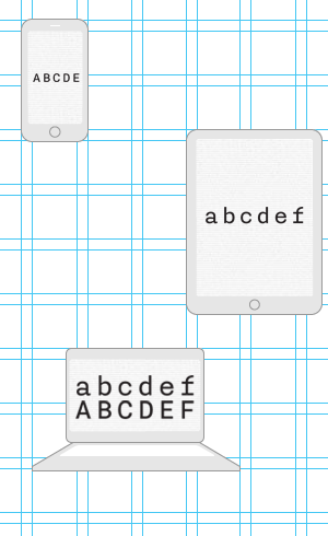
"HARDLY ANYONE CAN DISCERN GOOD FROM BAD TYPOGRAPHY, BUT EVERYBODY CAN FEEL IT"

(...)

fonte: http://www.theverge.com/2012/7/24/3177332/ia-oliver-reichenstein-writer-interview-good-design-is-invisible

19/04/2012

Mauro Zennaro

>
Mauro Zennaro è nato a Roma nel 1953.

Si occupa di grafica, calligrafia e type design.

Insegna presso l’Istituto d’istruzione superiore Carlo Urbani di Roma e presso l’Università per Stranieri di Perugia.

Ha scritto numerosi articoli sulla grafica, la scrittura e la didattica.

È stato tra i fondatori della rivista Calligrafia e nel comitato di redazione della collana di libri sulla grafica Scritture, pubblicata da Stampa Alternativa/Graffiti.

Suoi lavori manoscritti e a stampa, pubblicati dalle Edizioni dell’Elefante, sono stati esposti in numerosi musei e biblioteche europee e statunitensi.

È membro dell’Aiap–Associazione italiana progettazione per la comunicazione visiva.

fonte: http://www.scriptoria.it/maurozennaro.html


…


31/01/2012

Typotheque: Julien, geometric display typeface

>
Julien — the making of
by Peter Biľak

Julien is a playful geometric display typeface loosely inspired by the early 20th century avant-garde. It is based on elementary shapes and includes multiple variants of each letter. [Ler mais...]


Julien, geometric display typeface
by Peter Biľak

We are pleased to present a new typeface — Julien. It’s a playful geometric display typeface loosely inspired by the early 20th century avant-garde. It is based on elementary shapes and includes multiple variants of each letter (over 1000 glyphs per style), as well as intelligent OpenType scripts that select glyphs to create the best word shapes. Julien is a unicase typeface in which upper case and lower case letters are mixed together. [Ler mais...]


fontes:
http://www.typotheque.com/articles/julien-the_making_of
http://www.typotheque.com/blog/julien

 …

10/12/2011

Ricardo Santos

>
Ricardo Santos studied at António Arroio school and is graduated from IADE (Instituto de Artes Visuais, Design e Marketing), both in Lisbon, Master de Tipografia Avanzada - EINA (Escola de Disseny i Art) in Barcelona. He began his career as both a graphic designer and illustrator, and since 1997 has designed his own typefaces. He now works as a free-lance type designer and teaches at ESAD.CR in Caldas da Rainha. [ler mais...]

ABOUT VANARCHIV
Vanarchiv is an independent digital type foundry based in Lisbon, Portugal, directed by Ricardo Santos.
Vanarchiv develops and markets original text and display type fonts for both Mac and PC platforms. Vanarchiv typefaces are distributed by: Myfonts, Fountain and FontShop.

fonte: VANARCHIV

03/01/2011

Louise Fili

>
2004 HALL OF FAME
From an essay by Gail Anderson


Louise Fili reinvented book jacket design in the 1980s during her eleven-year tenure as art director of Pantheon Books. Louise may never have known that all the assistant designers, myself included, collected her covers like baseball cards, since we guarded our stashes like they were all Mickey Mantles and would never have traded unless we had doubles. [Ler mais...]


14/12/2009

Jan van Toorn

>
Rick Poynor
Jan van Toorn: Arguing with Visual Means

Jan van Toorn, subject of a meticulously researched retrospective that opened today (21 March) at the Kunsthal in Rotterdam, is one of the most distinguished and provocative figures in an exceptional generation of Dutch graphic designers. Van Toorn’s social and political concerns, and his way of talking about them, set him apart, even among such colleagues as Wim Crouwel, Anthon Beeke, Gerard Unger, Swip Stolk and Hard Werken founder Rick Vermeulen, who all attended the opening celebration. Van Toorn has described himself as someone interested in the history of ideas, who also happens to be a practical person, a designer, and this is how he comes across. The observations that follow are based on a talk I gave at the opening ceremony. [Ler mais...]

fontes:
Design Observer
D&AD

12/12/2009

Kohei Sugiura

>
Speakers Profile: Kohei Sugiura by Zara Arshad


Kohei Sugiura by designboom
at the recent icograda world design congress in beijing,
the japanese graphic designer kohei sugiura
gave a lecture entitled 'one is two, two is many, and many returns to one'.

we quote here:
'that’s the flow of yin and yang.yin and yang seem to be two things and in fact
have different meanings but canbe combined into one'.I often use our fingers
as a metaphor. the ten fingers stand for many. this one can be science, this one
the society, this one the environment… but they all stem from the same origin,
the one. people nowadays tend to make things more and more complex, as in
thenonstop development of science. yet they don’t know how to return to the origin,
and this I think is the problem.one contains two and many, and, many will return
to one.you should nurture yourself with all the information, all the pictures and texts,
and try to make them one.' [Ler mais...]


was born in tokyo in 1932. he graduated from tokyo university of fine arts and music
with a degree in architecture. he has been a graphic designer for five decades, and is
a recognised innovator, especially in the area of book design. sugiura taught at the ulm
school of design in germany from 1964 to 1967, and at kobe design university from 1989 to 2003.
he has written extensively about visual communication, perception, music, and iconography,
with a particular focus on the cultural traditions of asia. among them 'asian and japanese
forms and designs', 'swallowing up the universe','spirits of form and design', 'drumming the cosmos', 'wind and lighting: a half-century of magazine design by kohei sugiura', 'books, texts, and design in asia', and 'luminous mandala: book designs of kohei sugiura'.
sugiura has received numerous awards, including the special prize at the leipzig book design
fair, the mainichi newspaper arts prize, and the arts award from japan’s ministry of education.
in 1997, he received the medal of honor with purple ribbon from the japanese government.

[Ler mais...] > designboom

…

14/11/2009

Min Wang

© designboom


the beijing olympic games will begin on august 8, 2008 - and if it’s
not already the case, you can expect to see the game's iconography
on just about everything in the coming weeks. with such a massive
global audience guaranteed, the job of communicating the event
is no small task.

one of the people taking responsibility for this is min wang,
design director for the beijing 2008 olympic games. wang and his
team have been the creative force behind everything from street
banners to the olympic medals.

designboom recently spoke to him about his role.

past, present, future
I was born in china, where I also grew up and began my studies
before leaving for europe. I went to university of arts in berlin
and then the school of art at yale university in the US.
after studying, teaching and working in europe and the US for
over twenty years, I made the decision to come back to china
to focus my work on two things: design education and
design for the 2008 beijing olympic games. [Ler mais...]


about min wang
min wang was born in china, 1956. he completed his BA in art
at zhejiang academy of fine arts (now the china academy of
fine arts) before studying in berlin and then later achieving
an MFA at yale university school of art in 1986.
since graduating from yale he has worked at adobe systems
where he developed digital kanji typefaces (japanese fonts).
later he worked at a graphic design studio in connecticut,
while continuing in his roles as graphic designer, art director
and design manager in the creative services division at adobe
systems. in 1998, wang left adobe to form square two design
with eddie lee and the consultancy now has offices in
san francisco and beijing. in 2003 wang was appointed as
the dean of the school of design, at china central academy of
fine arts (CAFA) in beijing. after the creation of the art research
centre for the olympic games (ARCOG) at CAFA, wang became
the design director for the beijing 2008 olympic games.

[Ler mais...] > designboom

21/03/2009

Typography as Discourse

>
McCoy, Katherine, with David Frej, 'Typography as Discourse', ID Magazine, New York, March/April 1988, pp. 34-37.

The recent history of graphic design in the U.S. reveals a series of actions and reactions. The fifties saw the flowering of U.S. graphic design in the New York School. This copy-concept and image-oriented direction was challenged in the sixties by the importation of Swiss minimalism, a structural and typographic system that forced a split between graphic design and advertising. Predictably, designers in the next decade rebelled against Helvetica and the grid system that had become the official American corporate style.

In the early seventies, Robert Venturi's Complexity and Contradiction in Architecture emerged alongside the study of graphic design history as influences on American graphic design students. Simultaneously, Switzerland's Basel school was transformed by Wolfgang Weingart's syntactical experimentation, an enthusiasm that quickly spread to U.S. schools. Academia's rediscovery of early 20th century Modernism, the appearance of historicized and vernacular architectural postmodernism and the spread of Weingartian structural expressionism all came together in the graphic explosion labeled as New Wave.

Shattering the constraints of minimalism was exhilarating and far more fun than the antiseptic discipline of the classical Swiss school. After a brief flurry of diatribes in the graphic design press, this permissive new approach quickly moved into the professional mainstream. Today, however, the maverick has been tamed, codified into a formalistic style that fills our design annuals with endlessly sophisticated renditions. What was originally a revolution is now an institution, as predictable as Beaux Arts architecture. It is the new status quo-- the New Academy, as Phil Meggs calls it.

Determining whether New Wave is postmodernism or just late Modernism is important in understanding new work today. New Wave extends the classical Swiss interest in structure to dissections and recombinations of graphic design's grammar. Layered images and textures continue the collage aesthetic begun by Cubism, Constructivism, and Dada. But the addition of vernacular imagery and colors reflects postmodern architecture's discovery of popular culture, and the reintroduction of the classic serif typefaces draws on pre-20th century history. Taken as a whole, however, New Wave's complex arrangements are largely syntactical, abstracting type and images into baroquely Modern compositions.

The New Academy's knowing, often slick iterations have left some graphic designers dissatisfied. As a result, long neglected design elements, such as semantic expression in form, text and imagery, are beginning to resurface. Much of this recent work steps outside the lineage of Bauhaus/ Basel/ New Wave, and not surprisingly, some of its practitioners come from fine art, photographic or literary backgrounds rather than graphic design training.

When one looks for experimental typography today, what one finds is not so much new typography, as new relationships between text and image. In fact, the typography so celebrated over the past ten years of structuralist dissection is disappearing. The look and structure of the letter is underplayed and verbal signification, interacting with imagery and symbols, is instead relied upon. The best new work is often aformal and sometimes decidedly anti-formal, despite the presence of some New Wave elements. Reacting to the technical perfection of mainstream graphic design, refinement and mastery are frequently rejected in favor of the directness of unmannered, hand-drawn or vernacular forms-- after all, technical expertise is hardly a revelation anymore. These designers value expression over style.

Here on the edges of graphic design, the presence of the designer is sometimes so oblique that certain pieces would seem to spring directly from our popular culture. Reflecting current linguistic theory, the notion of "authorship" as a personal, formal vocabulary is less important than the dialogue between the graphic object and its audience; no longer are there one-way statements from designer. The layering of content, as opposed to New Wave's formal layering of collage elements, is the key to this exchange. Objective communication is enhanced by deferred meanings, hidden stories and alternative interpretations.

Sources for much current experimentation can be traced to recent fine art and photography, and to literary and art criticism. Influenced by French post-structuralism, critics and artists deconstruct verbal language as a filter or bias that inescapably manipulates the reader's response. When this approach is applied to art and photography, form is treated as a visual language to be read as well as seen. Both the texts and the images are to be read in detail, their meanings decoded. Clearly, this intellectualized communication asks a lot of its audience; this is harder work than the formal pleasures of New Wave.

Much new typography is very quiet. Some of the most interesting, in fact, is impossible to show here because of its radically modest scale or its subtle development through a sequence of pages. Some is bold in scale but so matter-of-fact that it makes little in the way of a visual statement. (One designer calls these strictly linguistic intentions "nonallusive" typography.) Typefaces now range from the classics to banal, often industrial sans serifs. Copy is often treated as just that-- undifferentiated blocks of words-- without the mannered manipulations of New Wave, where sentences and words are playfully exploded to express their parts. Text is no longer the syntactic playground of Weingart's descendants.

These cryptic, poker-faced juxtapositions of text and image do not always strive for elegance or refinement, although they may achieve it inadvertently. The focus now is on expression through semantic content, utilizing the intellectual software of visual language as well as the structural hardware and graphic grammar of Modernism. It is an interactive process that-- as art always anticipates social evolution-- heralds our emerging information economy, in which meanings are as important as materials.

fonte:  High Ground Design.

…

16/03/2009

Designingwithtype.com

by James Craig

Designingwithtype.com is a web site devoted to the art and appreciation of typography. It offers a unique typographic resource for students, educators, and professionals, showcasing talent from around the world. [Ler mais...]

(...)
There are many excellent ways of teaching the history of graphic design. One of the better ways, though this is not always possible, is to integrate the history of graphic design with the other arts — painting, literature, music — and with major political and cultural events of the time. The following timelines are from James Craig's book Thirty Centuries of Graphic Design and cover just a few of the highlights between 30,000 BC and 1990 AD, the year book was published.

1000 BC – 500 AD

500 – 1300

1300 – 1400

1400 – 1500

1500 – 1600

1600 – 1700

1700 – 1800

1800 – 1900

1900 – 1920

1920 – 1940

1940 – 1960

1960 – 1990


(...)

Prehistoric Pictograph
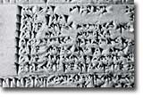
Cuneiform, ca 3100 B.C.
 
Egyptian Hieroglyphics
Early Latin. ca.700 B.C.
Ionic Greek adopted in 403 B.C.
Trajan Inscription A.D. 114
[Ler mais...] > Timelines 

(...)
Items of Interest
The following is an assortment of all things typographic. It will be of interest to anyone who loves typography and is curious about the history of graphic design and the evolution of the printed word. 

…

06/03/2009

Ariel Malka

chronotext is a growing collection of software experiments exploring the relation between text, space and time

beyond typography
The potential locked up in text at the digital age is huge: en route for some unvisited territories...

news
The iPhone is asking to become the main experiment channel for chronotext this year and the steering committee is likely to accept the request...

The experiments representative was quoted earlier, before fainting:

What a relief after years behind a desktop computer screen, stuck inside Java and hardly visited... People are going to interact physically with us, touching, tilting, shaking us... God!


© 2003-2009 ariel malka


14/02/2009

Helvetica _história, designers e imagens

Image Now Gallery

fifty years of helvetica 
05 -30.11.07

one: an exhibition in mono
03 - 17.11.06

forty-eight posters, Josef Müller-Brockmann
31.05 - 25.06.04


Outros links:
blanka.co.uk/50_years_of_helvetica

Paul Mijksenaar


Prof. Paul Mijksenaar is principal of Mijksenaar. The Dutch company with offices in Amsterdam and New York specialises in wayfinding. Its clients include Amsterdam Airport Schiphol, Port Authority of New York & New Jersey, New York City Transit, Dutch Railways, Rotterdam Metro and Amsterdam Metro but they work also for hospitals, museums, stadiums and any other venue that needs signing. Paul Mijksenaar teaches Visual Information Design at Delft University (Holland).


Left: Steven Spielberg, right: Paul Mijksenaar. Airport sign appears in the background.

Steven Spielberg Paul MijksenaarSignage on the setFlight-information panel

17/01/2009

Henrique Cayatte

Que designers queremos ser?
2007-04-18

Henrique Cayatte é um dos mais conhecidos e premiados designers portugueses, tendo ganho, no ano passado o Prémio Carreira, atribuído pelo Centro Português de Design. Sendo um dos mais criativos na sua área, Henrique Cayatte foi também responsável pelo primeiro projecto gráfico do diário Público. Um projecto arrojado e que mudou completamente a maneira de apresentar um diário aos seus leitores. Mas o seu percurso é bem mais vasto, como demonstra os cargos que tem desempenhado, casos de comissário e autor do design global para a exposição Uberdade e Cidadania - 100 Anos Portugueses, coordenador do curso de pós-graduaçâo em Design urbano da Faculdade de Belas Artes da universidade de Lisboa e do Centro Português dê Design. e designer da revista EGOÍSTA.

Em entrevista ao Ensino Magazine, aquele responsável que estará presente no 3º Fórum da Imagem da Escola Superior de Artes Aplicadas do Instituto Politécnico de Castelo Branco, fala da sua experiência, da evolução do design em Portugal e da relação com os responsáveis editoriais da imprensa escrita.
Desde há muitos anos que a noção de design gráfico foi substituída pela de design de comunicação, concorda com a ideia?

Concordo. O design de comunicação passou a integrar o gráfico. A evolução da profissão, das mentalidades e da tecnologia originou esta mutação. O design de comunicação inclui todas as variáveis do design gráfico embora a inversa não seja verdadeira.

O design de comunicação, hoje, recorre imagens fixas e animadas, de duas e três dimensões, som, texto e lettering, montagem sequencial de imagens, composição, cor e forma. Como vemos, um âmbito bastante mais lato que a área de operação do design exclusivamente gráfico. [Ler mais...] > tipografia em portugal_entrevistas

Entrevista retirada da Ensino Magazine Online
fonte: UBI :: Design Multimédia

…

15/01/2009

Andrew Howard

Andrew Howard é designer gráfico, curador e crítico de design. Vive e trabalha em Portugal desde 1989, onde tem desenvolvido uma colaboração intensa com diversas instituições culturais, entre as quais a Fundação Calouste Gulbenkian, a Fundação de Serralves e o Centro Português de Fotografia, e mantido uma colaboração permanente com a ESAD – Escola Superior de Artes e Design de Matosinhos. O pretexto para esta entrevista é a aproximação do fim da última temporada dos Personal Views um ciclo de conferências sobre design gráfico iniciado em 2003 e que trouxe a Portugal alguns dos mais importantes designers da actualidade. Ao longo da entrevista, Andrew Howard expõe os seus pontos de vista sobre a teoria, a prática e o ensino do design.

Por José Manuel Bártolo


P: É designer gráfico, crítico, curador e professor de design. A ordem é esta?

R: Eu preferiria evitar identificá-las como se escrevesse uma lista que automaticamente envolve colocá-las por uma determinada ordem. Gosto de considerar todas essas facetas, movendo-me constantemente entre elas. Também não usaria o termo “crítico”, prefiro usar a palavra “escritor” mesmo que não escreva tanto quanto gostaria. [Ler mais...] > tipografia em portugal_entrevistas


Links

www.studioandrewhoward.com

www.esad.pt/personalviews

http://www.studioandrewhoward.com/idioms/publications.php?cat=3


fonte: artecapital.net
…

11/01/2009

The Graphic Design of Peter Saville

"Saville's method, then as now, lies in fixing on a style or look slightly ahead of popular taste. He achieves the sort of ambiguity and complexity of resonance more usually associated with art," writes Rick Poynor in his essay.


The legendary cover of the New Order single Blue Monday (1983) and the sleeve of the Joy Division album Unknown Pleasures (1979), were to bring the Manchester graphic designer Peter Saville worldwide renown. Using a reduced, Modernist style Peter Saville has made key innovations in the field of visual communications, and in recent times he has had a profound effect on the interplay between art, design and advertising.

Born in Manchester in 1955, Saville was brought up in the affluent suburb of Hale. Having been introduced to graphic design with his friend Malcolm Garrett by Peter Hancock, their sixth form art teacher, Saville decided to study graphics at Manchester Polytechnic from 1974 to 1978. At the time Saville was obsessed by bands like Kraftwerk and Roxy Music, but Garrett encouraged him to discover the work of early modern movement typographers such as Herbert Bayer and Jan Tschichold. He found their elegantly ordered aesthetic more appealing than the anarchic style of punk graphics. Tschichold was the inspiration for Saville’s first commercial project, the 1978 launch poster for The Factory, a club night run by a local TV journalist Tony Wilson whom he had met at a Patti Smith gig. Having long admired the ‘found’ motorway sign on the cover of Kraftwerk’s Autobahn, the first album he bought for himself, Saville based the Factory poster on a found object of his own – an industrial warning sign he had stolen from a door at college. [Ler mais...]

…

16/11/2008

Bruno Munari al Museo dell’Ara Pacis

apri
Museo dell’Ara Pacis. Roma
9 Ottobre 2008 - 22 Febbraio 2009


a cura di Beppe Finessi e Marco Meneguzzo, progetto di allestimento di Marco Ferreri, progetto grafico di Italo Lupi

La mostra nasce da un approfondito lavoro di ricerca e da un progetto affinato nel corso degli anni. Accanto alle opere più note - come i progetti di allestimenti degli anni Quaranta e Cinquanta, gli interventi artistici in opere di architettura tra i Cinquanta e Sessanta, i progetti di grafica, la collaborazione con alcune delle realtà più significative per la cultura italiana del dopoguerra (Einaudi, La Rinascente, Olivetti e Danese) - ed evidenziando il particolarissimo metodo progettuale, vero denominatore comune della sua multiforme attività, l'esposizione sottolinea anche alcuni aspetti meno indagati dell'opera di Munari, tra cui il rapporto con il mondo dell'architettura e la sua collaborazione praticamente ininterrotta con molte delle riviste italiane dedicate al progetto, alla comunicazione e all'arte.

Il percorso espositivo, organizzato per aree tematiche non cronologiche o tipologiche, mette in relazione settori disciplinari normalmente distanti, ma che per Munari rappresentano solo momenti diversi di un'unica attività progettuale.

La mostra si inserisce nel circuito delle attività che la città di Roma ospita da fine settembre 2008 a fine febbraio 2009 per celebrare la figura dell'artista milanese.
Altri appuntamenti sono: “Vietato non toccare. Bambini a contatto con Bruno Munari” ad Explora - Il Museo dei bambini di Roma (27 settembre 2008 - 22 febbraio 2009) e la mostra-laboratorio “Bruno Munari prestigiatore” alla Casina di Raffaello di Villa Borghese (3 ottobre 2008 - 11 gennaio 2009).

Acquista in LibreriaOnLine i libri di Bruno Munari:
Libri di Munari
Munari e il club degli editor

[Ler mais...] > aiap.it
...

22/10/2008

The Art of Looking Sideways by Alan Fletcher


The Art of Looking Sideways' by Alan Fletcher is the ultimate guide to visual awareness, a magical compilation that will entertain and inspire all those who enjoy the interplay between word and image, and who relish the odd and the unexpected.

02/10/2008

Ellen Lupton

Photo by Jason Knauer, 2007


1 2 3 4 5 6 7 8 9 10


Born 1963, Philadelphia, PA

Recognized for her invaluable role as an educator, author and curator in the field of design and for her intellect and mastery of words. 

Ellen Lupton makes this industry smarter. If graphic design has a sense of its own history, an understanding of the theory that drives it and a voice for its continuing discourse, it’s largely because Lupton wrote it, thought it or spoke it.

Like so many other design legends that came of age in the era of “commercial art,” Lupton was not aware of design as a viable field of study before college. It wasn’t until she began as a fine art student at Cooper Union in 1981 that she discovered the expressive potential of typography. The visual art of writing was an inspiration to a self-professed “art girl” who came from a family of English teachers. Realizing the potential for an expanded critical discourse in graphic design provoked a shift in her ambitions. “Graphic design was a revelation to me,” says Lupton. “Design really wasn’t in the mainstream back then. It was esoteric. It was the thing you did if you were very ‘neat,’ which I wasn’t.”

Upon graduating in 1985, Lupton accepted an offer to run the newly founded Herb Lubalin Study Center of Design and Typography at the Cooper Union. The future advocate of “do-it-yourself” started out as a D.I.Y. curator herself, fusing her talents as a writer and designer with an abiding interest in post-structuralism to visually construct the principles of graphic design history and theory on a shoestring budget. Curatorial work came naturally as an extension of writing and design. Exhibitions provided another arena in which objects, images and text functioned as both the method of communication and the subject of inquiry. Lupton’s early work in this area brought the visual and the verbal together so playfully that she surprised her academic peers with her ability to make rigorous theory digestible and engaging. During this time Lupton also began publishing as a critic, establishing herself as a leading voice in the field in publications such as Blueprint, Eye, Design Review, I.D., Print, Emigre andAssemblage.

In the mid-1980s Lupton founded the Design Writing Research lab with partner J. Abbott Miller as a so-called “after school” supplement to their early working lives. “We were young and had theories,” she says, “so we created DWR as a thing where we could take on work with clients and do artsy-fartsy stuff for the real world.” The fledgling studio provided the ideal climate for the kind of seamless integration between theory and practice that would characterize the scope of Lupton’s career. Ideas from the Design Writing Research studio and early curatorial explorations at the Lubalin Center formed the basis for Design/Writing/Research: Writing on Graphic Design, co-authored and designed by Lupton and Miller in 1996. The Lupton/Miller partnership has yielded many accomplishments, both professionally and personally, from the Chrysler Design Award in 1993 to the ultimate collaboration: their two children, Ruby and Jay.

Lupton earned access to broader audiences and larger-scale projects in 1992, when she became the contemporary design curator at the Cooper-Hewitt National Design Museum, one of the few existing design curatorships in the country. During her continued tenure at the museum, Lupton has organized numerous exhibitions and major publications that showcase design for a general public without sacrificing conceptual depth. Shows such as 1996’s “Mixing Messages: Graphic Design in Contemporary Culture” set a precedent for sophisticated, mainstream legibility that came to fruition in 2000, when Lupton co-organized the first National Design Triennial, thus establishing a benchmark of innovation in American contemporary design.

“I first experienced Ellen Lupton’s curation when I visited her ‘Mechanical Brides’ and ‘Mixing Messages’ exhibitions in the late 1990s,” recalls Paul Warwick Thompson, director of the Cooper-Hewitt since 2001. “I was truly excited by the prospect of working with Ellen, and I remain captivated by the ‘Skin’ exhibition, which she curated in my first year in New York. She is a beautifully expressive writer, an eloquent and engaging speaker, a remarkable designer and design thinker: a true polymath.”

For the latest Triennial, 2006’s “Design Life Now,” Lupton raised a few eyebrows by including populist forms of new social media such as blogs, open-source software and D.I.Y. magazines, all of which work towards making design literacy part of mainstream culture and reflect her own desire to make design a less exclusive club. Lupton herself is an avid blogger on design-your-life.org and DIYKids.org, two sites that apply design to everyday life co-edited with her identical twin sister Julia. Inviting audiences to participate in the creation of a new design discourse shows a level of confidence rarely found among the design elite and a lack of fear in what she calls the age of “unstoppable self-education.”

“Ellen Lupton is an institution,” says Paula Scher. “In a time when design writing has moved to the blogosphere—and is more democratic, but more idiotic—Ellen’s clear voice is even more valuable.”

In her role as director of the graphic design MFA program at the Maryland Institute College of Art since 2003, Lupton has continued to practice an inclusive ethos of design and communication. (She joined the school as chair of the undergraduate design program in 1997.) In 2006, she and her grad students produced D.I.Y.: Design It Yourself, a manual for empowering non-designers with how-to skills. Lupton advocates exposing all methods of production: to this end, she has taught a course on code writing with a graduate student at MICA, and recently hosted seminars on independent publishing and blogging for designers and writers.

When she needed the right textbook for her students, Lupton wrote one herself. Although she has worked with various publishing houses over the years, she has produced over a dozen books with Princeton Architectural Press, including 2004’s Thinking with Type, one of the press’s best-selling titles. That seminal book features a series of concise essays, deftly illustrated examples and direct rules of engagement, and is most notable for the humor that hums dryly behind its Scala typeface. Her writing is smart, but more importantly, it entertains, too. “I wanted to produce a book that addressed both the how and why of typography, with serious history and theory,” she recalls, “and I wanted it to be fun, but not dumbed down. This is typography for people who think, but the book is not pompous or overly detailed.”

Lupton’s writing about design is itself an art. “She’s exceptionally adept at both the verbal and the visual, which is not to be taken for granted in this new era of ‘designer as author,’ an era that she so skillfully pioneered and has inspired many of us to follow suit,” says Chip Kidd. Lucid, sophisticated and free from jargon, her words continue to define the territory of graphic design after deconstruction—using theory not just as a collection of footnotes or an intellectual endgame, but also as a way to bring critical reflection into everyday practice. Abbott Miller concurs, “Ellen has always been interested in writing that is clear and stripped down. She wants to make theory and history relevant to what designers do, making her work a resource for practicing designers as well as a contribution to the discourse of design history.”

In addition to inspiring others to become contributors to the design world, Lupton challenges them to be intellectuals, too. Her conclusion to Thinking with Type offers this typically droll bit of advice: “Think more, design less.” She is this profession’s constant reminder to strive for conceptual depth, avoid style over substance and be smarter than we think we can be.

By Katherine Feo

© 2008 AIGA