Mostrar mensagens com a etiqueta fontes. Mostrar todas as mensagens

31/01/2012

Typotheque: Julien, geometric display typeface

>
Julien — the making of
by Peter Biľak

Julien is a playful geometric display typeface loosely inspired by the early 20th century avant-garde. It is based on elementary shapes and includes multiple variants of each letter. [Ler mais...]


Julien, geometric display typeface
by Peter Biľak

We are pleased to present a new typeface — Julien. It’s a playful geometric display typeface loosely inspired by the early 20th century avant-garde. It is based on elementary shapes and includes multiple variants of each letter (over 1000 glyphs per style), as well as intelligent OpenType scripts that select glyphs to create the best word shapes. Julien is a unicase typeface in which upper case and lower case letters are mixed together. [Ler mais...]


fontes:
http://www.typotheque.com/articles/julien-the_making_of
http://www.typotheque.com/blog/julien

 …

14/02/2009

Josef Müller-Brockmann

From Wikipedia, the free encyclopedia

Josef Müller-Brockmann, (May 9, 1914 – August 30, 1996), was a Swiss graphic designer and teacher. He studied architecture, design and history of art at both the University and Kunstgewerbeschule in Zurich. In 1936 he opened his Zurich studio specialising in graphic design, exhibition design and photography. From 1951 he produced concert posters for the Tonhalle in Zurich. In 1958 he became a founding editor of New Graphic Design along with R.P. Lohse, C. Vivarelli, and H. Neuburg. In 1966 he was appointed European design consultant to IBM. Müller-Brockman was author of the 1961 publications The Graphic Artist and his Design Problems, Grid Systems in Graphic Design where he advocates use of the grid for page structure, and the 1971 publications History of the Poster and A History of Visual Communication.

He is recognised for his simple designs and his clean use of typography, notably Akzidenz-Grotesk, shapes and colours which inspires many graphic designers in the 21st century. Many of his works can be found on the gallery Blanka. [Ler mais...]


Links:
A conversation with Josef Müller-Brockmann
by Yvonne Schwemer-Scheddin
eyemagazine.com

…

Helvetica _história, designers e imagens

Image Now Gallery

fifty years of helvetica 
05 -30.11.07

one: an exhibition in mono
03 - 17.11.06

forty-eight posters, Josef Müller-Brockmann
31.05 - 25.06.04


Outros links:
blanka.co.uk/50_years_of_helvetica

23/09/2008

FB Stainless _fonts.com

>
Like so many typefaces, the 
Stainless™ design grew out of experimentation. While drawing in his sketchbook one day, Cyrus Highsmith began to rough out a serifless version of his slab serif design, Dispatch™. As he drew strokes and counters, he realized that he had the beginnings of an original family – with its own strong character and identity – not just a sans serif partner for Dispatch. The final Stainless design was chosen as the new branding typeface for Premiere magazine.Highsmith designed three display weights for the project: Ultra Thin, Thin and Ultra Light.

Highsmith, senior type designer at Font Bureau, is no stranger to magazine type design. Martha Stewart Living, The Source, MensHealth and many other publications contain his typefaces. However, magazine type design isn’t Highsmith’s sole focus. He considers himself above all a draftsman. He draws calligraphic scripts and industrial-strength sans serif faces (like Stainless) with equal ease.

Stainless is now a full family of 35 designs. Weights range from a precise Ultra Thinto a full-bodied Black. Italics, condensed, compressed and even a suite of extendeddesigns complete the family. Square shoulders and clipped terminals give Stainless a sophisticated demeanor that stands out from the crowd. If you are looking for a distinctive – and exceptionally versatile – sans, Stainless just might be the family for you. [Ler mais...]


15/09/2008

Black Slabbat _YouWorkForThem

Designed by Stefan Kjartansson
Styles: Regular, Alternative

There’s only one thing about this new typeface that isn’t colossally black: the razor-thin white space. It slices through and between geometric characters, creating a juxtaposition of contrasts and rhythms. Typeface delivered in OpenType format.


07/08/2008

FF Meta Serif _FontShop

It took three years and three designers to develop FF Meta® Serif. All through the ’90s, Erik Spiekermann made several attempts at designing a counterpart for his groundbreaking FF Meta®. Fans of Meta frequently asked him which serif face would best complement it. He recommended Swift™, Minion™, FF Clifford™, and others, until he realized that he should just buckle down and draw his own serif Meta. True to his principle of collaboration, Spiekermann enlisted the help of accomplished type designers Christian Schwartz and Kris Sowersby. [Ler mais...]


Download Overview of FF Meta Serif Packages  540KB PDF

09/01/2008

The Futura typeface

>


The Futura typeface. Set to music by Wolf Parade
From: MaxTerry
Added: December 16, 2006
Category: Film & Animation
Tags: futura typeface font wolf parade after effects binary digital future futuristic yin-yang Taoism

02/09/2007

Nick Shinn

Foundry
Shinntype was founded in Toronto in 1998 to publish the type designs of Nick Shinn, and has since released sixteen retail typeface families. Shinntype fonts are available from Faces, Fonts.com, FontHaus, FontShop, Fontworks, MyFonts, Phil’s Fonts and Veer. Commissioned work is also undertaken, most notably a typeface to commemorate the author Mordecai Richler, in 2001. Custom types have been produced for newspapers such as The Birmingham News (Alabama), The Chicago Tribune, The Daily Express (London), The Daily Mail (London), The Globe and Mail (Toronto), The Montreal Gazette, and The St. Petersburg Times (Florida). Fonts with exclusive rights have been created for corporations such as Thomson Nelson, Enbridge, Rogers Communications Inc., and Martha Stewart Living.

Designer
Nick Shinn, R.G.D. was born in London, England in 1952, educated at Bedford, and acquired a Dip.AD in Fine Art (1974) from Leeds Polytechnic, Yorkshire. He has lived in Toronto since 1976. During the 1980s he was an art director and creative director at a number of advertising agencies, and a partner in the environmental marketing company Earthmark from 1988 to 1990. He went digital in 1989 and started the Shinn Design studio, which specialized in publication and marketing design during the 1990s. He has been a member of the Association of Registered Graphic Designers of Ontario (R.G.D.) since its inception in 1996.

Scope
Between 1980 and 1998 Shinn designed seven type families for a variety of foundries. In 1998 he went into the font business full time, launching Shinntype to publish and market his fonts worldwide. Shinn's background as an artist, writer, art director and graphic designer informs his eclectic type designs, which run the gamut from revivals to experimental work exploring new technology, and are used in everything from packaging and advertising to internet, book, magazine, and newspaper publishing around the world. He has created dozens of retail fonts, including the casual classic Fontesque, the unicase-monowidth poetry face Panoptica, and the OpenType script face Handsome Pro. He is currently developing a suite of typefaces for international use, with Latin, Greek, and Cyrillic alphabets.

Other
Shinn has written for magazines such as Applied Arts, Druk, Eye, Graphic Exchange, Marketing, and Typographic, has spoken at the ATypI, TypeCon and Graphika conferences, and taught at Seneca College and York University in Toronto. From 2002 to 2006 he served as a board member of the Society of Typographic Aficionados (SOTA), which puts on the international conference TypeCon every year, helping bring it to Toronto in 2002. [Ler mais...]

13/06/2007

Typographic Voices

Excerpted from the article originally published in Communication Arts March/April 1998.
Purchase Issue

Typography—how type is used rather than the specific design of typefaces—has always been a primary workhorse for communicating content. In much current design work though, images often take precedent over typography because of their power in terms of visual form. It is generally accepted that we live in an image-based culture rather than in one that is based on the written word.

Perhaps because of the emphasis on images in design, more and more designers are returning to typography as a means to make their work stand out. The power of the written word and typographic approaches to design are voices through which meaning can be articulated and content given more resonance.

Typographic treatments can be tailored to the specific purpose of a project: from traditional book typography that adheres to simple columns of text along with display type, to combinations of display and text type actively employing contrast, scale, white space, texture and layering to add further levels of emphasis and meaning. Media such as photography, filmmaking, television, multimedia and digital technology have also undeniably influenced contemporary typography. The most experimental results can readily be seen in many "alternative" music- and style-related publications that have sprouted up in recent years. New typographic approaches are becoming more prevalent in current graphic design beyond their more ephemeral editorial aspects. This article is a survey of some of the variety of ways typography is being applied in design.

In order to gain insight into typographic approaches currently in use, we contacted a group of designers from around the country who are using typography in innovative ways and asked them about the role it plays in their work, their influences and their creative processes.
Next Section >> Part Two > [Ler mais...]

27/05/2007

Type in the Future Tense

Excerpted from the article originally published in Communication Arts Jan./Feb. 2000.

With the arrival of a new millennium, it’s worth taking a look at our notions of type of the future. Obviously, there is no way of knowing what type will look like at the end of the next millennium—or if it will even exist as we know it—but we can look at current type that reflects our ideas of the future.

Although to look at “futuristic” type design is at once problematic. What makes any typeface inherently futuristic? If you look at type associated with early 20th century modernist movements such as De Stijl or the Bauhaus, you cannot say that designers associated with these groups were intentionally making futuristic typefaces. One underlying factor of all type identified as having futuristic aspects is experimentation. Experimentation in type projects ideas we associate with the future. For example, type designs associated with the De Stijl movement of the ’20s is often very rectilinear in form or made up of a series of rectangular shapes like building blocks (that may or may not be connected); they convey a sense of architectural horizontal and vertical elements—stripped down to basic components. There are many other aspects of form in type design that convey a sense of what we associate with the future: The use of extended or oblique projects speed; rectilinear form emphasizes structure; the use of weight and contrast conveys mass or strength; stroke width accentuates line and becomes a metaphor for electronic circuitry and communication; abbreviated shapes and glyphic forms project images of text as a new and unfamiliar language; organic forms visually reiterate aerodynamic forms traveling through time and space; geometric and mechanical emphasis, or various combinations of these components—whether used in a subtle way or in the most avant-garde experimental design—transform the familiar letterform into something exotic and otherworldly.

Some of the most prominent examples of futuristic type today appear frequently in display lettering. This kind of lettering can have a powerful effect on how products are perceived and what they represent in terms of identity. It is seen in use on electronic games, fashion, broadcast sports titles, graphic materials and ads for action sports such as snowboarding that cater to a young demographic, and it’s also part of graphic design associated with contemporary electronic dance and techno music genres.

Another example is futuristic elements in the logotypes designed for vehicle model nameplates. Frequently die-cast and chromed, these nameplates have letterforms that are often oblique and extended, projecting futuristic aspirations. In this context this kind of type transforms our perception of the gasoline-powered vehicle, repackaging a technology basically of the late 19th century, into one that is sleek, sophisticated and a contemporary mode of transportation.
Next Section >> Influential Faces >[Ler mais...]


Above (Clockwise from the top left): Taser ™ Round Black designed by Jim Marcus; Basis ™ Thin designed by David Weik, both from T-26 Digital Type Foundry www.t26font.com; Cyberotica ™ Bold designed by Barry Deck, Thirstype www.thirstype.com; FF Koko ™ Five designed by Kai Zimmermann, FontShop International www.fontshop.com; FB Clicker ™ designed by Greg Thompson, The Font Bureau, Inc. www.fontbureau.com.

Post-Industrial Sans Type

Excerpted from the article originally published in Communication Arts August, 1999.

With the constant demand in design and advertising for typefaces that reflect a contemporary look, there has been a resurgence of interest in sans serif typefaces. There are a number of innovative new sans designs as well as revivals of vintage sans typefaces. Many of these share a common utilitarian, technical quality that has made them particularly fitting for use in the complex, layered and constantly changing digital age we live in. It is worth looking back at the evolution of sans serif type in order to place post-industrial sans designs in historical context.
Next Section >> Early Sans Designs >[Ler mais...]

Above: FB Interstate™ designed by Tobias Frere-Jones, 1993-94, Font Bureau, Inc., www.fontbureau.com

26/05/2007

Typography School


Typography School (04:59)
Veteran graphic design/typography and letterpress teacher from the London College of Printing: David Dabner talks... giving an insight into the principles of design, Veteran graphic design/typography and letterpress teacher from the London College of Printing: David Dabner talks... giving an insight into the principles of design, creative letterpress and why computers make students sloppy.

Tags: printing metal type graphic dabner grierson design typography typesetting letterpress fonts lcc lcp london graphics Added: 8 months ago in Category: Film & Animation From: omairways

22/05/2007

The Story of Verdana

In 1994, Microsoft began a typeface development project which was to forever raise the bar for quality standards of screen type. The goal was to produce a new family of sans serif typefaces as TrueType outline fonts which had exceptional readability. To do the job right would require a team of individuals skilled in art, craft and engineering. For the type designer, they chose the talent of Matthew Carter, and for the technological expertise, they chose Tom Rickner of Monotype Imaging.

Matthew Carter’s breadth of experience includes cutting punches in steel for metal typefaces, editing bitmaps, and drawing outlines for photo and digital systems. One typeface of note is Matthew's Bell Centennial, which he designed as a bitmap for use on the new CRT typesetting systems of the late 1970’s. That typeface was used to print phone books, which are notorious for being printed on poor quality paper at high speeds. So when Microsoft presented Matthew with the challenge of designing a highly legible and readable outline font, optimized for the screen, he borrowed a chapter from his past and began by making bitmaps.

The pixel, or picture element, is the basic building block of screen type. Every bit, whether black, white or gray has tremendous impact on our ability to read fluidly and without impediment. Matthew therefore focused his attentions on the final product which people would read, namely three sizes of bitmaps for each of four weights of this new sans serif typeface family. From those bitmaps, Matthew “wrapped” outlines around them, which would in turn be produced as hinted TrueType outlines.

What is TrueType hinting, anyway? Hinting is both engineering and art. It is about defining and controlling the structure of letters. It requires the elimination of subtlety at small sizes where choices are limited. Hinting enforces consistency among similar features, where mathematical chance could introduce optical and typographical errors. It is accomplished by writing small computer programs for each glyph in a font. These programs adjust the shape of the scaled outline to improve the bitmap which is generated by the rasterizer.

Tom Rickner is well versed in TrueType hinting. He was a part of the TrueType development team at Apple Computer, where he hinted and oversaw the production on the first TrueType fonts to be released with Apple’s System 7. After leaving Apple and prior to joining Monotype Imaging, Tom worked as a freelance designer, hinting custom typefaces for such clients as Apple and Microsoft.

Hinting is full of decision making, such as choosing the right compromises between shape, spacing and proportions. However the Verdana project added a new element. Typically, the hinter exercises his or her own judgment in adjusting the font to best represent the “spirit” of the outlines at a given size. With Verdana, Tom had to apply hints in such a way as to reproduce the bitmaps which Matthew had created, while still faithfully rendering the outlines at all other sizes. This required further compromise. In some rare cases, the bitmaps which Matthew had designed were too radically different from the outlines, and so the bitmaps had to be modified. In other cases, Tom’s hinting resulted in a different yet preferable bitmap, and that revision was adopted as well. However, the vast majority of letters appear just as Matthew first designed them, matching his vision pixel for pixel.

Since Verdana first shipped with Internet Explorer in 1996, it has become one of the most widely specified fonts in Web sites around the world. We choose to attribute this to both the universal appeal of the design, and the quality of the rendering. The team of Carter, Monotype Imaging and Microsoft have since produced other widely used typeface families, including the condensed cousins to Verdana, named Tahoma and Nina, and Matthew’s serifed family named Georgia. It should be noted that Monotype Imaging’s role has not been limited to supplying technical expertise alone. When Microsoft chose to extend Tahoma to support the Hebrew, Arabic, and Thai scripts, they chose the expertise of Monotype Imaging and its talented drawing office. But that is another story...
[Ler mais...]

10/04/2007

Jean-François Porchez

From Wikipedia, the free encyclopedia
Jean-François Porchez (born in 1964) is the president of ATypI (Association Typographique Internationale), the leading organisation of type designers. By 1994, he had created the new typeface for Le Monde newspapers. Today he designs custom typefaces for Beyoncé Knowles, Costa Crocieres, France Télécom, Peugeot, RATP (Public Transport in Paris), as well as distributing internationally his retail typefaces via his typofonderie.com website. For the Linotype Library Platinum collection, he recently finished a revival of the Sabon, a Jan Tschichold revival of Garamond.
He has been a visiting lecturer at the MA typefaces design
MATD at the Reading University (United Kingdom) and regularly conducts type design workshops all over the world. He also contributes regularly to conferences and international publications. He published Lettres Françaises, a book (in French & English) that shows all contemporary French, digital typefaces. In late 2001 he was the President of a jury set up by the Ministère de l’Éducation Nationale to select the new handwriting model and system for France and was a jury member of the 3rd Linotype Type design Contest.
He was awarded the Prix
Charles Peignot in 1998. FF Angie (1990) & Apolline (1993) were prize-winning entries in the Morisawa typeface competition. Costa received a Certificate of Excellence in Type Design at the TDC2 2000. Ambroise, Anisette, Anisette Petite, Charente, Le Monde Journal, & Le Monde Courrier were all prize-winning entries in the Bukva:raz international competition (2001). Deréon and Mencken won a Creative Review Type Awards (2006).
In 2004 he became president of
ATypI.

External Links
Porchez Typofonderie
Porchez.com

Parisine Plus PTF (avec les sous familles Clair et Sombre) est la seconde famille OpenType publié en 2006.

Usage du Parisine dans de la signalétique RATP.


Le Parisine PTF, la troisième famille OpenType publié après le Parisine Plus PTF est disponible.


[Ler mais...]

26/03/2007

William Addison Dwiggins

William Addison Dwiggins in his studio late 1930s.
Photograph by Robert Yamall Richie.

About the Designer
William A. Dwiggins – born 19. 6. 1880 in Martinsville, USA, died 25. 12. 1956 in Hingham, Massachusetts, USA – type designer, printer, typographer, graphic designer – studied at the Frank William A. Dwiggins – born 19. 6. 1880 in Martinsville, USA, died 25. 12. 1956 in Hingham, Massachusetts, USA – type designer, printer, typographer, graphic designer – studied at the Frank Holme School of Illustration in Chicago under Frederic W. Goudy.


1903–04: runs his own printing workshop in Cambridge, Ohio. 1905–16: commercial artist in Hingham, Massachusetts. 1917–18: director of Harvard University Press. 1919: founds the Society of Calligraphers in Boston and is their president and sole member. 1922: he is the first to use the term "graphic designer". 1923: over the years, Dwiggins designs over 300 book covers for his friend Alfred A. Knopf’s publishing firm. 1928: produces his first type designs for Mergenthaler-Linotype, whom he works with for 27 years. 1929: is awarded a gold medal by the American Institute of Graphic Arts (AIGA).

Fonts: Caravan™ (1938), Metro® (1929–30), Electra™ (1935–49), Caledonia™ (1938), Eldorado (1953), Falcon (1961) and numerous other designs which were never manufactured.Publication: "Layout in Advertisement", New York 1928.

* TYPOGRAPHY – An Encyclopedic Survey of Type Design and Techniques Throughout History by Friedrich Friedl, Nicolaus Ott (Editor), Bernard Stein, published by Könemann Verlagsgesellschaft mbH. [Ler mais...]

Works and Samples

Metroblack: Comparison of sizes(from "Linotype Faces", published by Mergenthaler Linotype Company)


Main Title (1929)


Electra™ (1935–49)


Cover (1935)


Outros artigos:
William Addison Dwiggins (1880 - 1956) era designer de livros, calígrafo, ilustrador e tipógrafo. Nascido em Martinsville, Ohio. Ele trouxe para o seu design de tipos um caráter presente em de seu trabalho publicitário.
Dwiggins cunhou o termo “
designer gráfico” em 1922.
Origem: Wikipédia, a enciclopédia livre.


The Type Designs of William Addison Dwiggins
by Vincent Connare

22 May 2000

Abstract
This document is a critical look at the major type designs of William Addison Dwiggins (1880-1956).
Individual letterforms and their letter parts will be critiqued and questioned to their relevance in the font or justify their existence in the typeface. Dwiggins' typefaces maybe compared to other typefaces that were used for inspiration or his own critical deviations. [Ler mais...]

25/03/2007

Adrian Frutiger

(15 years old)
Adrian Frutiger nació el 24 de marzo de 1928 en Unterseen (Suiza). Entra a trabajar como aprendiz en la imprenta Otto Schaeffli al mismo tiempo que acude a la Escuela de Artes y Oficios de Zurich. En 1951 realiza un estudio sobre la escritura occidental que merece un premio del Ministerio del Interior.

Su trabajo llega a oídos de Charles Peignot, presidente de la fundición francesa Deberny & Peignot, quien ofrece a Frutiger un puesto en la empresa que este acepta y trabaja en esta fundición durante nueve años. Durante los años 50 Frutiger supervisa la adaptación de muchos de los tipos clásicos de Deberny & Peignot (Garamond, Baskerville, Bodoni, etc) para el sistema de fotocomposición Lumitype (conocido como "Photon" en USA) y en el año 1955 diseña el tipo Meridien para este sistema. Abandona Deberny & Peignot en 1960 para abrir su propio estudio cerca de París (este estudio todavía existe y está ocupado por su socio Bruno Pfäffli).

El mayor logro de Frutiger en el campo del diseño tipográfico fue la creación del tipo Univers. Este tipo fue introducido en el año 1957 para fotocomposición y composición en metal y Frutiger creó un ingenioso sistema de numeración para diferenciar los 21 pesos y anchuras que significó un hito para la denominación y catalogación de tipos. Frutiger volvió a Suiza en 1994 y estableció su estudio en Bremgarten (Berna), desde donde redise–ó la imagen corporativa del correo suizo (Swiss Post) y acometió la señalética del aeropuerto Charles de Gaulle (para el que creó el tipo Frutiger) así como otros trabajos para la compañía del gas francesa (Gaz de France) y de electricidad (Electricité de France), trabajos en donde se reveló como un gran creador de signos.

El 6 de mayo de 1997 y dentro del evento Typomedia 97, Adrian Frutiger presentó su nuevo diseño de la familia Linotype Univers con 59 pesos diferentes. Adrian Frutiger no solo diseñó uno de los tipos más famosos de todos los tiempos, Univers, sino que creó un estándar y un nivel de excelencia en el diseño de tipos que quedará para generaciones posteriores.

Otros tipos que diseñó Adrian Frutiger son:
President (1953)
Phoebus (1953)
Ondine (1954)
Méridien (1955)


Outras referências:

Adrian Frutiger – Traces
1997, in the studio near Bremgarten-Bern


Studies for a Sanserif Type, Zürich 1950/51 (teacher Walter Käch)


> Adrian Frutiger (Adrian Frutiger. L'Homme du Noir et du Blanc) de Christoph Frutiger, Christine Kopp


L'Homme du Noir et du Blanc > [ver filme...]

Le Suisse Adrian Frutiger est l'un des plus grands concepteurs de caractères de notre temps. Il est né à Interlaken dans l'Oberland bernois le 24 mai 1928. Après plus de quarante ans de travail à Paris, il vit maintenant à Berne. On lui doit plus de trente familles d'écritures typographiques, dont le Méridien, l'Univers et le Frutiger. Il a travaillé notemment pour des entreprises liées à la typographie telles IBM, Linotype et Westiform et a créé de nombreux logos et des systèmes de signalisation. Les Postes suisses ont très tôt adopté le Frutiger comme écriture de marque. Ses travaux libres sont moins connus. Ils sont nés du désir de Frutiger de trouver des représentations imagées plus fortes que la parole.

Ce film est un portrait sobre et sensible d'Adrian Frutiger. Il présente l'ensemble de son oeuvre, d'une remarquable maîtrise, à partir des lignes d'inspirations qui, tout au long de sa vie, ont guidé ses recherches, tout particulièrement sa relation avec la nature. Le scénario de Christine Kopp accompagne les prises de vue tournées en haute définition de Christoph Frutiger. Ils ont assuré ensemble la réalisation du film. D'anciennes photographies du cameraman suisse bien connu Pio Corradi et une partie d'un film d'archiv complètent la documentation. L'accompagnement musical a été, pour la plus grande part, composé par Hanery Amman, compositeur suisse de chansons fameux, dont les oeuvres ont été honorées par des disques d'or et de platine. Comme Adrian Frutiger et son neveu Christoph Frutiger, il est aussi originaire d'Interlaken dans l'Oberland bernois d'où parviennent aussi les prises de vue de nature filmées de Christoph Frutiger.

Christine Kopp

Christine Kopp est née le 15 janvier 1967 à Berne et vit à Lecco dans le nord de l'Italie. Après des études de traductrice, elle travaille dès 1991 comme traductrice, journaliste et rédactrice indépendante et s'est spécialisée dans le domaine de l'alpinisme et du tourisme. Elle a traduit neuf livres de l'italien et du français. Depuis 1994, elle est rédactrice responsable des pages sur la montagne pour le journal suisse bien connu "Neue Zürcher Zeitung". En 2002, elle a, avec Christoph Frutiger et le photographe Thomas Ulrich, réalisé le film documentaire "Sie wollen ihn nicht verstehen..."

2004 ADRIAN FRUTIGER - DER MANN VON SCHWARZ UND WEISS
2002 CERRO TORRE - SIE WOLLTEN IHN NICHT VERSTEHEN...

Christoph Frutiger

Christoph Frutiger est né le 9 avril 1965 et vit à Interlaken dans l'Oberland bernois avec sa femme et ses deux filles. Après un diplöme d'enseignant, il suit à New York une formation de cameraman qu'il prolonge par des temps d'assistanat à New York, aux studios Bavaria à Munich et en Suisse. Depuis plusieurs années il est cameraman indépendant et travaille, entre autres, pour des télévisions suisses et étrangères. En tant que deuxième cadreur, il a collaboré à deux "James Bond" ainsi qu'à "Band of Brothers" de Steven Spielberg. Il tourne par ailleurs des films de publicité et des documentaires. Ces dernières années, il a réalisé plusieurs documentaires grand écran pour le Mystery Park à Interlaken.

2004 ADRIAN FRUTIGER - DER MANN VON SCHWARZ UND WEISS
2002 CERRO TORRE - SIE WOLLTEN IHN NICHT VERSTEHEN...

Internet


http://www.artfilm.ch
Films suisses sur DVD

28.05.2007

23/03/2007

Eric Gill


Eric Gill was one of the most colourful figures in early 20th century art, despite the majority of his prints being in black and white. Sculptor, typographer, and writer, it was the unequalled clarity of line of his engravings that have made his work so sought after.

Gill’s subject matter swung between the deeply religious and the highly erotic, a direct echo of his eccentric life.

His prints first appeared invariably in tiny editions or as illustrations in limited edition books, such as those he illustrated for the Golden Cockerel Press. We are fortunate that in 1929 his friend and publisher, Douglas Cleverdon, produced a book of his prints, all printed from the original blocks. This was followed 5 years later by a second similar book, this time published by Faber.

Unless otherwise stated the prints available for purchase on this site are from one or other of these volumes. [Ler mais...]

From Eric Gills Book of Engravings, published by Douglas Cleverdon, 1929.


The Canterbury Tales
Original drawings and annotated proofs of the wood engravings for the Golden Cockerel Press edition of Geoffrey Chaucer’s Canterbury Tales.
Medium: Mixed Media
Date of Work: 1929

(...) The archive comprises 106 original drawings by Gill in inks and/or graphite, all signed with his monogram. [Ler mais...]


GILL, ERIC [ 2003] ENSAIO SOBRE TIPOGRAFIA, Coimbra, Almedina, ISBN 972-40-1913-6 (A 1ª edição de Eric Gill, An Essay on Typography data de 1931)

21/03/2007

A. M. Cassandre


A. M. Cassandre (real name: Adolphe Jean-Marie Mouron) – born 24. 1. 1901 in Kharkov, Ukraine, died 17. 6. 1968 in Paris, France – graphic designer, type designer, painter, set-designer, teacher.

1918: studies at the Ecole des Beaux-Arts, at the Académie Julian and with painter Lucien Simon in his studio in Paris. 1921: starts designing posters. 1922: has his first studio in Montparnasse in Paris, signs his works for the first time with the pseudonym "Cassandre". 1930: starts producing work for the Nicolas company. 1933: produces his first work as a set-designer. Teaches at the Ecole Nationale des Arts Décoratifs. 1934–35: teaches at the Ecole d’Arts Graphiques. 1935: designs posters for French, Swiss ad Italian clients. 1936: contract with "Harper’s Bazaar" magazine, New York, for various covers. 1939: returns to France. Works for the theater and the ballet and produces work in the field of free painting. 1948: co-founder of the AGI (Alliance Graphique International). Until 1959 he produces sets for Aix-en-Provence, the Comédie Française, the Bavarian State Opera in Munich and for stages in Florence. 1962: is made an officer of the Legion of Honor. 1963: designs Yves Saint-Laurent’s trademark. With his combination of applied and free design, Cassandre was a model in the field of graphic design for several decades.

Exhibitions: retrospective poster exhibition at the Museum of Modern Art, New York (1936), Galerie René Drouin (paintings, 1942), Galerie Motte, Geneva (1966), Galerie Janine Hao, Paris (1966), Rijksakademie in Amsterdam (1967).


Fonts: Bifur (1929), Acier (1930), Acier Noir (1936), Peignot™ (1937), Touraine (with Charles Peignot, 1947), Cassandre (1968).

Publications include: R. K. Brown, S. Reinhold "The Poster Art of A. M. Cassandre", New York 1979; Henri Mouron "Cassandre", Munich 1985.
* TYPOGRAPHY – An Encyclopedic Survey of Type Design and Techniques Throughout History by Friedrich Friedl, Nicolaus Ott (Editor), Bernard Stein, published by Könemann Verlagsgesellschaft mbH.
more ...

Poster (1929)
The poster Normandie (1935) is Cassandre's most famous design [From Wikipedia]

09/03/2007

Hermann Zapf

Manuale_HZapf001.jpg © photos peter gabor. Reproduction interdite. Usage strictement pédagogique.
Manuale Typographicum par Hermann Zapf, édité à 1000 exemplaires en 1954.

Oeuvre majeure de démonstration typographique.

peter gabor
graphiste / créateur d'alphabets / logotypes / presse et plaquettes d'entreprise / direction artistique http://www.typogabor.com 01.44.84.37.07 / 06.80.13.90.90 graphiklab@noos.fr

24/07/2006

TwentyFaces


"Jenson
Robert Slimbach, based on Nicolas Jenson
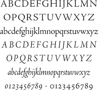
Like Bruce Rogers’ Centaur and Ronald Arnholm’s Legacy, Robert Slimbach’s Adobe Jenson is based on late-15th century types by the printer Nicolas Jenson; it is in my opinion the most successful in digital form. Jenson breathes the Venetian Renaissance: in its humanist strokes, low contrast and harmonious proportions lay scribal ideals. Despite a strong presence of the broadnib pen, it is a stately, quietly complicated font of supreme elegance.
Jenson is available as a multiple master font, which adjusts stroke weight and counter space as size is adjusted: larger text takes on a lighter stroke, and letterspacing is reduced."


Jenson · Bembo · Granjon · Elzevir · Caslon · Fleischmann · Baskerville · Fournier · Bell · Bulmer · Miller · Centaur · Perpetua · Janson · Electra · Fairfield · Dante · Aldus · Sabon · Albertina