Mostrar mensagens com a etiqueta designers de tipos. Mostrar todas as mensagens

22/01/2013

Erik Spiekermann _downloads

>
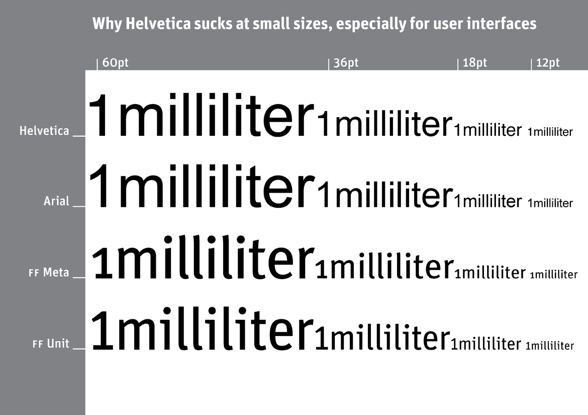
Why Helvetica sucks at small sizes, especially for user interfaces
by Erik
I have been suf­fer­ing from Typo­ma­nia all my life, a sick­ness that is incur­able but not lethal. The Spiekerblog reflects the fact that I see most things from a typo­graphic perspective. As most of what we find out about comes to us by typo­graphic media – i.e. vis­i­ble lan­guage – any­thing and every­thing may be reported.
Erik Spiek­er­mann, Decem­ber 2008

 fonte: http://spiekermann.com/en/downloads/

02/06/2012

Jean-Baptiste Levée

>
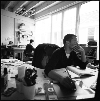
Après une formation en communication visuelle à l’école Estienne, Jean-Baptiste Levée (né en 1981) poursuit son cursus en intégrant la section de création typographique en 2002. Il y suit les cours de Franck Jalleau, Michel Derre & Margaret Gray. Il s’intéresse alors aux systèmes de ligatures et à la typographie en signalétique, tout en développant un goût pour les techniques traditionnelles d’impression. [Ler mais...]

 fontes:
http://www.jblt.co/about/bio
http://www.esad.pt/pt/eventos/esad-talks-jean-baptiste-levee


Photo © Pascal Béjean


…

19/04/2012

Mauro Zennaro

>
Mauro Zennaro è nato a Roma nel 1953.

Si occupa di grafica, calligrafia e type design.

Insegna presso l’Istituto d’istruzione superiore Carlo Urbani di Roma e presso l’Università per Stranieri di Perugia.

Ha scritto numerosi articoli sulla grafica, la scrittura e la didattica.

È stato tra i fondatori della rivista Calligrafia e nel comitato di redazione della collana di libri sulla grafica Scritture, pubblicata da Stampa Alternativa/Graffiti.

Suoi lavori manoscritti e a stampa, pubblicati dalle Edizioni dell’Elefante, sono stati esposti in numerosi musei e biblioteche europee e statunitensi.

È membro dell’Aiap–Associazione italiana progettazione per la comunicazione visiva.

fonte: http://www.scriptoria.it/maurozennaro.html


…


31/01/2012

Typotheque: Julien, geometric display typeface

>
Julien — the making of
by Peter Biľak

Julien is a playful geometric display typeface loosely inspired by the early 20th century avant-garde. It is based on elementary shapes and includes multiple variants of each letter. [Ler mais...]


Julien, geometric display typeface
by Peter Biľak

We are pleased to present a new typeface — Julien. It’s a playful geometric display typeface loosely inspired by the early 20th century avant-garde. It is based on elementary shapes and includes multiple variants of each letter (over 1000 glyphs per style), as well as intelligent OpenType scripts that select glyphs to create the best word shapes. Julien is a unicase typeface in which upper case and lower case letters are mixed together. [Ler mais...]


fontes:
http://www.typotheque.com/articles/julien-the_making_of
http://www.typotheque.com/blog/julien

 …

10/12/2011

Ricardo Santos

>
Ricardo Santos studied at António Arroio school and is graduated from IADE (Instituto de Artes Visuais, Design e Marketing), both in Lisbon, Master de Tipografia Avanzada - EINA (Escola de Disseny i Art) in Barcelona. He began his career as both a graphic designer and illustrator, and since 1997 has designed his own typefaces. He now works as a free-lance type designer and teaches at ESAD.CR in Caldas da Rainha. [ler mais...]

ABOUT VANARCHIV
Vanarchiv is an independent digital type foundry based in Lisbon, Portugal, directed by Ricardo Santos.
Vanarchiv develops and markets original text and display type fonts for both Mac and PC platforms. Vanarchiv typefaces are distributed by: Myfonts, Fountain and FontShop.

fonte: VANARCHIV

14/11/2009

Min Wang

© designboom


the beijing olympic games will begin on august 8, 2008 - and if it’s
not already the case, you can expect to see the game's iconography
on just about everything in the coming weeks. with such a massive
global audience guaranteed, the job of communicating the event
is no small task.

one of the people taking responsibility for this is min wang,
design director for the beijing 2008 olympic games. wang and his
team have been the creative force behind everything from street
banners to the olympic medals.

designboom recently spoke to him about his role.

past, present, future
I was born in china, where I also grew up and began my studies
before leaving for europe. I went to university of arts in berlin
and then the school of art at yale university in the US.
after studying, teaching and working in europe and the US for
over twenty years, I made the decision to come back to china
to focus my work on two things: design education and
design for the 2008 beijing olympic games. [Ler mais...]


about min wang
min wang was born in china, 1956. he completed his BA in art
at zhejiang academy of fine arts (now the china academy of
fine arts) before studying in berlin and then later achieving
an MFA at yale university school of art in 1986.
since graduating from yale he has worked at adobe systems
where he developed digital kanji typefaces (japanese fonts).
later he worked at a graphic design studio in connecticut,
while continuing in his roles as graphic designer, art director
and design manager in the creative services division at adobe
systems. in 1998, wang left adobe to form square two design
with eddie lee and the consultancy now has offices in
san francisco and beijing. in 2003 wang was appointed as
the dean of the school of design, at china central academy of
fine arts (CAFA) in beijing. after the creation of the art research
centre for the olympic games (ARCOG) at CAFA, wang became
the design director for the beijing 2008 olympic games.

[Ler mais...] > designboom
30/07/2009

Jean François Porchez

>
This month marks the second anniversary of our acclaimed series of interviews. Thank you all for your compliments and encouragements! We celebrate the event with a lengthy interview conducted in French (don't worry — we did translate it)…

Ever since he vaulted onto the type scene fifteen years ago with a series of widely visible and award-winning typefaces, Jean François Porchez has been among the most prominent type designers in France. He designed custom type for clients ranging from the Baltimore Sun to Louis Vuitton and the Paris Métro, and drew some of the best-known logos in his country. He has been with MyFonts since our first year and has recently made available several more of his spectacular font families. Meet Jean François Porchez, our man in Paris.

[Ler mais...] > Creative Characters is the MyFonts newsletter dedicated to people behind the fonts.

05/03/2009

Hannes von Döhren


Hannes von Döhren was born in Berlin/Germany in 1979. After completing his studies (graphic design) in 2005, he worked in an advertising agency in Hamburg/Germany. Since 2007 he has been working as a freelancing graphic designer in Berlin, which allows him to spend some of his time developing fonts as well.

[Ler mais...] > hvdfonts.com

14/02/2009

Josef Müller-Brockmann

From Wikipedia, the free encyclopedia

Josef Müller-Brockmann, (May 9, 1914 – August 30, 1996), was a Swiss graphic designer and teacher. He studied architecture, design and history of art at both the University and Kunstgewerbeschule in Zurich. In 1936 he opened his Zurich studio specialising in graphic design, exhibition design and photography. From 1951 he produced concert posters for the Tonhalle in Zurich. In 1958 he became a founding editor of New Graphic Design along with R.P. Lohse, C. Vivarelli, and H. Neuburg. In 1966 he was appointed European design consultant to IBM. Müller-Brockman was author of the 1961 publications The Graphic Artist and his Design Problems, Grid Systems in Graphic Design where he advocates use of the grid for page structure, and the 1971 publications History of the Poster and A History of Visual Communication.

He is recognised for his simple designs and his clean use of typography, notably Akzidenz-Grotesk, shapes and colours which inspires many graphic designers in the 21st century. Many of his works can be found on the gallery Blanka. [Ler mais...]


Links:
A conversation with Josef Müller-Brockmann
by Yvonne Schwemer-Scheddin
eyemagazine.com

…

11/01/2009

The Graphic Design of Peter Saville

"Saville's method, then as now, lies in fixing on a style or look slightly ahead of popular taste. He achieves the sort of ambiguity and complexity of resonance more usually associated with art," writes Rick Poynor in his essay.


The legendary cover of the New Order single Blue Monday (1983) and the sleeve of the Joy Division album Unknown Pleasures (1979), were to bring the Manchester graphic designer Peter Saville worldwide renown. Using a reduced, Modernist style Peter Saville has made key innovations in the field of visual communications, and in recent times he has had a profound effect on the interplay between art, design and advertising.

Born in Manchester in 1955, Saville was brought up in the affluent suburb of Hale. Having been introduced to graphic design with his friend Malcolm Garrett by Peter Hancock, their sixth form art teacher, Saville decided to study graphics at Manchester Polytechnic from 1974 to 1978. At the time Saville was obsessed by bands like Kraftwerk and Roxy Music, but Garrett encouraged him to discover the work of early modern movement typographers such as Herbert Bayer and Jan Tschichold. He found their elegantly ordered aesthetic more appealing than the anarchic style of punk graphics. Tschichold was the inspiration for Saville’s first commercial project, the 1978 launch poster for The Factory, a club night run by a local TV journalist Tony Wilson whom he had met at a Patti Smith gig. Having long admired the ‘found’ motorway sign on the cover of Kraftwerk’s Autobahn, the first album he bought for himself, Saville based the Factory poster on a found object of his own – an industrial warning sign he had stolen from a door at college. [Ler mais...]

…

23/09/2008

An Interview with Cyrus Highsmith

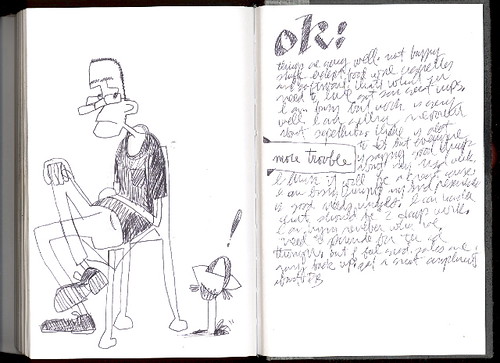
Cyrus Highsmith is a Senior Designer at the Font Bureau in Boston and faculty member at Rhode Island School of Design. He has been called "one of the truly original new voices in American type design" on account of his vast range of new typefaces, alongside numerous revivalist projects. I met Cyrus while at RISD and he has since left a lasting impression on my approach to typography and type design. Cyrus was kind enough to answer a few questions for us, sharing some insight into his type filled world.

Christian Palino: With so many typefaces being designed every year, last year Stephen Coles noted at least 1,800 new commercial typefaces for 2006, what is the criterion of "good" type design? Do you think that criterion is different today than it was for someone like W. A. Dwiggins?

Cyrus Highsmith: I look at typefaces in the context of their intended use. The spring semester at RISD is about to start and I will be teaching my type design elective. The students can draw whatever kind of typeface they want to, but they have to define the kind of document it will be used in and how their typeface will be used. The more specific they can be, usually the better the semester goes, and the better the results. Without this context, it is hard to say very much about a typeface. I think this was true in the old days also.

To me, the really interesting question now is what is the effect of 1800 new typefaces a year on the reader? Not only are readers exposed to all these different typefaces, they are being exposed to more different kinds of typefaces. I wonder what effect this is having. It is making readers more sensitive to typography or less sensitive? or both?

CP: Its a good question, certainly if the reader is bombarded with more and more typefaces then one could generalize that the sensitivity to type becomes duller, but that doesn't account for variety. And what about quality, that must have an effect on the reader as well. How do you answer these questions?

CH: My focus is working with the typographers who are choosing and setting the type, and to a lesser extent working with the engineers who are designing the type setting systems. The type designer is just one small part of the process of creating a document. In the big picture, I just want people to keep reading. If typography gets so bad that literacy rates actually go down, then we are in trouble.

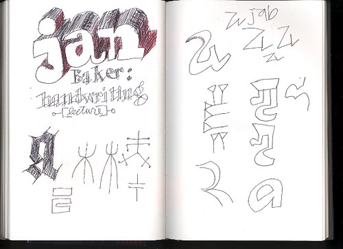
CP: On one of your sketchbook pages there is a note about "Jan Baker: handwriting" which reminded me of John Hegnauer's penmanship and how emphatic he was about the importance of good handwriting. Any thoughts on this?

CH: I am writing my responses for this interview by hand. Later, I will type them. (or actually, now I am typing them). The reason for this is that when I write by hand, and I can see the pencil or pen marking the marks on the page, all these different parts of my brain light up. Ideas flow better. I remember what I write by hand longer. So for me, handwriting is an important thing. However, I don't have very good handwriting in a traditional sense! If I sit down and focus, I can do pretty nice lettering. But that is a different kind of thing for me. [Ler mais...]


FB Stainless _fonts.com

>
Like so many typefaces, the 
Stainless™ design grew out of experimentation. While drawing in his sketchbook one day, Cyrus Highsmith began to rough out a serifless version of his slab serif design, Dispatch™. As he drew strokes and counters, he realized that he had the beginnings of an original family – with its own strong character and identity – not just a sans serif partner for Dispatch. The final Stainless design was chosen as the new branding typeface for Premiere magazine.Highsmith designed three display weights for the project: Ultra Thin, Thin and Ultra Light.

Highsmith, senior type designer at Font Bureau, is no stranger to magazine type design. Martha Stewart Living, The Source, MensHealth and many other publications contain his typefaces. However, magazine type design isn’t Highsmith’s sole focus. He considers himself above all a draftsman. He draws calligraphic scripts and industrial-strength sans serif faces (like Stainless) with equal ease.

Stainless is now a full family of 35 designs. Weights range from a precise Ultra Thinto a full-bodied Black. Italics, condensed, compressed and even a suite of extendeddesigns complete the family. Square shoulders and clipped terminals give Stainless a sophisticated demeanor that stands out from the crowd. If you are looking for a distinctive – and exceptionally versatile – sans, Stainless just might be the family for you. [Ler mais...]


17/09/2008

An Interview with Zuzana Licko

Stephen Coles | September 29, 2005

Zuzana Licko co-founded Emigre — one of the first independent digital type foundries — in 1984. This interview with Licko was conducted on the eve of Emigre’s 15th anniversary in 1998.

How do you get ideas for new typeface designs?

Most of my inspiration comes from the particular medium that I’m involved with at the time. I search out a problem that needs to be addressed or a unique result that a production method can yield.

For example, my interest in making type was initiated by my need for unique and more effective fonts than those originally available for the Macintosh computer screen and dot matrix printer in 1984. As graphic designers, we also enjoyed the new found ability to test and implement the faces directly within our design work. Initially I was designing typefaces exclusively for use in Emigre magazine, but as other designers expressed interest in using them as well, we formed Emigre Font in 1986. [Ler mais...]

Emigre Lo-Res Narrow FontEmigre Modula FontEmigre-Base-9-FontEmigre Mrs Eaves Ligatures
Whirligig


15/09/2008

Black Slabbat _YouWorkForThem

Designed by Stefan Kjartansson
Styles: Regular, Alternative

There’s only one thing about this new typeface that isn’t colossally black: the razor-thin white space. It slices through and between geometric characters, creating a juxtaposition of contrasts and rhythms. Typeface delivered in OpenType format.


07/08/2008

FF Meta Serif _FontShop

It took three years and three designers to develop FF Meta® Serif. All through the ’90s, Erik Spiekermann made several attempts at designing a counterpart for his groundbreaking FF Meta®. Fans of Meta frequently asked him which serif face would best complement it. He recommended Swift™, Minion™, FF Clifford™, and others, until he realized that he should just buckle down and draw his own serif Meta. True to his principle of collaboration, Spiekermann enlisted the help of accomplished type designers Christian Schwartz and Kris Sowersby. [Ler mais...]


Download Overview of FF Meta Serif Packages  540KB PDF

29/07/2008

Sibylle Hagmann _Kontour

Kontour is a design studio in Houston, Texas. It was founded by Sibylle Hagmann in 2000. It is committed to non-profit projects. The client list includes the MFAH, Museum of Fine Arts Houston; the Dallas Museum of Art, Dallas; the Fisher Gallery of the University of Southern California, Los Angeles, among others.

Most type design project are client independently initiated, but feed often back into client driven assignments. [Ler mais...]


Odile was among the awarded projects in the 2006 Swiss Federal Design Grants, "Selected — Awarded", of the Swiss Federal Office of Culture. [Download pdf specimen (620 kb]

The Cholla™ type family was published in Experimental Typography, edited by Teal Triggs, Thames & Hudson, 2003.

Kontour was commissioned to submit a proposal for a new typeface design for use in the Twin Cities Design Celebration (TCDC) in Minneapolis/St.Paul in 2003.


11/06/2008

Jan Tschichold

Jan Tschichold, Leipzig
1902–1974
german type designer, calligrapher, typographer, author and teacher; einer der Wortführer der Bauhaus-Epoche
(most famous font: Sabon-Antiqua)