Mostrar mensagens com a etiqueta A. Mostrar todas as mensagens

22/01/2013

Erik Spiekermann _downloads

>
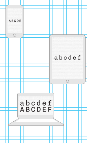
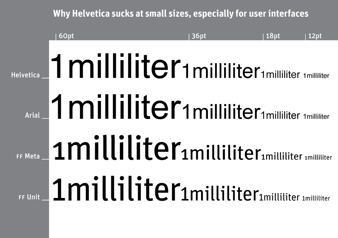
Why Helvetica sucks at small sizes, especially for user interfaces
by Erik
I have been suf­fer­ing from Typo­ma­nia all my life, a sick­ness that is incur­able but not lethal. The Spiekerblog reflects the fact that I see most things from a typo­graphic perspective. As most of what we find out about comes to us by typo­graphic media – i.e. vis­i­ble lan­guage – any­thing and every­thing may be reported.
Erik Spiek­er­mann, Decem­ber 2008

 fonte: http://spiekermann.com/en/downloads/

15/01/2013

The Unicode Consortium

>
Welcome!
The Unicode Consortium enables people around the world to use computers in any language. Our freely-available specifications and data form the foundation for software internationalization in all major operating systems, search engines, applications, and the World Wide Web. An essential part of our mission is to educate and engage academic and scientific communities, and the general public. [Ler mais...]


Acclaim for Unicode

“The world is a global village, trade crosses language barriers, and yet every one of us likes to feel comfortable within their own mother tongue. Unicode enabled us to give the local sense to every one of our users, while connecting the world of trade—which is the reason we will support Unicode in all of our products.”
—shai agassi, former Member SAP Executive Board

fonte:
http://www.unicode.org/
http://www.unicode.org/announcements/quotations.html#moro

14/01/2013

Unicode and Multilingual File Conversion

>
Alan Wood
Created 26th December 2001
Last updated 23rd December 2004

Unicode and Multilingual File Conversion, Font and Keyboard Utilities for Macintosh OS X Computers 

Introduction 
Mac OS X 10 did not originally include support for as many languages and scripts as Mac OS 9. Mac OS X 10.1 supported Central European, Cyrillic and Japanese, and Korean, Simplified Chinese and Traditional Chinese were made available as downloads. Mac OS X 10.2 introduced support for Arabic, Devanagari, Greek, Gujarati, Gurmukhi, Hebrew and Thai scripts. Mac OS X 10.3 introduced support for Armenian, Unified Canadian Aboriginal Syllabics and Cherokee scripts. 

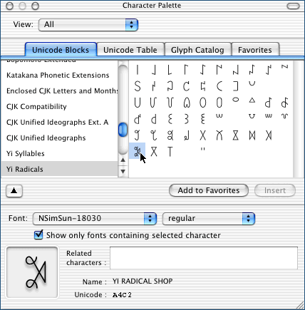
Character Palette 
Character Palette is a character map for Unicode 3.2 (including supplementary planes) that is supplied with Mac OS X 10.2. It is available on the Keyboard menu, not in the Applications folder. Character Palette can arrange characters by Unicode range, or display them in a table. It can show you a catalogue of the characters in a font, and a list of the fonts that contain a selected character. Characters can be inserted into another application by double-clicking them, or by dragging them, or by selecting them and then clicking the “Insert” button.

Character Palette can also display Japanese, Simplified Chinese and Traditional Chinese by radical or by category. [Ler mais...]

fonte: http://www.alanwood.net/unicode/utilities_fonts_macosx.html

Yi Syllables from NSimSun-18030, in Character Palette under Mac OS X


20/11/2012

Good design - Oliver Reichenstein

>
Good design is invisible: an interview with iA's Oliver Reichenstein
By Sam Byford on July 24, 2012 01:00 pm

Oliver Reichenstein is the founder and director of Information Architects, the Tokyo, Zurich, and Berlin-based design agency. iA's usual trade is website design and consultancy along with the odd concept like the Twitter strikethrough, but the company has also found recent success in iOS and Mac app development. Writer for iPad is a pioneering minimalist text editor, and its focus-enhancing combination of sparse visuals and refined typography has since made the leap to OS X and the iPhone.

Reichenstein recently took the time to answer some of my questions on design and development. Since iA's work is informed by its presence in Europe and Asia, I wanted to know his thoughts on the differences between the two, and in particular where he sees the state of Japanese design right now. After all, for anyone who's visited a cluttered Japanese website recently, the tasteful and restrained work put out by iA would seem to be entirely out of step with the agency's Tokyo base. Read on for Reichenstein's thoughts on why this is, as well as typography, user interface design, influences, and more — he has a lot to say.

Sam Byford: Where are you right now, and what are you doing? 
Oliver Reichenstein: I’m in Switzerland. My wife and I decided to move from Japan after the earthquake, because we deemed a triple meltdown two car hours away from Tokyo too insecure for our 3 year old boy. It’s too early to tell whether we were right or wrong, but I think it was the right decision, if only for peace of mind. Since we have offices in Zurich and Berlin, and most of our clients are European, it was not a big business risk. Actually, this has been our best year so far, and it has helped me being closer to our main clients. [Ler mais...]

(...)

"HARDLY ANYONE CAN DISCERN GOOD FROM BAD TYPOGRAPHY, BUT EVERYBODY CAN FEEL IT"

(...)


fonte: http://www.theverge.com/2012/7/24/3177332/ia-oliver-reichenstein-writer-interview-good-design-is-invisible

17/11/2012

Musée de l'imprimerie Lyon

>
Le Musée de l'imprimerie : présentation et historique Le musée de l'Imprimerie est un des musées de Lyon dont les missions principales sont d'enrichir, de conserver, de documenter et de valoriser auprès de divers publics le patrimoine livresque et graphique. [Ler mais...]

Corpus Typographique Français 150 ans de lettres en France

Le Corpus typographique français recense les polices de caractères dessinées en France entre 1850 et aujourd’hui. Il se veut une illustration de la création française dans ce domaine. Il n’a pas pour but d’être exhaustif mais représentatif : s’y côtoient des grands classiques et des créations plus obscures, des caractères de labeur « sérieux » et de la « titraille » fantaisiste, des créations de haute volée mais, aussi, des caractères médiocres, voir mauvais, car l’histoire de la typographie en comporte également. [Ler mais...]

fonte: http://www.imprimerie.lyon.fr/imprimerie/sections/fr/musee# 
http://www.imprimerie.lyon.fr/imprimerie/sections/fr/documentation/corpus

…

31/01/2012

Typotheque: Julien, geometric display typeface

>
Julien — the making of
by Peter Biľak

Julien is a playful geometric display typeface loosely inspired by the early 20th century avant-garde. It is based on elementary shapes and includes multiple variants of each letter. [Ler mais...]


Julien, geometric display typeface
by Peter Biľak

We are pleased to present a new typeface — Julien. It’s a playful geometric display typeface loosely inspired by the early 20th century avant-garde. It is based on elementary shapes and includes multiple variants of each letter (over 1000 glyphs per style), as well as intelligent OpenType scripts that select glyphs to create the best word shapes. Julien is a unicase typeface in which upper case and lower case letters are mixed together. [Ler mais...]


fontes:
http://www.typotheque.com/articles/julien-the_making_of
http://www.typotheque.com/blog/julien

 …

02/06/2009

¿Que es Carácter Tipográfico?

>
"Carácter tipográfico es un lugar para todos aquellos que gustan, entienden u otorgan un valor importante a la tipografía y a la letra en general. Es un medio digital a partir del cual proponemos informar o participar en la creación de una cultura tipográfica en castellano. Queremos convocar inteligencias y voluntades, muchas o pocas, en torno a una representación de nuestra época: vivimos una era interesante para la letra y la cultura impresa; los medios digitales, lejos de sustituirlas por otra cosa, las transforman y desarrollan."

fonte: Carácter Tipográfico

19/04/2009

Petit guide de typographie

Eric Martini

Quand et comment abréger,
où mettre des capitales,
quels caractères choisir,
qu'est-ce qu'un sigle,
comment utiliser les espaces…

En accord avec l’éditeur, l’auteur, Eric Martini, reprend ici la quasi-totalité des recommandations présenté dans le Petit Guide de typographie (Editions Glyphe. Deuxième édition, 2008).

Le livre – plus facilement consultable, annotable – est disponible en librairie et sur le site de l’éditeur: Petit guide de typographie

L’auteur
Eric Martini dirige l’entreprise Glyphe, qu’il a créée en 1999. Au sein des Editions Glyphe, il corrige les textes et conseille les auteurs dans la présentation de leurs manuscrits. [Ler mais...]
fonte: Editions Glyphe

…

21/03/2009

Um Século em Cartaz

>
Lúcia Bergamaschi Costa Weymar
Universidade Federal de Pelotas e Pontifícia Universidade Católica do Rio Grande do Sul.

Resumo: Este artigo resulta de uma proposta pedagógica acerca de design gráfico.
A proposta em questão é de caráter teórico e prático e propõe uma retrospectiva a propósito de alguns designers nacionais e internacionais que contribuíram para a história do design gráfico moderno e pós moderno. A partir desta teoria, os alunos projetaram cartazes homenageando tais designers e o resultado deste projeto, bem como a metodologia e a avaliação de todo este processo, estabelece o desenvolvimento deste texto.

Palavras-Chave: história do design gráfico moderno e pós-moderno 1. cartaz 2. ensino da comunicação visual 3. comunicação e cultura 4.

(...)
2.2) Design Gráfico Pós-Moderno
2.2.1) Origens do Design Gráfico Pós-Moderno

Segundo Cauduro, na metade dos anos 1960 a monotonia e pasteurização do design ocidental começam a ser contestadas com Odermatt & Tissi em Zurique e Wolfgang Weingart em Basel: “(...) alternativas não-dogmáticas e mais descontraídas (retorno à ornamentação, ao simbolismo, ao humor e à improvisação) para fugir da esterilidade das formas modernistas” (CAUDURO, 1998, p. 79) passam a ser incluídas. Para o autor, citando Keedy, design pós-moderno é reação e não rejeição ao design moderno. Os pós-modernistas reagem aos excessos racionalistas e positivistas da modernidade. Como influências para estas mudanças podem ser lembradas as novas formas de viver dos existencialistas e beatniks dos anos 1950 e hippies dos anos 1960. É importante destacar que nesse momento surge o movimento psicodélico no design americano de contracultura. Cauduro5 aponta que este estilo pode ser considerado como apropriação (como veremos adiante com Poynor) e radicalização da Op-Art: estilos revividos, história reciclada, progresso material desprezado, valorização do inconformismo, da intuição e do subjetivismo. Podemos ainda lembrar o revivalismo dos estilos vitoriano, do Art Nouveau e do Art Déco, destacando então os designers Milton Glaser e Herb Lubalin com seu autoproclamado expressionismo, onde funde tipos com pictogramas inspirados no vernacular.

2.2.2) Estética Logocentrista
A metafísica logocêntrica da presença, ou logocentrismo, é aquela posição filosófica
pela qual a fala tem sido sempre vista como sendo a única conexão verdadeira que
temos com o nosso pensamento, a escrita sendo apenas uma mera técnica para
representá-la. (Cauduro, 1998, p. 84)
Creio ser pertinente trazermos a nossa reflexão as pontuações realizadas por Cauduro
acerca do confronto de idéias entre Saussure e Derrida6 no que se refere à escrita. Saussure a
via como servil à fala, essa sim ligada ao pensar. Acreditava até que ela poderia ser maléfica
e perigosa já que muitas vezes infiel ao pensamento. Derrida, em contrapartida, definia a
escrita como um signo a mais, não apenas uma notação representativa da fala, mas uma
diferença. Ele se perguntava onde estava o perigo, porque a escrita vem sendo condenada a
uma distância, a uma invisibilidade? Cauduro avança o confronto passando então a criticar
um autor contemporâneo, o inglês McLean, que defende que o propósito do design
tipográfico é o comunicar palavras concebidas na mente de alguém, destituindo de sua
abrangência toda e qualquer imagem que não a formada por tipos, uma prática absurdamente
anacrônica em se considerando que as vanguardas do design em décadas passadas já haviam
refutado estes postulados7.
O design tipográfico pós-moderno não é excludente tal como todas as outras
manifestações das artes visuais contemporâneas, já que é abrangente e inclusivo. A condição
pós-moderna supõe que a transparência sobrevive, e em muitos casos deve permanecer, mas
não mais privilegia apenas o conteúdo verbal da estética logocêntrica, pois o estímulo à
inovação e à experimentação já é uma conquista centenária.

2.2.3) Retórica Tipográfica e Tipografia Digital
Em relação à retórica, Cauduro nos ensina que a tipografia clássica “é apenas uma das
variantes retóricas que a escrita tipográfica, ou o design tipográfico, melhor dizendo, pode
assumir na prática (...) ela não é toda a tipografia (...)”. O autor analisa que a tipografia
clássica é adequada “para manter o mito da autoridade” e conclui que “esta retórica
tipográfica da invisibilidade (...) é a face gráfica, visível, do logocentrismo”. (CAUDURO,
1988, p. 95)
O autor afirma que hoje
é o computador que propiciará o rejuvenescimento, uma vez mais, do design
tipográfico, como preconizado pelos futuristas, dadaístas e surrealistas, permitindo o
retorno do jogo e do acaso, fatores anteriormente oprimidos pelos funcionalistas do
design, mas que agora emergem, e são cada vez mais valorizados, graças aos
incríveis resultados gerados pelas novas tecnologias digitais de criação e produção
visuais
(Cauduro,1998, p.99).
Em outro artigo, Cauduro classifica a tipografia digital hoje em: fontes bitmap ou
pixeladas, fontes techno, fontes revival ou retro, vernaculares, informais e idiossincráticas,
grunges, randômicas, híbridas, fontes de artifício e dingbats. (CAUDURO, 2002, p. 1-1)
(pp. 5)

referencias:
5 CAUDURO, 2000, p. 127-139.
6 CAUDURO, 1998, p. 81-85.
7 CAUDURO, 1998, p. 81-93.
Typography as Discourse

>
McCoy, Katherine, with David Frej, 'Typography as Discourse', ID Magazine, New York, March/April 1988, pp. 34-37.

The recent history of graphic design in the U.S. reveals a series of actions and reactions. The fifties saw the flowering of U.S. graphic design in the New York School. This copy-concept and image-oriented direction was challenged in the sixties by the importation of Swiss minimalism, a structural and typographic system that forced a split between graphic design and advertising. Predictably, designers in the next decade rebelled against Helvetica and the grid system that had become the official American corporate style.

In the early seventies, Robert Venturi's Complexity and Contradiction in Architecture emerged alongside the study of graphic design history as influences on American graphic design students. Simultaneously, Switzerland's Basel school was transformed by Wolfgang Weingart's syntactical experimentation, an enthusiasm that quickly spread to U.S. schools. Academia's rediscovery of early 20th century Modernism, the appearance of historicized and vernacular architectural postmodernism and the spread of Weingartian structural expressionism all came together in the graphic explosion labeled as New Wave.

Shattering the constraints of minimalism was exhilarating and far more fun than the antiseptic discipline of the classical Swiss school. After a brief flurry of diatribes in the graphic design press, this permissive new approach quickly moved into the professional mainstream. Today, however, the maverick has been tamed, codified into a formalistic style that fills our design annuals with endlessly sophisticated renditions. What was originally a revolution is now an institution, as predictable as Beaux Arts architecture. It is the new status quo-- the New Academy, as Phil Meggs calls it.

Determining whether New Wave is postmodernism or just late Modernism is important in understanding new work today. New Wave extends the classical Swiss interest in structure to dissections and recombinations of graphic design's grammar. Layered images and textures continue the collage aesthetic begun by Cubism, Constructivism, and Dada. But the addition of vernacular imagery and colors reflects postmodern architecture's discovery of popular culture, and the reintroduction of the classic serif typefaces draws on pre-20th century history. Taken as a whole, however, New Wave's complex arrangements are largely syntactical, abstracting type and images into baroquely Modern compositions.

The New Academy's knowing, often slick iterations have left some graphic designers dissatisfied. As a result, long neglected design elements, such as semantic expression in form, text and imagery, are beginning to resurface. Much of this recent work steps outside the lineage of Bauhaus/ Basel/ New Wave, and not surprisingly, some of its practitioners come from fine art, photographic or literary backgrounds rather than graphic design training.

When one looks for experimental typography today, what one finds is not so much new typography, as new relationships between text and image. In fact, the typography so celebrated over the past ten years of structuralist dissection is disappearing. The look and structure of the letter is underplayed and verbal signification, interacting with imagery and symbols, is instead relied upon. The best new work is often aformal and sometimes decidedly anti-formal, despite the presence of some New Wave elements. Reacting to the technical perfection of mainstream graphic design, refinement and mastery are frequently rejected in favor of the directness of unmannered, hand-drawn or vernacular forms-- after all, technical expertise is hardly a revelation anymore. These designers value expression over style.

Here on the edges of graphic design, the presence of the designer is sometimes so oblique that certain pieces would seem to spring directly from our popular culture. Reflecting current linguistic theory, the notion of "authorship" as a personal, formal vocabulary is less important than the dialogue between the graphic object and its audience; no longer are there one-way statements from designer. The layering of content, as opposed to New Wave's formal layering of collage elements, is the key to this exchange. Objective communication is enhanced by deferred meanings, hidden stories and alternative interpretations.

Sources for much current experimentation can be traced to recent fine art and photography, and to literary and art criticism. Influenced by French post-structuralism, critics and artists deconstruct verbal language as a filter or bias that inescapably manipulates the reader's response. When this approach is applied to art and photography, form is treated as a visual language to be read as well as seen. Both the texts and the images are to be read in detail, their meanings decoded. Clearly, this intellectualized communication asks a lot of its audience; this is harder work than the formal pleasures of New Wave.

Much new typography is very quiet. Some of the most interesting, in fact, is impossible to show here because of its radically modest scale or its subtle development through a sequence of pages. Some is bold in scale but so matter-of-fact that it makes little in the way of a visual statement. (One designer calls these strictly linguistic intentions "nonallusive" typography.) Typefaces now range from the classics to banal, often industrial sans serifs. Copy is often treated as just that-- undifferentiated blocks of words-- without the mannered manipulations of New Wave, where sentences and words are playfully exploded to express their parts. Text is no longer the syntactic playground of Weingart's descendants.

These cryptic, poker-faced juxtapositions of text and image do not always strive for elegance or refinement, although they may achieve it inadvertently. The focus now is on expression through semantic content, utilizing the intellectual software of visual language as well as the structural hardware and graphic grammar of Modernism. It is an interactive process that-- as art always anticipates social evolution-- heralds our emerging information economy, in which meanings are as important as materials.

fonte:  High Ground Design.

…

20/03/2009

Classification Vox-AtypI

Polices de caractères

Des commentaires de polices très sérieux, enrichis de définitions pour les néophytes et d'illustrations pour vos beaux yeux ?
Cliquez à votre guise :

Banco
Baskerville
Bodoni
Caslon
Cheltenham
Cochin
Didot millimétrique
Galliard
Garamond
Garamont de l'Imprimerie nationale
Gauthier de l'Imprimerie nationale
Gill
Grandjean de l'Imprimerie nationale
Helvetica
Jaugeon
Marcellin Legrand de l'Imprimerie nationale
Luce de l'Imprimerie nationale
Optima
Peignot
Times
Univers
Vendôme
Walbaum


Familles de caractères
Classification Vox-AtypI
C'est Francis Thibaudeau qui, le premier en 1921, eu l'idée de regrouper certains caractères présentant des caractéristiques communes établies selon certains critères formels principalement liés aux empattements. Il classa ainsi les caractères en quatre familles : bâton ou antique, didot, égyptienne, elzévir.

Cette répartition, insuffisante pour concerner l'ensemble de la production graphique, fut complétée en 1954 par Maximilien Vox avec une répartition en neuf familles tenant compte de l'architecture générale des lettres et de détails historiques : manuaire, humane, garalde, réale, didone, mécane, linéale, incise, scripte. Il fallut attendre l'addition de deux familles, fractur et orientale, proposées par l'AtypI (Association Typographique Internationale) en 1962, pour parvenir aux onze familles de la classification Vox-AtypI.

Cette classification, adoptée par toute la profession du monde des Arts et Industries graphiques, permet de faire entrer dans une de ces familles tous les caractères actuellement sur le marché ou, tout au moins, par le principe d'addition de définitions, de pouvoir décrire tous les caractères.

Bien entendu certains caractères dessinés pour le titrage ou pour des amusements typographiques peuvent en être exclus.

Manuaires
Humanes
Garaldes
Réales
Didones
Mécanes
Linéales
Incises
Scriptes
Fraktur
Orientales

[Ler mais...]

Affaire-esperluette, 2003. Tous droits réservés.

18/03/2009

Tipografía vernacular:

La revolución silenciosa de las letras del cotidiano

Vera Lúcia Dones*

Este artigo pretende fazer um registro da tipografia
vernacular e de algumas expressões gráficas de letristas
anônimos da região metropolitana de Porto Alegre. A
complexidade de estéticas gráficas visuais dos últimos
50 anos testemunha a superação de modelos universais
da tipografia aplicada à comunicação gráfica. As reflexões
que seguem procuram evidenciar a proliferação
de sincretismos e da união de elementos gráficos díspares
nas construções imagéticas, as formas autênticas e
arcaicas permeiam o sofisticado e tecnológico do design
gráfico atual.
Em se tratando de legibilidade da tipografia aplicada
ao design gráfico, sabemos que na perspectiva moderna,
a legibilidade era tida como o resultado de uma série
de atributos e critérios fixos aplicados ao texto, com
base em normas criadas a partir de pesquisas óticas-funcionais,
as “regras” tipográficas. Esses referenciais
não consideravam as conotações culturais dos caracteres,
e tampouco entendiam o design como parte de
uma cultura cada vez mais complexa e diversa. A partir
dos anos 70 os textos pós-estruturalistas invadiram
algumas escolas norte-americanas de design, dentre
elas a Cranbrook Academy, vindo a constituir-se em
rico material de reflexão e sustentação teórica para os
projetos gráficos dos alunos. Segundo Lupton (1991), os
primeiros passos no caminho do design pós-estruturalista
se deve à escola de Detroit. As peças gráficas eram
produzidas como signos visuais e verbais e explorados
através de seus múltiplos significados.
A desconstrução tipográfica passou, igualmente, pela
Escola da Basiléia com Wolfgang Weingart. Voz
alternativa na Suíça dos anos 70, Weingart defendeu o
enfoque experimental na tipografia. Suas experimentações
tipográficas de alguns letristas na região metropolitana de Porto
Alegre, e de que forma o imaginário da cultura popular
serve de inspiração à criação dos designers gráficos.
(pp.109-110)

* Graduada em Artes Plásticas, Mestre em Comunicação
Social, Centro Universitário Feevale.


fonte:
Actas de Diseño 1. Facultad de Diseño y Comunicación. Universidad de Palermo. pp. 23-164. ISSN 1850-2032

16/03/2009

Designingwithtype.com

by James Craig

Designingwithtype.com is a web site devoted to the art and appreciation of typography. It offers a unique typographic resource for students, educators, and professionals, showcasing talent from around the world. [Ler mais...]

(...)
There are many excellent ways of teaching the history of graphic design. One of the better ways, though this is not always possible, is to integrate the history of graphic design with the other arts — painting, literature, music — and with major political and cultural events of the time. The following timelines are from James Craig's book Thirty Centuries of Graphic Design and cover just a few of the highlights between 30,000 BC and 1990 AD, the year book was published.

1000 BC – 500 AD

500 – 1300

1300 – 1400

1400 – 1500

1500 – 1600

1600 – 1700

1700 – 1800

1800 – 1900

1900 – 1920

1920 – 1940

1940 – 1960

1960 – 1990


(...)

Prehistoric Pictograph
Cuneiform, ca 3100 B.C.
 
Egyptian Hieroglyphics
Early Latin. ca.700 B.C.
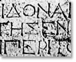
Ionic Greek adopted in 403 B.C.
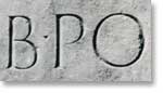
Trajan Inscription A.D. 114
[Ler mais...] > Timelines 

(...)
Items of Interest
The following is an assortment of all things typographic. It will be of interest to anyone who loves typography and is curious about the history of graphic design and the evolution of the printed word. 

…

07/03/2009

15/02/2009

Text Treatment and the User Interface

By Tobias Komischke
Published: January 22, 2009


“Much of the information user interfaces present is textual. Therefore, we should not underestimate how the right text treatment can measurably improve user productivity and increase user satisfaction.”

Before graphic user interfaces, text was the primary means of both input and output defining human-computer interactions. Even today, much of the information user interfaces present is textual. Therefore, we should not underestimate how the right text treatment can measurably improve user productivity and increase user satisfaction. As new technologies become available—for example, larger monitors with higher resolutions—a good foundation of knowledge about effective text treatment can help designers create usable user interfaces for them more quickly.

Font Type

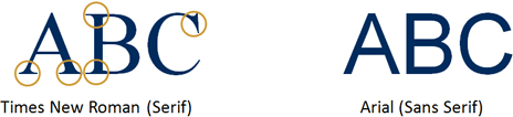
Content developers have hundreds of serif and sans serif fonts at their disposal. Serifs are small lines at the ends of the main strokes of characters. Serif fonts improve readability in continuous text, because the serifs help readers to structure and discriminate characters [1]. Times New Roman, for example, is a serif font, as Figure 1 shows. Typically, newspapers, magazines, and books use serif fonts.

Figure 1—Examples of serif and sans serif fonts

Serif and sans serif fonts


“On computer screens, sans serif fonts are preferable, because relatively low screen resolutions…make serif fonts look fuzzier, especially in small sizes.”

[Ler mais...] > UXmatters > 


References

[1] Wheeler, Susan G., and Gary S. Wheeler. TypeSense: Making Sense of Type on the Computer. Boston: International Thompson Computer Press, 1996.
[2] Dul, Jan, and Bernard Weerdmeester. Ergonomics for Beginners. Oxford: Taylor & Francis, 1993.
[3] Arditi, Aries, and Jianna Cho. “Letter case and text legibility in normal and low vision.” Vision Research: September, 2007.
[4] Watzmann, Suzanne. “Visual Design Principles for Usable Interfaces,” in The Human-Computer Interaction Handbook, ed. Andrew Sears and Julie A. Jacko. New York: Lawrence Erlbaum Associates, 2008.
[5] Byrne, Michael D. “Reading Vertical Text: Rotated vs. Marquee,” in Proceedings of the Human Factors and Ergonomics Society 46th Annual Meeting. Santa Monica, CA: Human Factors and Ergonomics Society, 2002.
[6] ISO 9241-3. Ergonomic requirements for office work with visual display terminals (VDTs)—Part 3: Visual display requirements. Geneva: International Organization for Standardization, 1992.
[6] Grandjean, Etienne. Ergonomics in Computerized Offices. New York: Taylor & Francis, 1986.
[8] Kroemer, Karl H.E., and Anne D. Kroemer. Office Ergonomics. New York: Taylor & Francis, 2001.

…

29/01/2009

Jorge Bacelar _livros e artigos.pdf

Livros Labcom


bocc
Biblioteca On-line de Ciências da Comunicação

Apontamentos sobre a história e desenvolvimento da impressão
[ PDF 29 KB ] - Jorge Bacelar, 1999

Designarcisismo
[ PDF 21 KB ] - Jorge Bacelar, 1999

Elegia ao papel
[ PDF 13 KB ] - Jorge Bacelar, 1999

Linguagem da visão
[ PDF 85 KB ] - Jorge Bacelar, 1998

Notas sobre a mais velha arte do mundo
[ PDF 35 KB ] - Jorge Bacelar, 2002

O círculo (quase) fechado
[ PDF 14 KB ] - Jorge Bacelar, 1999

09/12/2008

Anatomía del Tipo (I)

por Milko A. García Torres

Estos contenidos pertenecen al "Curso práctico de diseño gráfico".
Ediciones Génesis S.A., Madrid.


El arte de la tipografía consiste en hacer legibles y atractivas visualmente las palabras y los signos gráficos que las acompañan. El diseñador trabaja con palabras que ha de transformar en última instancia en imágenes gráficamente sugestivas y además ópticamente legibles.
Los orígenes de la palabra impresa se remontan a los tipos móviles tallados en madera inventados por Gutenberg en Alemania, los cuales, a lo largo de un rápido desarrollo, evolucionaron hacia la impresión de tipos metálicos. En los sistemas de composición se ha producido una evolución constante hasta desembocar en los actuales sistemas de composición, completamente electrónicos. Esta evolución ha ido influyendo a lo largo de todo su proceso en la apariencia y en la estructura de la letra, tanto para ganar calidad y legibilidad de su forma como para evolucionar en un sentido puramente estilístico, ya que la aparición de nuevos y más avanzados sistemas de fotocomposición permitió ir matizando los diseños, así como complicando el trazado de la letra, avances estéticos imposibles de conseguir con anterioridad debido a problemas meramente técnicos. Se trata de una evolución que es necesario conocer.

Con la llegada de la fotocomposición electrónica a mediados de los años setenta, se produjo un gran avance desde el punto de vista estilístico, ya que la propia capacidad de la máquina permitía modificar los trazos de una tipografía determinada sin que ésta perdiera sus características fundamentales. Permitió también poder modificar el espaciado entre letras, palabras y líneas de una manera mucho más sencilla que como se podía realizar hasta ese momento con los métodos de composición de tipos móviles.
Realizaremos, a continuación, un primer análisis de las partes constituyentes de la estructura básica de una letra, para posteriormente pasar a analizar históricamente la evolución que ha sufrido su anatomía mientras se ha ido adaptando a las transformaciones que han sufrido los sistemas de fotocomposición. [Ler mais...]

06/11/2008

Typography _Classical_Contemporary _timeline


This is
typoGRAPHIC, an interactive experience informed by type and typography. It aims to illustrate the depth and import of type, and to raise relevant questions about how typography is treated in the digital media, specifically online. A continuous work in progress, we welcome any suggestions and comments concerning the site.