25/04/2008

Sob o Sol, a Garoa e a Fumaça:

O Experimentalismo e a Desconstrução na Prática Tipográfica


Under the Sun, the Drizzle and Smoke: The Experimentalism and the Desconstruction at the Typographic Practical


Oliveira, Jefferson Cortinove; Mestre; Centro Universitário Euripedes de Marília Santos, Tania Ismerim; Graduando Design Gráfico; Universidade Tiradentes


Resumo

O surgimento da Bauhaus e da Escola Suíça veio a domesticar o design gráfico ao impor regras e defender o racionalismo, entretanto começou a ser contestado por designers que buscavam soluções gráficas mais expressivas e interpretativas. Este artigo aborda a influência do experimentalismo e da desconstrução na prática tipográfica através de uma investigação da exposição “Sob o Sol, a Garoa e a Fumaça” onde é possível observar uma diversificação de estilos com princípios similares: rompimento dos padrões ortodoxos, o uso da representação visual do tipo e pluralidade de conceitos.


Palavras Chave: Tipografia, Desconstrução, Experimentalismo.


Abstract

The appearance of the Bauhaus and the Switzerland School domesticated the graphic design when imposing rules and defending the rationalism, so was contested by designers to whom was searching expressive and interpretative graphical solutions. This article presents the influence of experimentalism and desconstruction in the typographic practical with an investigation of exposition "Under the Sun, the Drizzle and Smoke" where it is possible to verify diversification of styles with similar principles: disruption of the orthodox standards, use of the visual representation of the type and diversity of concepts.


Key Words: Typography, Desconstruction, Experimentalism.


Introdução


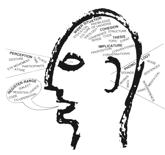
A tipografia na sua origem era sinônimo de impressão, hoje o seu significado vai além da arte de criar e ou manipular caracteres. Jan Tschichold, mesmo sendo um dos seguidores do estilo funcionalista da Bauhaus, já afirmava que “a tipografia significa muito mais que simplesmente a escrita com tipos” (TSCHICHOLD, 1953-1967 apud CAUDURO, 1998 pg.89). Para Lucy Niemeyer (2001, p.12) a tipografia “envolve a seleção e a aplicação de tipos, assim como a composição de letras de texto como o objetivo de transmitir uma mensagem o mais eficaz possível.”


O funcionalismo e o racionalismo provenientes da Bauhaus e da Escola Suíça trouxeram padronização ao design gráfico através de regras para a obtenção do bom design1, um estilo onde as criações pareciam ser feitas em série cujas fórmulas eram copiadas por qualquer pessoa que detivesse o conhecimento das tecnologias. O resultado da padronização “que essas fórmulas mecanicistas geravam tornaram-se muito facilmente previsíveis, aborrecidas e desinteressantes, passando a ser

praticamente invisíveis após algum tempo.” (CAUDURO, 1998, P.78)


Logo este cenário começou a ser questionado a partir dos anos 60 por designers como Wolfgang Weingart e em seguida Neville Brody e David Carson ao desenvolverem soluções gráficas que fugiam das diretrizes modernistas. Além disso, correntes artísticas como o experimentalismo e filosóficas como a desconstrução de Jacques Derrida vieram a influenciar a prática tipográfica onde o tipo ultrapassa os limites da simples representação fonética.


É importante salientar que o estilo bauhasiano não deixou de existir no design gráfico já que ainda são utilizados, porém esta linha de organização da página deixou de ser o único caminho e o mais eficaz para se tornar um dos caminhos possíveis. KEEDY (1994, p.27 apud GRUSZYNSKI, 2002 p.151) diz que: “[...] Ainda que as regras sejam estabelecidas para serem desrespeitadas, escrupulosamente observadas, mal entendidas, reavaliadas, readequadas e subvertidas, a melhor regra básica é a de que as regras nunca devem ser ignoradas.”


Metodologia


Este artigo retrata a influência da desconstrução e do experimentalismo, típicos do mundo pósmoderno, na prática

tipográfica atual tendo como objeto de estudo a exposição “Sob o sol, a garoa e a fumaça” realizada no ano de 2004, na cidade de São Paulo, organizada por Cecília Consolo e Alécio Rossi através de uma revisão bibliográfica de teóricos como Vicente Gil, Flávio Vinícius Cauduro, João Pedro Jacques, Priscila Farias e Rudinei Kopp. [Ler mais...]


Esta é a versão em html do arquivo http://www.alb.com.br/anais16/sem14pdf/sm14ss02_08.pdf

Relato crítico do texto

E TIPOGRAFIA DIGITAL, de Flávio Cauduro

por Vinícius Andrade Pereira (UFRJ)


1. Resumo do texto Desconstrução e Tipografia Digital:


Cauduro, ao apresentar um breve histórico da arte tipográfica, problematiza a relação

de subserviência que esta apresentaria em relação às mensagens, às idéias, aos conteúdos de

um texto, perspectiva que, pela supervalorização das palavras racionalmente ordenadas,

assumindo o papel de representantes legítimas do pensamento, é conhecida como

logocentrismo.

O nó górdio do texto é formado pela tensão entre duas forças: uma, que se apresenta

através da forma gráfica como as palavras se compõem em um texto qualquer; e, outra força,

constituída pelos significados, as informações que este texto transmite, que traduziriam as

idéias de um autor.

Para Cauduro, como já dito, haveria uma limitação e mesmo uma escravidão imposta

à arte tipográfica na designação de sua função. Escreve, pois, que a função primordial da

tipografia seria, então, apenas instrumental, dedicada à difusão genérica de informações

sob a forma escrita e em grande escala.(1)

Partindo desta constatação, o autor irá criticar tanto aqueles designers que admitem tal

subserviência - postura adotada pela escola de Bauhaus, onde se impunham as formas claras,

ordenadas, racionais, geométricas e repetitivas(...) evitando ao máximo a ornamentação e a


disposição expontânea, intuitiva ou ao acaso dos elementos gráficos utilizados -, levada ao

extremo pela escola dos minimalistas e funcionalistas suíços(Ruder, Hoffman, Müller,

Brockman), quanto os pressupostos filosóficos e linguísticos que sustentariam o

logocentrismo, oriundos particularmente de autores tais como Platão, Aristóteles, Rousseau e

Hegel e, mais especificamente, Ferdinand Saussure.(2)


(1) Cf. Cauduro, F.V.; Book GTs/Compós98, p.97

(2)  Cf. Cauduro, F.V.; op.cit.;p.97 e 98


.Esta é a versão em html do arquivo http://www.comunica.unisinos.br/tics/textos/1998/1998_fvc_vap.pdf.

Modelos de Comunicação


(Swann, 1991)

Swann, 1991"Comunication is like pornography: nobody seems to Know how to define it, but we all Know it wen we see it. Webster's tells me that comunication is the act of transmitting information; information, oddly enough, it that wich informs. I believe we need to go no further than this to have a common basis for discussion: we communicate whenever we transfer meaning to ("inform") someone else (even if the meaning isn't what we intended)._Successful_ cominication transfers the meaning that we intended. Information design has de goal of successful comunication" (Geoff Hart)


Antes de nos apegarmos as variáveis tipográficas, é interessante entendermos alguns modelos de teorias de linguagem, que procuram esquematizar as relações entre escritor e leitor, ou origem e destino.Isto é importante para entender os princípios básicos da comunicação escrita, mas vale lembrar que poucos teóricos se aventuraram a estudar o papel das variáveis tipográficas na comunicação escrita.
[Ler mais...] 

© Ariane Stolfi, CNPQ, 2002

22/04/2008

Jon Gray _entrevista


Jon Gray is a far-too humble designer working out of East London. He operates under the monicker “gray318” and is creating some of the most memorable and recognizable book covers on the market today. He was kind enough to grant us an interview: 

Fwis: What’s your background? How and when did you become interested in design?
Jon Gray:When I was 8 I decided to be an artist. Apparently this didn’t pay, but the careers advisor at school said that by adding the word ‘commercial’, I would become extremely rich. I adjusted my aspirations accordingly, did a basic foundation course and managed to con my way into the London College of Printing. LCP is like the design equivalent of marine training. I went in a boy and came out a … boring graphic designer. [Ler mais...]


18/04/2008

Art is Work: Milton Glaser retrospective

On view at the AIGA National Design Center from November 2 through December 27, 2000

"Art is Work: Milton Glaser Retrospective" the largest retrospective show ever held in New York of the work of the American graphic designer Milton Glaser. The show coincides with the publication of Glaser's eponymous book, Art is Work, a comprehensive survey of his work in the 25 years since the publication of his classic Milton Glaser Graphic Design.

One of the most influential and unusual figures in the history of graphic design, Glaser has been producing memorable images and objects for more than four decades. From the famous Bob Dylan poster of 1967 and the universally imitated "I Love NY" logo up to the cutting-edge design of his new websites and his masterful illustrations for Dante’s Purgatory, Glaser has created some of the most powerful and enduring visual art of our time.

I Love NY logoThe extraordinary variety of subject matter and style in the show demonstrates why Glaser has been called "the Picasso of the graphic arts field." It includes his posters, magazine and newspaper designs, interior designs, corporate logos, record albums, magazine illustrations and typography, as well as watercolors, drawings, prints and illustrated books, toys, textiles, jewelry and home furnishings.

Among the more unusual pieces in the show are the erotic drawings the designer created for a French edition of Boris Vian's novels, a wood-and-glass sculptural tribute to Glaser's teacher, Giorgio Morandi (1890-1964) and a set of ingeniously modular children's building blocks.

The show will also feature rare examples of illustrated books Glaser conceived for European publishers that have never been shown in this country, including versions of Charles Baudelaire'sLes Fleurs du Mal and Guillaume Appolinaire's Oeuvres Poetiquesand Oeuvres en Prose.

Born in 1929, Milton Glaser was educated at the High School of Music and Art and the Cooper Union in New York, and via a Fulbright Scholarship, the Academy of Fine Arts in Bologna, Italy. He co-founded the seminal Pushpin Studios in 1954, founded New York magazine with Clay Felker in 1968, established Milton Glaser, Inc. in 1974, and teamed with Walter Bernard in 1983 to form the publication design firm WBMG. Milton Glaser, Inc. is a multidisciplinary design company, specializing in corporate identity, logos and trademarks, brochures, packaging, interiors, exhibitions, posters and websites.

Glaser was the 1972 recipient of the AIGA medal, the highest honor given to a graphic designer in this country, and is the only graphic artist ever to have had one-man shows at both the Centre Gorges Pompidou in Paris and the Museum of Modern Art in New York.

Buy Milton Glaser's book Art is Work

17/04/2008

Milton Glaser

Milton Glaser (b.1929) is among the most celebrated graphic designer in the United States. He has had the distinction of one-man-shows at the Museum of Modern Art and the Georges Pompidou Center. In 2004 he was selected for the lifetime achievement award of the Cooper Hewitt National Design Museum. As a Fulbright scholar, Glaser studied with the painter, Giorgio Morandi in Bologna, and is an articulate spokesman for the ethical practice of design. He opened Milton Glaser, Inc. in 1974, and continues to produce an astounding amount of work in many fields of design to this day. [Ler mais...]

01/04/2008

Morris Fuller Benton

Morris Fuller Benton - born 30. 11. 1872 in Milwaukee, USA, died 30. 6. 1948 in Morristown, USA – engineer, type designer.

After training as a mechanic and engineer, Benton jointed the ATF, where he became type designer and in-house designer with ATF.

Fonts:
Benton developed over 200 alphabets, all of which were published by ATF, including Century roman (with Theodor Low de Vinne, 1885), Mariage (1901), Alternate Gothic (1903), Franklin Gothic (1903–12), Cheltenham® (1904), Clearface® (1907), News Gothic™ (1908), Bodoni (1909), Cloister Oldstyle (1913), Souvenir® (1914), Garamond® (with T. M. Cleveland, 1914), Goudy™ bold, 1916, Century Schoolbook™ (1919), Civilité (1922), Broadway™ (1928), Bulmer™ (1928), Bank Gothic (1930), Stymie (with S. Hess and G. Powell, 1931), American Text (1932).

* TYPOGRAPHY – An Encyclopedic Survey of Type Design and Techniques Throughout History by Friedrich Friedl, Nicolaus Ott (Editor), Bernard Stein, published by Könemann Verlagsgesellschaft mbH.

more ... Works and Samples

Cover (1929)