Published: January 22, 2009
“Much of the information user interfaces present is textual. Therefore, we should not underestimate how the right text treatment can measurably improve user productivity and increase user satisfaction.”
Before graphic user interfaces, text was the primary means of both input and output defining human-computer interactions. Even today, much of the information user interfaces present is textual. Therefore, we should not underestimate how the right text treatment can measurably improve user productivity and increase user satisfaction. As new technologies become available—for example, larger monitors with higher resolutions—a good foundation of knowledge about effective text treatment can help designers create usable user interfaces for them more quickly.
Font Type
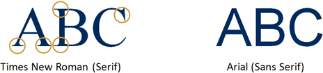
Content developers have hundreds of serif and sans serif fonts at their disposal. Serifs are small lines at the ends of the main strokes of characters. Serif fonts improve readability in continuous text, because the serifs help readers to structure and discriminate characters [1]. Times New Roman, for example, is a serif font, as Figure 1 shows. Typically, newspapers, magazines, and books use serif fonts.
Figure 1—Examples of serif and sans serif fonts
“On computer screens, sans serif fonts are preferable, because relatively low screen resolutions…make serif fonts look fuzzier, especially in small sizes.”
[Ler mais...] > UXmatters >
References
[1] Wheeler, Susan G., and Gary S. Wheeler. TypeSense: Making Sense of Type on the Computer. Boston: International Thompson Computer Press, 1996.
[2] Dul, Jan, and Bernard Weerdmeester. Ergonomics for Beginners. Oxford: Taylor & Francis, 1993.
[3] Arditi, Aries, and Jianna Cho. “Letter case and text legibility in normal and low vision.” Vision Research: September, 2007.
[4] Watzmann, Suzanne. “Visual Design Principles for Usable Interfaces,” in The Human-Computer Interaction Handbook, ed. Andrew Sears and Julie A. Jacko. New York: Lawrence Erlbaum Associates, 2008.
[5] Byrne, Michael D. “Reading Vertical Text: Rotated vs. Marquee,” in Proceedings of the Human Factors and Ergonomics Society 46th Annual Meeting. Santa Monica, CA: Human Factors and Ergonomics Society, 2002.
[6] ISO 9241-3. Ergonomic requirements for office work with visual display terminals (VDTs)—Part 3: Visual display requirements. Geneva: International Organization for Standardization, 1992.
[6] Grandjean, Etienne. Ergonomics in Computerized Offices. New York: Taylor & Francis, 1986.
[8] Kroemer, Karl H.E., and Anne D. Kroemer. Office Ergonomics. New York: Taylor & Francis, 2001.
…