Cyrus Highsmith is a Senior Designer at the Font Bureau in Boston and faculty member at Rhode Island School of Design. He has been called "one of the truly original new voices in American type design" on account of his vast range of new typefaces, alongside numerous revivalist projects. I met Cyrus while at RISD and he has since left a lasting impression on my approach to typography and type design. Cyrus was kind enough to answer a few questions for us, sharing some insight into his type filled world.
Christian Palino: With so many typefaces being designed every year, last year Stephen Coles noted at least 1,800 new commercial typefaces for 2006, what is the criterion of "good" type design? Do you think that criterion is different today than it was for someone like W. A. Dwiggins?
Cyrus Highsmith: I look at typefaces in the context of their intended use. The spring semester at RISD is about to start and I will be teaching my type design elective. The students can draw whatever kind of typeface they want to, but they have to define the kind of document it will be used in and how their typeface will be used. The more specific they can be, usually the better the semester goes, and the better the results. Without this context, it is hard to say very much about a typeface. I think this was true in the old days also.
To me, the really interesting question now is what is the effect of 1800 new typefaces a year on the reader? Not only are readers exposed to all these different typefaces, they are being exposed to more different kinds of typefaces. I wonder what effect this is having. It is making readers more sensitive to typography or less sensitive? or both?
CP: Its a good question, certainly if the reader is bombarded with more and more typefaces then one could generalize that the sensitivity to type becomes duller, but that doesn't account for variety. And what about quality, that must have an effect on the reader as well. How do you answer these questions?
CH: My focus is working with the typographers who are choosing and setting the type, and to a lesser extent working with the engineers who are designing the type setting systems. The type designer is just one small part of the process of creating a document. In the big picture, I just want people to keep reading. If typography gets so bad that literacy rates actually go down, then we are in trouble.
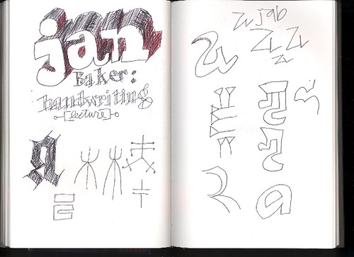
CP: On one of your sketchbook pages there is a note about "Jan Baker: handwriting" which reminded me of John Hegnauer's penmanship and how emphatic he was about the importance of good handwriting. Any thoughts on this?
CH: I am writing my responses for this interview by hand. Later, I will type them. (or actually, now I am typing them). The reason for this is that when I write by hand, and I can see the pencil or pen marking the marks on the page, all these different parts of my brain light up. Ideas flow better. I remember what I write by hand longer. So for me, handwriting is an important thing. However, I don't have very good handwriting in a traditional sense! If I sit down and focus, I can do pretty nice lettering. But that is a different kind of thing for me. [Ler mais...]